Any Web designer worth his or her digital salt can create a beautifully designed site that clearly conveys professionalism. If it doesn't engage a brand's visitors, however, the website wastes everyone's time (the client's, the designer's and, not to mention, the visitor's).
If visitors aren't pulled, grabbed and propelled to interact with a site by actually doing something while on it....what's the point?
How do companies get visitors to do what they want them to do while on their sites? By making the site more engaging. Without engagement, a website has nothing. Shoppers don't add items to their carts, they don't share the site's products or services on social media and they don't sign up for its newsletters.
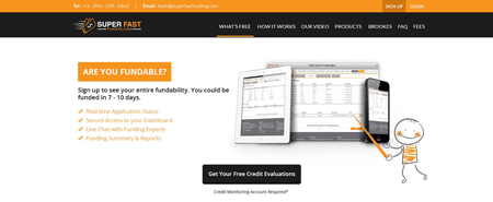
There are many ways to increase visitor engagement and the Super Fast Funding website provides as perfect example as any. Take a look at the "before" picture:
Notice that there's not a lot of opportunity to engage visitors, unless they are interested in a free credit evaluation. Even then, the black call-to-action doesn't do the conversion funnel any favors.
One crucial mistake that this pages makes, is that it asks a question that could have a "No" response. "Are you fundable?" Face it, there are many out there who do not believe they are fundable. And once "No" pops up in their heads - they disengage (e.g. leave the website). The very opposite of what a site owner, marketer or the like would want.
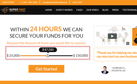
Now check out the new re-designed home page:

For starters, the phone number is preceded by the word "Questions?" to persuade visitors to pick up the phone if they have questions (note: to zoom in, click on the image). Other improvements made include:
- Live chat has been added
- A blog has been added
- A video has been added
- There is no headline asking a question that could garner a "No" response
- A brightly colored, action-oriented call-to-action has been added
- An interactive slidebar has been added, letting visitors choose the dollar amount they would like to receive. Not a boring text box or drop-down menu. Rather, a cool slider bar that's difficult not to play around with.
- This slidebar gives visitors a sense of power and control. This is exactly the feeling to give them to help them move confidently through your conversion funnel.
Giving your visitors a sense of power and control helps to alleviate anxieties, as does solid customer service. And in this day and age, good customer service can turn Web visitors into Web buyers.
Screen Sharing
LiveLOOK is a co-browsing, otherwise known as screen sharing, platform that lets agents onto the screens of their shoppers.
Taken over by Oracle last summer, LiveLook has had some interesting results. One of the nation's leading health insurance organizations, for example, has been using the co-browsing platform as part of its customer service strategy. When visitors are having difficulty registering, paying online or finding information, agents are able get onto their screens to step in and assist them.
With this strategy, it was immediately noticed that call handling times were reduced, on average, from up to an hour down to 7-10 minutes. This translates to an 85 percent reduction in the company's resources.
Agents also quickly noticed that there was also a great reduction in visitor frustration. By reducing frustrations, customer loyalty and satisfaction was increased. This is why engagement is so important. Not only engaging visitors on your pages, but also engaging with your visitors.
In a brick-and-mortar store, there is always help nearby. Well, if it's a good store. It's vital that you provide the same experiences if you want to succeed online. Not only is it important to engage visitors, but it's just as important to track that engagement.
HotJar does both by bundling multiple solutions. Online merchants can survey their audience, present exit polls and recruit user testers. Merchants can also track engagement with heat mapping, visitor playback sessions and form and funnel analysis.
Heat Mapping
Heat mapping is an effective way to track the engagement of visitors by displaying what they are doing on the site. Color coding shows where they are clicking, where they aren't clicking and how far down they are scrolling.
It's interesting to see indications that visitors are clicking on areas that have no click-able links or buttons. It provides good insight that maybe a link should be added there. It's what visitors are looking for.
Or, if they're not clicking in an area that is click-able - what would be better suited in that spot?
Visitor Playback Sessions
Visitor playback sessions go a step further by providing actual video of what visitors are doing. Site owners, developers, marketers, etc., can watch their mouse move around and see where they are going, where they are stopping and every other move they make.
Surveys
Why are surveys so important? Because they provide the opportunity to ask the questions businesses would love to ask in-person.
For example, 40 percent of people surveyed by researchers at Georgia Regents University said that they would save their dog's life before they'd save the life of a foreigner. And this number is higher at 45 percent among women.
Who would have known had the question not been asked? This is why surveys are vital to understanding your visitors. It's a highly effective way to get inside of their heads.
Brands should make sure that when creating a survey they ask open-ended questions that will illicit more information that a "yes" or "no" response. Offering an incentive to visitors for filling out a survey is also an effective way to get more participants (e.g. percentage off, free shipping, etc.).
Exit Polls
Exit polls are similar - but they typically ask a single question as visitors are leaving a website. Usually these questions focus on objections visitors might have. For example, "What prevented you from making a purchase today?"
User Tester Recruitment
User tests give companies the opportunity to peek over the shoulders of their visitors while they browse their sites and see where they are having issues. It is claimed by usability expert, Jakob Nielsen, that five user testes will reveal 85 percent of your websites problems. He goes on to state that 15 user tests will reveal all of website issues as documented in the graph below.
Form & Funnel Analysis
A Form & Funnel analysis will reveal the exact point that visitors are dropping out. Once identified, companies can work on resolving the issues that are keeping visitors from moving to the end of their funnel.
The Bottom Line
Are you starting to see why engagement is so vital to the conversion equation? A flat site that does little to engage visitors and get them to interact is detrimental to your bottom line. As you've read, it's really not all that difficult to implement strategies that will increase visitor engagement.
By using the tools to do so, you improve the visitor experience and will convert more browsing shoppers into buyers.

