Mega-List of Online Survey Tips

Popular survey solutions have made it extremely easy to create, distribute and analyze online surveys.
Marketers, however, must do their due diligence to ensure that best practices are met in order to optimize the response rates, quality of responses and internal reporting that can be done to support business decisions. Let the following serve as your mega-list of online survey tips to improve the experience for both users and brands.
Indicate Survey Length
The number one question a user has when being asked to do a survey is, "how long is this going to take?" Marketers should manage expectations by including copy like, "Take our two-minute survey" or "Fill out our nine-question survey." The alternative option, although not as effective, is to be more vague like Subway did at the start of its survey, "thank you for taking the time to complete our short survey." It is, however, better than no length indicator.
Give Questions/Answers Context
Many survey providers have personalization features like taking previous questions' answers and automatically generating new questions based on those answers. For instance, in the example below, Care.com could have improved its survey had it used a service like ZOHO Survey which can eliminate questions that don't apply to that particular user. Notice in the image below that Care.com asks, "Have you posted a job on Care.com?" The next question states, "If you posted a job, how many caregivers responded to your job posting?"
Care.com is not only risking skewing its results (a user could indicate a number even though he or she did not post a job) but also annoying the user. There is far too affordable and sophisticated survey options that eliminate unnecessary questions based on the previous answers' context to have to rely on these outdated methods. Another alternative is to simply include a "N/A" answer to ensure Care.com's results are not skewed because of improper survey execution.
Use a Progress Indicator
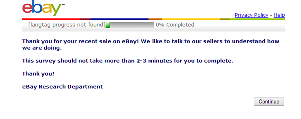
Just like users want to know how long a survey is going to take to complete, they want to know how many questions they have left in the process. eBay includes a progress bar to indicate the percentage of the survey that has been completed.

Use Consistent Branding
Similar to ensuring a landing page mimics a banner ad, marketers should make sure that the marketing collateral that is asking users to fill out a survey (most likely that's an email message) matches the survey itself, in terms of colors, logo used, title of survey, copy and more. This is just another step in managing customer expectations. The customers/users are going to expect a certain look and feel when they leave the page/message they are current on and visit a Web page from the same brand.
For example, eBay uses the previously mentioned best practice of including how long its survey will take (in this case 2-3 minutes) and carries over that message from the email (first image) to the landing page where users are taken to from the email (second image).


Survey No Longer Available? How About Another Option?
Similar to how there are some really creative uses of 404 pages, marketers have the opportunity to not just tell users "sorry but this survey has expired" but rather to send them to a contact form ("we'd still love to hear what you think about ___) or even just to a homepage. Another idea is to set the expiration date as far in the future as possible and segment the reporting appropriately (e.g. answers received after Sept. 2015). Don't marketers care about their customers' opinions even if they are late responding to the survey?
Apply Email Marketing Best Practices
Most marketers send online surveys via email, which means they shouldn't forget about email marketing best practices. They should ensure their messages have large calls-to-action, are brief, are sent at a time of day their users are known to respond, include a clear and concise subject line (don't try and trick users to believe the email is anything other than a request for feedback) and are mobile friendly. Additionally, marketers will want to run A/B tests for their surveys for items like the subject line, email copy, imagery and more.
Integrate When Possible
From social integrations to CRM integrations, survey senders should look for applications that make distributing, storing and acting on survey information easier and more effective. For example, a survey solution that integrates with a brand's existing CRM can enable them to act on feedback quicker because it may automate the workflow if, say, someone had a bad experience with a company, certain negative responses could trigger a customer support ticket.
Use a Partial-Save Feature
Despite all a marketer's best efforts, users can still leave a survey without finishing it. Most of the popular survey options on the market have a partial-save feature where answers are saved in real-time in case a user bounces.
Share Results
Surveys are useless if marketers are unable to share the results. The survey results should not be siloed to just marketing though. Customer service reps, executives and everyone who can learn from the results should have access to the responses. What's more, some survey solutions let marketers slice and dice the information for particular departments.
Online surveys remain one of the most effective ways to gather qualitative and quantitative feedback, but at the end of the virtual day it's the sender's responsibility to ensure recipients are provided with an optimal user experience. By providing a good user experience, chances are that marketers will end up with better results (like more thoughtful answers and more completed surveys) to inform business decisions.

Subscribe to Our Newsletter!
Latest in Marketing


