Create Your First Sample Usability Report

Those responsible for testing the usability of their websites might be excited to share the findings in a lengthy document that their colleagues may not read in its entirety (although clients might).
In Website Magazine's upcoming October 2017 issue (access our digital archive here), conversion rate optimization expert Martin Greif of SiteTuners warned against publishing a "50-page slide deck." Instead, he provided some actionable advice, which is the basis of what we've included below.
Item #1
Include a recording of the person using the site to be referenced later. The more users using the site that can be included in the single video the better (brevity is a friend). Depending on the solution used, the report's author may be able to link to the solution's site that is hosting the video(s), share in Google Drive, or have to upload to YouTube (be sure it's private).
[Watch real users using out website here: www.youtube.com/xxxxx]
Userbrain provides several example videos that are worth checking out, here.
Items #2 & #3
Here, the report's author(s) will want to include bullet points about the three most serious usability issues (after a batch of tests has been completed, says Greif) and a recommendation on the simplest possible fix for the worst of the issues (he continues to say those fixes that do not need a website redesign or a new content management system for example).
- [Most serious usability issue]
- [Recommendation]
- [Second most serious usability issue]
- [Recommendation]
- [Third most serious usability issue]
- [Recommendation]
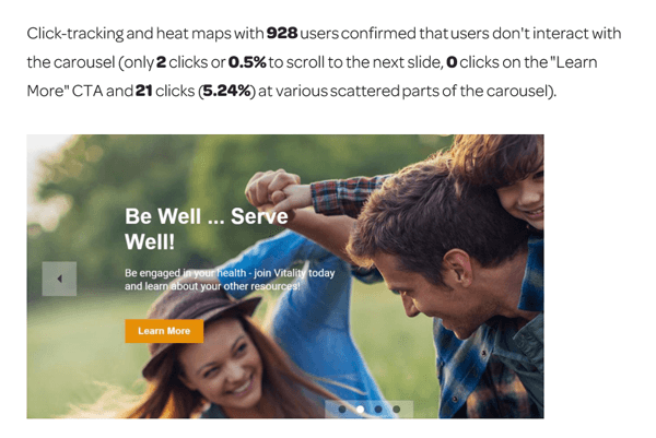
In Intechnic's sample report, the authors found the homepage carousel to be the worst usability offender.

( Image source)
In Greif's suggested format, this item would be listed as the top bullet point followed by a recommendation. Intechnic immediately provided a recommendation under its findings, which we've included below.
- Carousel Image Slider
- RECOMMENDATION: Replace the carousel with an interactive UserCentric
Wizard that will help users quickly find the information they are
looking for based on who they are and what they need. The real estate
taken up by the carousel can be used more effectively.
- RECOMMENDATION: Replace the carousel with an interactive UserCentric

Subscribe to Our Newsletter!
Latest in Marketing


