5 Showstopping Websites & What They Did Right

As you know, your website is the face of your brand--or ambassador if you will.
Like any good representative, an ambassador has to look and act the part by putting his or her best face forward, empowering others, staying in tuned with the needs of customers and noncustomers alike, and delivering the right messages at the right time. They should be approachable, confident and charismatic.
To be the ultimate face of your brand, your website needs to do the same. You can have the best product in the world, but if your site lacks the authority, personality and pizzazz people expect than nobody will stay on long enough to discover all you have to offer. In order to create a successful site you have to incorporate the perfect combination of visual design, user experience, customization and social prowess that captures the attention of your audience and drives them to build conversation and community. So sit back and take some advice from these experts who completely nailed it:
1. Amazon
Some may argue that Amazon knows its customers better than its customers know themselves. Practically speaking, this may very well be the case. Amazon knows what you want to buy, what you want to watch and everything in between. This of course, is how Amazon grew to be the ecommerce giant it is today.
So how did the company grow to develop such a loyal following? The answer in this case is website personalization. Personalization is an extremely important part of attaining dedicated customers. In fact according to Monetate, 20 percent of marketers experienced an increase in sales once they implemented personalization into their Web strategy.
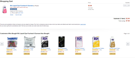
In Amazon's case, much of this personalization comes from a deep understanding of buyer behavior, which takes into account various user segments and explores their interests and activities. Tracking tools help gather such information by showing which stories specific users are reading, where they are clicking and which products they are looking at.
As can be seen below, Amazon provides customer recommendations based on what a user has bought in the past as well as what they have shown interest in. Of course, by providing such helpful hints based on personal preferences, sites can provide smart insights to their audience about other products they may be interested in, eventually helping to push sales and increase customer loyalty and satisfaction.

2. Bored Panda
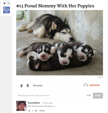
Everyone's crazy for content, but some sites simply do it better than others. Bored Panda knows its readership and therefore, understands the type of content that will bring users back for more. The site aims to entertain and provide interesting and relevant content that is pertinent to Generation Y, while also provoking conversations amongst users.
What truly makes its site great is the wide variety of content it offers and the amount of user interaction and social activity it creates. Not only does the site post humorous and attention-grabbing stories, but Bored Panda also encourage comments, shares and upvotes for articles as well as individual pictures to give users more opportunity to connect to the content.
In addition, the fact that users can also sign in with a username and picture helps them take ownership of their comments, eventually helping to build a strong, loyal online community.
The beauty of an online community is that it brings attention to your content and gets people involved in your brand's persona. In addition, having a community ensures you will always have visitors who you can connect with as a brand.
On a related note, it's also important to note that the site uses social features such as comments, shares and a ranking system - all of which are generally thought of as being exclusive to social media sites. Yet, by taking social features and incorporating them into their own website they increased interest, activity and user retention.
3. Uber
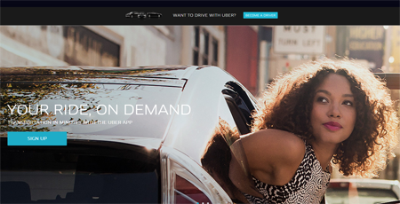
Going back to basics, design makes a huge impact in commanding attention, and drawing browsers to your site. Since first impressions make a huge impact on whether or not people choose to stay, utilizing bold and stylish design elements as well as a clear-cut user journey is imperative for every effective site.
According to recent studies, 55 percent of casual browsers will leave your website in 15 seconds - unless of course, you give them reason to stay. Uber knew this and as a result, made their design and user experience a huge priority.
The site is in-line with relevant design trends, such as using bold yet simple visuals, engaging photos and a logical user-journey which is all culminated with a prominent call-to-action.
A site's user experience plays an essential role in its design. Uber incorporates user experience into their design by using a short headline with a picture illustration right above the CTA. As you continue scrolling, you can find out more information about the benefits, offerings and where the company's services are available.
The reason this is so important is because it's organized in accordance with what people are actually looking for. Most people that use Uber know what services they offer. Therefore, they just want to get straight to the point and order a car, hence the need for a short blurb and immediate CTA. However, in some instances, users want more information. That's why the company then places the product's benefits and other offerings below.
4. Shopify
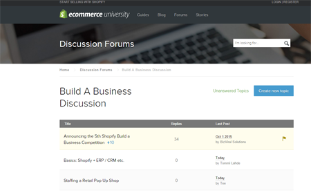
Shopify is another site that has mastered the art of creating conversation and building communities. Unlike Bored Panda however, this site uses a different strategy to cultivate conversations.
While its site is also full of useful and pertinent content, Shopify uses discussion boards as a means to communicate with users about content and empower them to contribute their opinions. Since its community consists mostly of ecommerce store owners, having a designated area where everyone can contribute thoughts about useful strategies and industry news has proven to be a bonus for the site.
If discussion boards are not your style, you can use similar socially oriented strategies such as comments, notifications and even onsite social chat. By giving your users the opportunity to create their own conversations surrounding your content and brand, you increase engagement and loyalty as well as likelihood of becoming viral.
5. Care2
Care2, a site that specializes in social-change campaigns, is a concept that would not work if not for a strong, vibrant and empowered community. As a result, the site goes to all lengths to get users involved and give them individualized attention. Not only does Care2 encourage people to create their own petitions as well as conversations surrounding causes, but it also glorifies users who get involved, encouraging them to get active and become influencers.
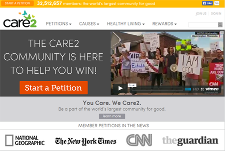
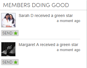
Their "members doing good" section rewards users who have been the most active in their causes, which eventually motivates them to become advocates for more and more causes as well as for the site itself. This strategy can be an extremely effective part of an influencer marketing campaign, a method in which brands develop relationships prominent individuals, to get them to be a brand ambassador.
According to a recent study by McKinsey, word-of-mouth marketing leads to double the sales of regular advertising. Therefore, getting influencers to promote your site, your product and your brand is a trending and effective way of getting more users to stick around and become loyal to your brand.
Nobody likes that person who can sit there and talk about himself day in and day out. So don't let your site be take on that persona. Instead, use your site as a vehicle to deliver value where it counts most. Websites today are becoming increasingly sophisticated. As a result elements such as user-experience, social features, individualization and other tactics are becoming more and more critical to capture attention and increase activity onsite. Gone are the days of one-sided information, instead sites should do everything possible to empower their individual users, make their site accessible and deliver benefit that people expect.
Subscribe to Our Newsletter!
Latest in Marketing


