7 Sites Opting for Simple Designs

If 2015 was the year of anything, it was minimal Web design.
Fueled by smartphone usage, more companies took advantage of the previous year's trend toward larger images, less text and collapsed navigation, which more easily adapts to different screen sizes. Building on 2014, however, some creative brands added subtle animation rather than static images, while keeping everything else on the page (copy, calls to action, etc.) minimal.
Below you'll find seven sites opting for minimal designs, but their concepts are anything but simple as conversion paths, user experiences and more have been accounted for.
Squarespace
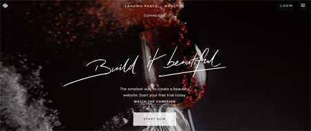
Subtle background animation keeps the site interesting, while the prominent call to action keeps users moving forward - with the hamburger icon giving users on all devices access to more navigation options in a streamlined way.
Virgin America
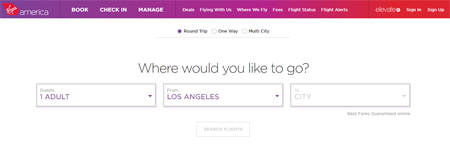
Compared to its competitors, Virgin America's homepage is clutter free and provides users immediate access to travel options.
Capital One

Greeting a user they don't know, Capital One's homepage keeps everything very organized and simple thanks to a drop-down menu to sign in to the correct account and option to respond to a mail offer (like the top two destinations of a vistor).
Apple
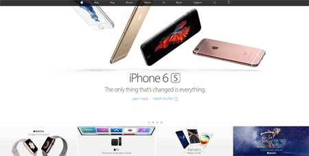
Clearly a site designed for mobile first, Apple's digital destination looks simple but is a true case study in mobile websites done right. Apple blends content and commerce, while using beautiful product imagery to showcase its offerings. Episerver recently named Apple as the best mobile website for these reasons and others.
Chapstick
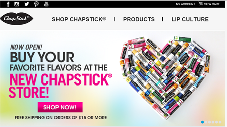
A visit to almost any retailer's website will prove just how much they have going on - from promotions to product suggestions to categories. While Chapstick isn't a retailer per say, it is selling direct to consumers. Its website does three main things: sells Chapstick, promotes its various offerings and publishes content. While there are other options, like finding a local store, Chapstick is wise to keep its homepage simple - providing a trio of navigation options with the main one being Buy Chapstick.
Walker Sands
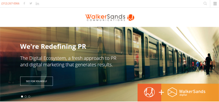
An attractive image, a ghost button and a strong value proposition greet visitors on Walker Sands' website, which provides a sense of authority and online expertise - exactly what their prospetive clients are looking for.
Sproutling
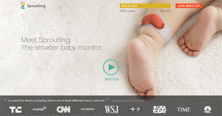
A new concept, the Sproutling baby monitor (which track's an infant's vital signs and sleep patterns) benefits from the trust indicators it offers on the homepage. The video it immediately provides complements the page, as it shows what the product can do more effectively than copy would - allowing Sproutling to keep its site looking modern and simple.

Subscribe to Our Newsletter!
Latest in Web Design


