4 Value Propositions Worth Re-Thinking

Copywriting is a difficult task. It's one that most marketing and website professionals are required to do, yet few are really good at.
Communicating a message in as few words as possible is tough, yet it's one of the most important elements of a good website homepage - especially when it comes to value propositions. Often discussed at great length at Website Magazine, value propositions are a promise of value to be delivered by a product or service. In other words, why someone would buy or subscribe to a product or service.
While digital enterprises need to test to see which of their value propositions work best, we've listed four value propositions we feel have missed the mark. (Editor's Note: To zoom in, click on any of the images.)
The Missing Value Proposition
Despite some value propositions doing more harm than good, the company that doesn't include a value proposition altogether is fairing worse when it comes to motivating users. Although Prudential is basically a household name (and its main website receives roughly 700K unique visitors each month), its homepage dangerously lacks any verbiage motivating visitors based on perceived benefit minus perceived cost (the popular formula for getting consumers to take action).
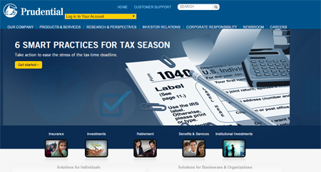
In fairness, however, as users navigate to the section of the website that best fits their needs (insurance, investments, retirement, etc.), Prudential does start to include value props (see image below). Its retirement landing page, for example, tells users that Prudential Retirement has been delivering retirement security for 85 years (certainly a benefit) and that it can help all sorts of businesses and individuals looking to start or transfer their plan assets. What's more, Prudential provides supporting statements and supporting paragraphs. The downside to the way Prudential presents this information though is that the page is cluttered, distracting from the most important copy on the page (the value prop).

The One That Relies On A Video
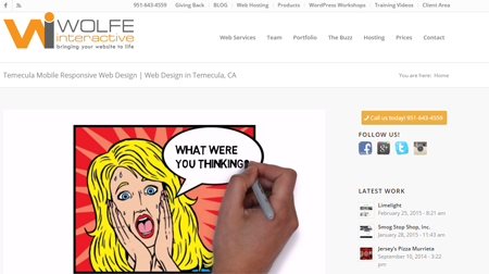
Although executives (aka decision-makers) are watching more and more video, brands marketing to these professionals shouldn't rely on homepage videos to relay their value propositions. Rather, videos should be used to support them, as videos assume people will watch them and won't be annoyed by them (especially those that start automatically). And although Website Magazine has long been a fan of a good whiteboard/scribing video like shown on Wolfe Interactive's website (it's a great example of one done right), this site fails to include a direct value proposition. The value prop should be written and, again, the video should support it.
The One You Can't Read
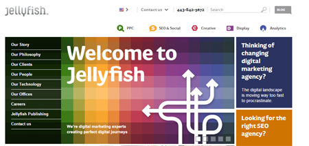
"We're digital marketing experts creating perfect digital journeys." This sentence tells visitors what it is Jellyfish offers and who its service is intended for, but the main headline above this supporting statement is, "Welcome to Jellyfish," which is a misuse of this very valuable digital real estate. Instead, that headline should provide a benefit, with the supporting statement going into more detail. What's more, the supporting statement is white font on a multi-colored background, making it very tough to read, let alone notice.
In fairness (once again), Jellyfish's homepage includes a slideshow, which details more of its selling points, but that makes a terrible assumption that visitors will give the site more than (roughly) 10 seconds before the slide changes.
The One That Is Too Vague
A key component of a good value proposition is one that offers the benefits of doing business with that business (and further, not the competition), but it must provide some inclination as to how. Unisys's provides plenty of benefits (and some buzzwords) but no real hint as to how it achieves those benefits or who they are or what its expertise is. The homepage presents a scavenger hunt of sorts to figure out what it is offering.

Bonus: Props to These Value Propositions
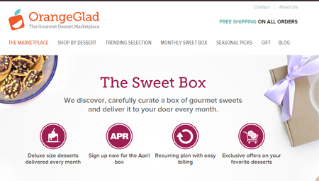
In our search for value propositions we feel could be improved, we ran across some great examples of those that are clear, attention-grabbing and quickly relay their product or service offerings in a quick, yet thorough way.




Subscribe to Our Newsletter!
Latest in Marketing


