Wireframes: 4 Tips for Presenting

By Samantha Turner, Celtic Chicago, Inc.
Showing wireframes to a client is an interesting conundrum. Clients may not understand the initial vision of the site, and it's a challenge to show them why this series of black and white lines with gray boxes is important.
Whether internal or external, wireframes are an important part of the process. The research has been done and the idea conceptualized. The developers use it to plan for the functionality, the copywriters use it to estimate content - so why not share it?
Including a client is a great opportunity for feedback and learning. It fosters open communication on the functionality - and confirms clarity across all parties if presented correctly.
EXPLAIN THE BASICS
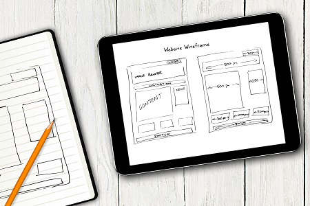
What is a wireframe? A wireframe is the foundation to your website, no matter the size. Wireframes lack any type of typography or style so that the main function can be on behavior and priority of content. Wireframes can often be compared to the blueprint for a home, where you can see the placement of plumbing and electrical, but not where the giant blue couch is going to go. Not only do wireframes lay this framework, they highlight usability features of the site. It initiates the conversation to discuss ease of use, navigation and content placement - without getting distracted.
SHOW THE WORK
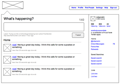
Wireframes do not just appear out of thin air, so they should not be presented as if they were. They typically round out phase one of your digital process, occurring after the site structure, but prior to the design. Whether your process contains user personas, flow diagrams or a site map, show the work it takes to get to this step. All artifacts that lead to the wireframe are important to the site - but for a different reason. Explaining the entire process can help define what the strategy is behind the user experience being presented (like a wireframe to mock up Twitter below):
GET THEM INVOLVED
Choosing how to display the wireframe is also essential in getting your message across. Using a platform such as Axure or UXPin helps to eliminate confusion with real-time functionality. This makes it easier to pull up a wireframe in a meeting and walk a client through each user experience. Building this interaction into the wireframe shows how the site flow would actually be in a real Web browser.
These platforms also let you send your client a live link directly after the meeting - which they can then navigate on their own time or distribute to other key stakeholders in the company. These live links make things easier, but they must be used wisely. Simply sending a link off to the client could put out the wrong message and not illicit the correct feedback. It is important to walk the client through the wireframe so they can be educated on each element.
FEEDBACK IS KEY
One of the main benefits of the wireframe is saving time. Even if you are operating on a tight deadline, the wireframe can eliminate any potential problems early, before the development team gets involved. Once feedback from the client is received, it is as simple as reorganizing objects instead of a complete re-design. When the wireframe is approved, the designer and the client are able to focus on visual treatments without concerning the layout. Wireframes can give a true sense of your client's feedback, without any visual distractions.

Overall, Wireframes provide context to goals and make sure everything is headed in the right direction. The client should absolutely be involved this process to initiate changes and provide feedback on the ground floor. Working together levels expectations and sets the pace for the rest of your project.
Samantha Turner is a digital project manager at Celtic Chicago, Inc., a full-service communications agency that launches products and brands with dynamic strategy and stellar creativity.


