Don't Stress Out the User: 10 Usability Mistakes to Avoid

Have you ever had to read a book with a really small font size? Pushing your eyesight to the limit, struggling through the words, before inevitably closing the infuriating text never to open it again. It's a similar feeling for the user who has to face a product or a website with poor usability.
Here is a list of the most common designer mistakes that can make you lose your clients.
Information form mistakes
1. Making the user think too much
The easiest way to overload a website visitor is to ask questions in a form that has to be filled in. Most users won't want to think about what to write and will leave the site.
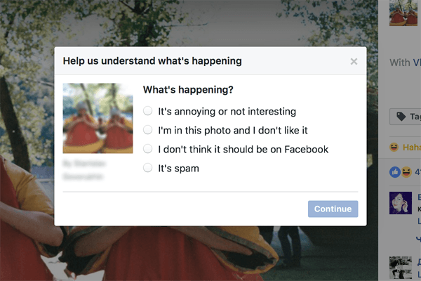
Facebook is a good example. At one stage, designers created a form to allow users to ask a friend to remove a particular photo. The function was unpopular, however, as only 20 percent of users reached the final step of sending the message. It is no wonder, as it was difficult to find the right words to politely explain to a friend why you wanted them to delete a picture they had posted.
Later, Facebook invented a better way to help users deal with this awkward situation. Lead Facebook designer Margaret Gould Stewart says that the problem was solved by providing a predefined message, which is automatically generated when a user marks a picture as an embarrassing photo. As soon as Facebook started offering a ready-made text the number of forms sent rose by three - up to 60 percent.
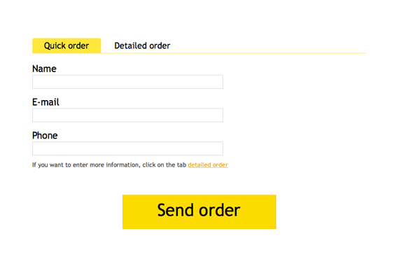
A good design rule is to think about the user where possible and to create ready-made messages for them. Our team tested it out ourselves. Some time ago a contact form on our website was too complex. After the studio had simplified it to «Hi, I want to get touch with you» the number of references rose significantly.
2. Asking for extra information
A client that has spent a long time adding products to the shopping cart will not be happy having to spend even longer giving more details about him or herself. Entering the credit card number one more time, writing the address for the third time - a client just does not have the patience for that.
The worst part about such design mistakes is when users have to fill in extra fields. If a person is trying to order some food for his dog, writing the name of the company and the position he occupies there is the last thing he wants to do. If it is impossible to send a form without this information, he quickly leaves the website.
Most online stores know how to tackle this issue. My favorite solution was offered by pethouse.ua where there is no need to give any extra details except for your phone number. The details of your previous orders are stored in the database and a manager will call you back to confirm the address.
3. Lacking a flexible data input
It is a usual mistake on a government website and on ticket and hotel booking services when a client is trying to enter a date or a phone number and the website would accept only one way of writing these details.
A client has to try multiple options to guess the right one.
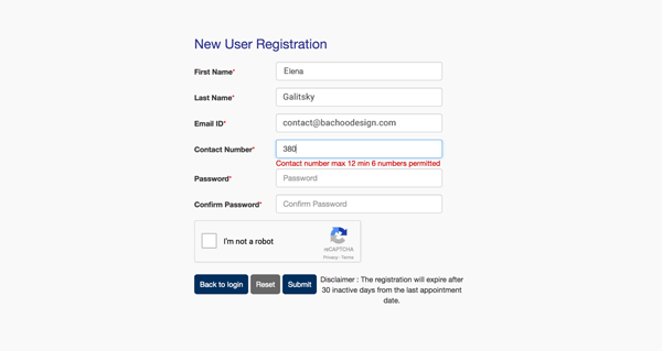
Another example of such a design flaw is complicated, unclear or incompletely described password requirements.
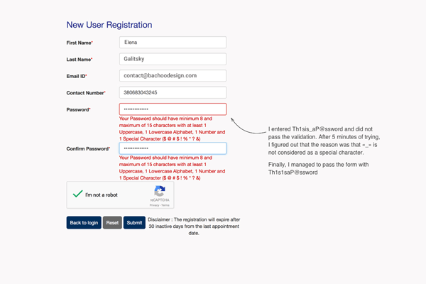
A good form helps you to input the necessary data, or it accepts any or the provided ways of writing phone numbers and dates - using spaces, slashes, dashes or dots.
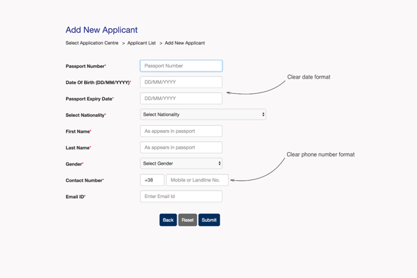
Though people nowadays spend a lot of time online, they don't want to spend it filling out a form. All they want is an opportunity to solve a problem quickly and get back to what they were doing.
Interface errors
4. Lack of user feedback
If there is a button in the interface that looks active it has to be usable. Show the user action and provide feedback for it whether it is successful or not.
The "Bucket" (a collection of shots) of a famous website for designers Dribbble is annoying. When a designer is trying to add a shot to Bucket nothing happens, as he or she didn't choose a definite cart. At the same time, the Done button in the pop-up is glowing pink as active which makes a designer think that need to click on it. The interface does not provide any feedback to show that the shot was not added only accidentally. Check it out at work here.
5. Abusing the user's fine motor skills
Fitts's law says that the smaller the size of the button, icon or any other interface element, and the further it is from the cursor, the more time and effort you need to click on it.
A user wants to be able to close a pop-up not by struggling to click on a small cross in the corner, but by clicking on a whole area outside the pop-up.
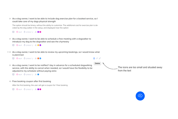
Another example of bad design is tiny icons for working with the main text at craft.io.
They're too small and situated away from the text, which is very irritating for the user.
6. Too many clicks
A well-thought-out design saves the user clicks. If an action can be done with a smaller number of user clicks - reduce them, especially frequently repeated actions in the interface.
7. Interfaces you have to decrypt
An interface has to be clear to the user, which is, first and foremost, all about the icons. A good design avoids over-decorated icons and buttons that perform different functions at a different time, and also common icons used for unusual actions.
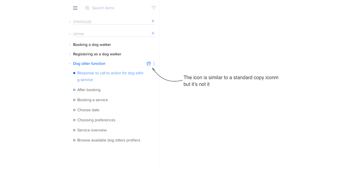
A frequent mistake is to use unclear and unsigned icons. My favorite example is gmail. Even me, as a fairly experienced user of digital products, can't understand what all the icons mean.
And this button is extremely similar to a standard copy icon, but it in fact switches the view from a list to a card.
8. Making the user guess the mistake
If something goes wrong, say, for example, a person has insufficient funds on a credit card, or is missing some data, the interface should let a user know about it. Turning the user into Sherlock to find out the reasons for the mistake isn't the best idea for a good design.
Ethics mistakes
9. A user-autopilot trick
A founder of our design company has recently decided to unsubscribe from multiple subscriptions and realized that it is not an easy task. Services have many tricks and manipulations with design to prevent the user from unsubscribing. Sometimes they include a huge red button which users rush to click, which, instead of unsubscribing, actually changes the subscription conditions. Or they request a 50-question form to be filled out.
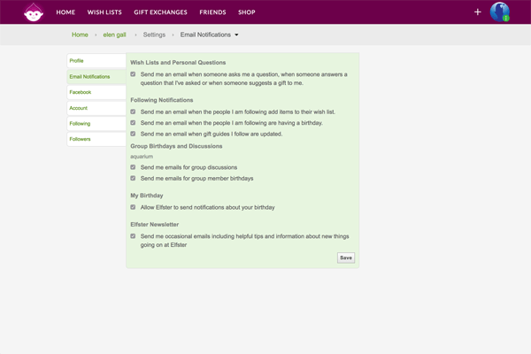
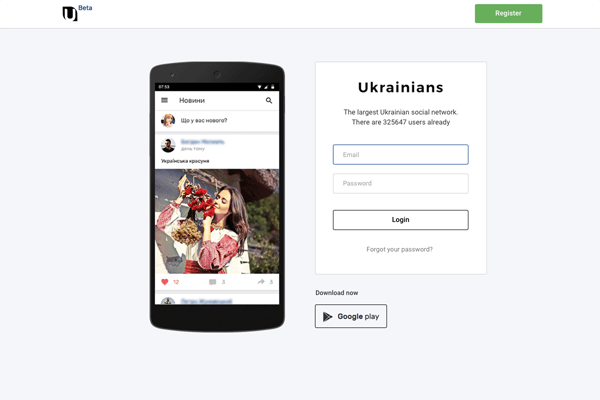
Sometimes to unsubscribe a user has to remember the account password that he forgot long ago.
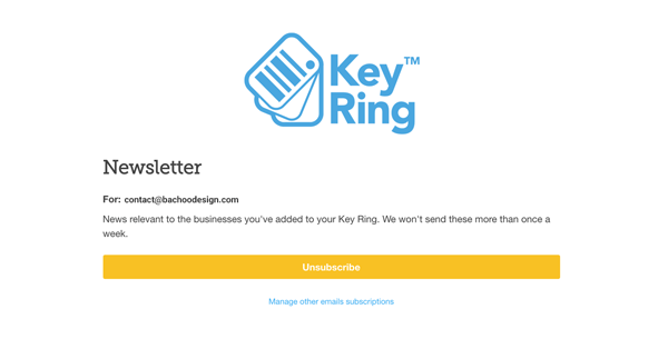
There are some positive examples of the unsubscribe function, but they are really rare.
Another field to critique is the annual or monthly subscription. For most services it is easy to subscribe but difficult to unsubscribe, because of designer manipulations, some of which can be found on Shutterstock.
A big bright button to take out an annual subscription encourages the user to click on it and many do so. At the same time the service hides a message that you can't cancel such a subscription and it will automatically roll over without a proper warning. Every user would like to find out about these conditions before subscribing.
10. Too many pop-ups
Never-ending ads are an obvious nuisance - too many hints and other distracting elements that supposedly help a user and are not so transparent. Well, they should be clear, as pushing your user too much is a way to overload anyone.
The main task for a designer is to focus on user care and not immediate service interests. The right approach will create a good image for the service that will almost definitely generate multiple sales and build client trust. Honesty should be the main priority, not the desire to sell by any means.
About the Author
Elena Galitsky is a co-founder and the head of design at B√°choo, which is a young award-winning team specialized in Web and application design. They have accomplished over 60 projects and won several awards for best mobile app design, best visual design, best productivity app. B√°choo is after new technologies, among their recent projects are e-health apps, blockchain-based certification, online education platforms.


