Website Inspiration By Color

Web professionals know that certain colors evoke certain reactions from people visiting their websites. For example, blue is said to instill trust while black is associated with power. Choosing the right colors for a website is a difficult decisions as brand guidelines come into play as do cultural norms, opinions and even egos.
For sheer inspiration, let's look at some websites and their use of color.
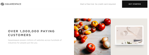
Black & White
Squarespace lets its customer websites shine by only using black and white for its own design choices.

Orange
If you've ever been to a conference where Avalara is at, you can spot its orange logo in a sea of vendor booths. Avalara commits to orange with great success as it's recognizably Avalara.

Purple
While the pink on Spotify's homepage blends into purple, the company uses purple more and more as the user scrolls down the page. Offering music "for everyone," Spotify can get away with a non-traditional "business" color that is bright and attention-grabbing.

Green
While subtle, InfusionSoft's use of green is inspirational because as a visitor scrolls down the page the experience is anchored by a static call-to-action that reaffirms brand identity and that their scrolling down the page won't get them too far away from the action they ultimately will want to take.

Blue
There's almost no vendor a company wants to trust more than its hosting provider. 1&1 rightfully uses blue in its branding to help confirm its level of trustworthiness, and its website is no exception.

Red
Interactive Red uses its namesake color on its website without hitting visitors over the face with it. For instance on the homepage, people scroll down and the static (red) navigation bar follows them to get them back where they need to go and reinforce branding.

Yellow
This color can be overwhelming and make font difficult to read, so CAT uses it sparingly without straying too far from its branding.

Gray
Zenman's use of gray helps the website look cool and modern, just like many of its clients are hoping the company will do for their own websites.

There are many colors to choose from when designing a website, of course, but the right choices will be on-brand, enhance user experience (rather than distract from it), and used consistently and methodically throughout all Web pages.

Subscribe to Our Newsletter!
Latest in Web Design


