Web Design & The Rule of Thirds

 Grid-based design provides designers a formal way to assess the communicative expression power of the UI thanks to the rule of thirds - a topic Website Magazine addresses in our July 2011 issue. But what is the rule of thirds and how can you use it to improve interaction on your own site?
Originally used in the visual arts field, the rule of thirds is adapted well to any design and any design format or device thanks to its simplicity. The rule of thirds identifies four focal points within compositions to where the human eye is naturally attracted. By aligning elements on dividing lines or placing elements at these focal points, a maximum amount of interest and energy can be directed to the most important elements of the page. While eye tracking and heat maps provide meaningful, empirical data on how the site was used in the past by users, applying the rule of thirds can be useful as the design takes shape to ensure you are meeting the underlying objectives initially set forth and within the boundaries of standard design practices.
To really understand how the rule of thirds can be used it is necessary to compare and review various websites to see what are they doing right and what are they doing wrong. Rolling Stone, Spin Magazine and our very own Chicago Music Blog, Sound Citizen. We're looking beyond the homepage as well with an analysis of content pages on these websites and how the rule of thirds applies to their layout/structure.
Rules of Thirds on Homepages
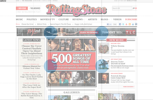
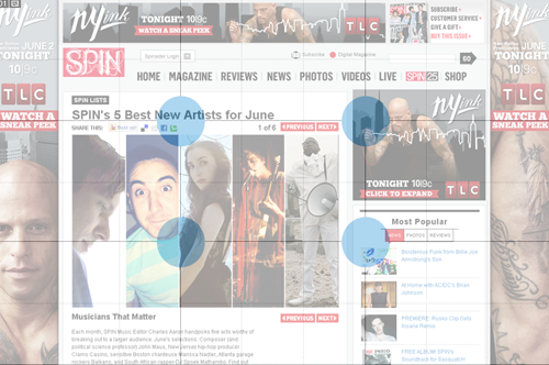
When applying the rule of thirds to home or index pages, having site-wide objectives prioritized is of vital importance. In the case of the three sites reviewed, exposing content, profiling advertising, and encouraging "social" are the apparent core objectives of these sites when the rule of thirds is applied.
So how do the sites stack up? All things considered, pretty well. Some things that stand out at the outset are the predominance of advertising on Rolling Stone and Spin and how well they have done to balance advertising with featured editorial content. Sound Citizen's focal points mainly target content and community features. Sound Citizen is also the only one of the three sites to employ a two column layout as opposed to three column layouts used by the others. The use of a two-column layout has different restrictions than that of a three-column. Rolling Stone and Spin are able to feature more content over the fold than Sound Citizen without losing site of the primary ad's importance. Also, notice how much more linear (and in-line with grid based design) Rolling Stone and Spin are compared to Sound Citizen.
Rules of Third on Content Pages
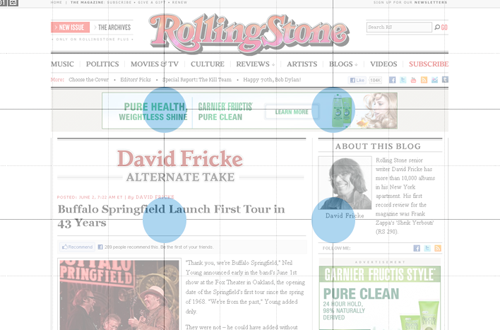
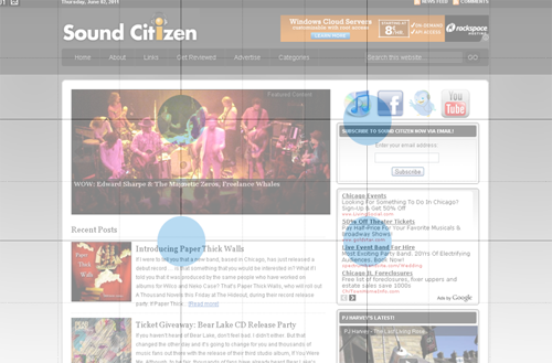
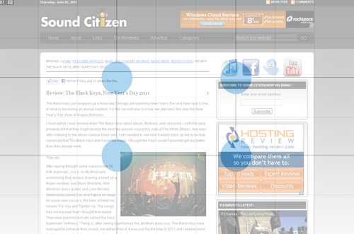
When it comes to content pages, the rule of thirds once again proves useful. Keep in mind that the intersections of our "thirds" (represented by the blue dots) are not actually intended to be the the exclusive focus of our readers but also what is immediately around them.
So how do these pages stack up? Not very well, in our estimation. But there are some instances of abiding by the rule of thirds. Rolling Stone once again puts the ad in plain sight and Spin further exposes its most popular content to the lower right of the fourth focal point. Both, however, put the burden on the viewer to locate and consume the page's content. Unlike Rolling Stone and Spin, Sound Citizen maintains its structure well. The design supports the primary objectives of the site (content and community) and it is carried over from previous pages visited by the user, such as the homepage. However, based on our evaluation, there is a great deal of room for improvement on all three sites.
Rule of Thirds @ RollingStone.com
Homepage
Content Page
Rule of Thirds @ Spin.com
Home Page

Content Page
Rule of Thirds @ SoundCitizen.com
Home Page
Content Page

Subscribe to Our Newsletter!
Latest in Web Design


