Unlocking the Power of Single-Theme Landing Experiences

In most cases, a discussion of landing pages and microsites comes down to their differences: single page versus multi-page, one call-to-action versus multiple calls-to-action, and simplicity versus complexity. However, when you take a step back, they have something critically important in common from a marketing standpoint: They draw on the power of single-theme landing experiences, existing outside the structure of the run-of-the-mill corporate website.
A few weeks ago, Website Magazine's "Essential Rules of Single-Page Design" did an effective job of describing some of the key principles involved in a one-page format. All three of them apply equally to multipage microsites: 1) Get to the point, 2) Keep navigation top of mind, and 3) Be a design show off.
As the article points out, single-page site design is among 2013's hottest trends. I agree, but I'd like to expand on that thought. I suggest that an even bigger trend is the growth in single-theme landing experiences, whether in the form of a single page or a microsite. Organizations have come to value the "Swiss Army knife" capabilities of these highly targeted vehicles--and the fact that they can capture audience attention, foster interaction and spur action in ways that corporate websites aren't particularly suited for. For everything from contests, initiatives, and events to new product launches and promotions, a single-theme landing experience is becoming recognized as a superior solution to boost SEO and cut through the clutter.
As defined by the CMI Content Marketing Playbook, a microsite is a website that "concentrates on a narrow topic or issue, featuring rich content developed by the sponsoring brand itself. Correctly executed, the microsite creates a gathering place that positions the brand as a contributing member of the community."
That's also true of a well-designed landing page, of course: You are delivering a theme or brand message that's focused on the customer experience, and providing cohesiveness to what might otherwise be a fragmented, multi-channel marketing campaign.
And here's why that matters: Fitting your unique brand into social media sites, for example, is like putting a square peg in a round hole; their regimented formats offer little flexibility for meaningful customization. Social media sites tend to commoditize brand messages and generate a "me-too" look and feel--with very little opportunity to differentiate your business.
By the same token, adding another section to an existing corporate website can't deliver the same sort of customization available to you as a microsite or landing page provides. A single-theme landing experience can make a major impact to your bottom line--increasing sales and generating leads, in an easy-to-use and cost-effective way, and outside of the often-rigid requirements of corporate brand standards, internal planning and development cycle. If you incorporate a microsite with its own domain, there are SEO advantages as well--it's much easier to climb the search engine rankings if you are able to target specific keywords that aren't a priority for your corporate site.
In design, the key is knowing and choosing the right tool for the job. Some of the factors to consider between microsites and landing pages include:
Budget: Obviously, a landing page doesn't require as extensive development as a multipage site, but this shouldn't be your only reason for choosing that route--nor does a microsite need to be expensive and complicated.
Complexity: If your message is short and sweet, the landing page is probably your go-to solution. With more detailed or voluminous information, a microsite will be a superior way to communicate and avoid clutter.
Timeframe: A single page is easier to get up and running quickly; if you have the time and resources to create a microsite, make sure you plan the development cycle accordingly.
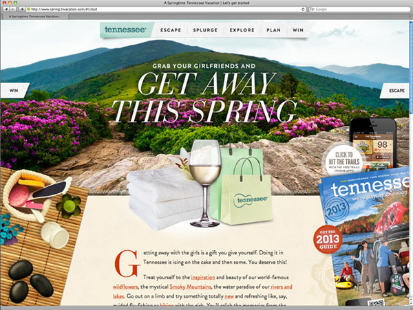
Ultimately, as with all marketing and advertising projects, it comes down to understanding your needs and goals. For example, I can't imagine that Tennessee's "Get Away this Spring" interactive vacation planning microsite would be nearly as effective in a single-page format.

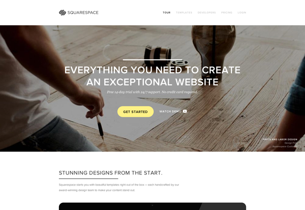
Similarly, this example from Squarespace would lose its dramatic impact if you padded it out to multiple-page sites.

Yet, I believe what they have in common--a finely tuned, single-theme landing experience--is what unlocks the power in delivering clients' messages and driving user action.
Eileen Burick is president/CEO of Burick Communication Design. She blogs weekly on graphic design, branding, marketing and advertising topics at her "Briefcase blog."
Subscribe to Our Newsletter!
Latest in Web Design


