UI Trends with Greater Staying Power than Flat Design

Over the past few years, flat design has been a hot topic and a huge hit in the design and development community.
If you have no idea what this term means, then you will be surprised that you have already experienced it in the digital world. It is a popular trend in user interface (UI) design to the extent that you will not hear about design trends without hearing a mention of this concept.Before we look at UI trends with greater staying power than flat design, it is important that we learn a few important things about this trend.
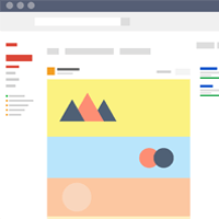
As the name suggests, the design is flat. This means that the design gets rid of the 3-D components such as bevels, gradients, texture and drop shadows. Basically, this design eliminates anything that brings about visual depth leading to graphics having illusions of popping out. This trend did not become popular for no reason. The flat design has works through the elimination of any unnecessary fluff and visual dimension forms that complicate communication between the website and the user. Now that the design trend has been around for a while, one is left to wonder what the next trend in UI design after flat design will be. Below is a better look at the possible trends.
Is Flat Design Here to Stay?
Probably not. Like everything else in the universe, change is inevitable. The main reason flat design became popular was that it followed skeuomorphic design, which takes design ideas from the physical world such as gradients, shadows, textures and many others. The design looked fresh and ensured that the website was only about important elements. So, what will happen when all websites are using the flat design? How will you stand out? This is the point where dimensions will come back to life.
There is a lot of debate about the future of UI flat design trend, so it is helpful to know about other designs that could take its place.
Single and Simple Numbers
There will be specialized interfaces that feature single datum and rely on the user's memory to fill the gaps. For instance, when you are looking at your favorite weather application and see a giant '65' on a blue background you can remember that this means 65 degrees Fahrenheit.
Parallax Scrolling
Parallax scrolling was once used to navigate the top of the page to the bottom. Today, this trend is being used by UI designers to display and sift through content in a creative way. The trend involves technology that gives a 3-D sense where the background is moving faster than the foreground. It works well in presenting content ranging from text to images and videos. In most cases, single-page websites overuse this trend and this compromises the site's usability.
Advanced Animation
It is clear that most websites are abandoning static images in favor of animation. Animation engages the use and creates new usability levels on the page. This is made possible by the changes that have happened in jQuery, HTML5 and CSS3. UI designers are turning to these platforms and animation to present the user with a better experience. The animation ranges from small distractions when the page is loading to animation when you hover over certain content.
Video Trends
Videos are becoming the content of choice and this is based on reliable statistics. There are over 50 billion video views every month and this simply means that videos cannot be ignored in UI Web design. Users are highly attracted to video as compared to static images and plain text. This is why you will find videos in many modern websites. They are becoming an important part of Internet marketing especially because they can tell a story better and describe a service or a product in an understandable manner.
More Originality in Images
Stock images have been used for a long period of time and it is time they retire. Lately websites are avoiding the flat boring stock images that we are all used to. They are going for the original images that are visually appealing and more natural looking (even if it's photographing employees like the screenshot below).

When people are all using stock images, it might be difficult to stand out with the new approach a website can easily appear to be authentic and this attracts an audience. It is highly likely that we will slowly see a different way of presenting content by various websites across industries.
Bold Color Trends
 In recent times, we have seen a rise in the use of rich-colored websites that employ vibrant hues and amazing gradients. Screen technologies have advanced and this could be the reason behind abandoning the flat colors that we were used to. Mobile phone screens can display millions of colors now and this makes it easy for designers to work on a range of colors when making the design.
The best example is the Instagram logo. It initially had a flat design that was considered neutral. Today, this logo is more colorful and vibrant.
Responsive Design Use
Though responsive design has been around for a while, it will now be used by more companies. This is because there is an increase in the number of people accessing the Internet with mobile phones and other small screen gadgets. Responsive design makes sure that you can still view the website in small screens and not have to deal with distorted content.
About the Author
Derek Robinson is the founder and CEO of Top Notch Dezigns, a Web design and digital marketing company located in New York. In his free time loves to share his knowledge about the Web design industry.

Subscribe to Our Newsletter!
Latest in Web Design


