There's a Major Problem with Flat UI Design

Design trends emerge routinely and they often immediately capture the attention of everyone involved in the digital experience, but it is difficult - even for the most data-driven or industry experienced - to understand the result and broader impact of implementing specific elements or leveraging entirely new styles. Such is the case, it appears, with the trend of flat design.
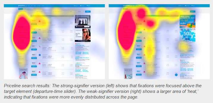
Some research made available recently from nngroup revealed that flat interfaces often use weak signifiers. The eyetracking experiment compared different kinds of clickability clues, and found that user interfaces with weak signifiers require more user effort than strong ones. Essentially, flat UI elements attract less attention and cause greater uncertainty - and that is obviously not the ideal scenario.
nngroup investigated how strong clickability signifiers (traditional UI design clues such as underlined, blue text or a glossy 3-D button) and weak or absent signifiers (for example, linked text styled as static text or a ghost button) impact the ways users process and understand Web pages. The results, as you might imagine, are anything but encouraging. The average amount of time was significantly higher on the weak-signifiers versions than the strong signifier versions. On average, participants spent 22 percent more time (which means slower task performance) looking at the pages with weak signifiers.
What's more, the average number of fixations was significantly higher on the weak-signifiers versions than the strong-signifiers versions - on average, people had 25 percent more fixations on the pages with weak signifiers. nngroup suggested that since their experiment used targeted findability tasks, more time and effort spent looking around the page are not good indicators.

Subscribe to Our Newsletter!
Latest in Web Design


