The Web's Most Gorgeously Designed Websites

Stagnant websites simply can't keep up in the continually evolving online world. Those that update often and experiment bravely with an eye to gorgeous, yet functional design are sure to grab visitors' attention. These top sites feature striking design elements that help them stand out at the head of the pack.
BBC - Design Across Platforms
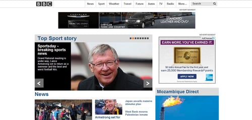
Image via BBC.com
BBC's most recent page design features a look that's strikingly similar to what you expect in a mobile app. Don't be surprised if you're tempted to swipe your finger across your computer screen, even though you don't have a touch-screen monitor. The Web page features eye-catching images that quickly grab your attention and pull you into the stories. The site uses this same design across all platforms including tablets and smart phones.
Elysium Burns - Bold Typography
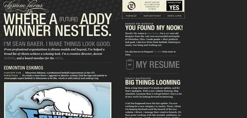
Image via elysiumburns.com
A diverse choice of eye-catching sans serif fonts gives Elysium Burns a memorable look. Article titles and site headings sit against subtle CSS image backgrounds. The simple white on charcoal color scheme really allows the shape and flow of the typography to take center stage on this page.
Disney - Highly Responsive Video Design
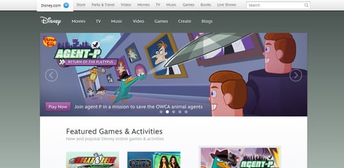
Image via disney.com
Responsive design is essential for any site, but creating a page that's user-friendly on any platform is more difficult for some features than others. Disney's site prominently features high-quality videos, so the challenge of their redesign was maintaining video size and quality across platforms. The result is a simple streamlined design that showcases video beautifully on any device.
Web Design Ledger - Where Serif and Sans Serif Meet
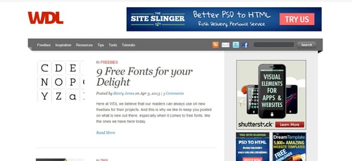
Image via webdesignledger.com
The intriguing look of Web Design Ledger combines both serif and sans serif fonts. The striking difference in font styles throughout the site effectively draws your eye to certain features, such as reader comments. Though this is an unconventional choice of typography styles, it works well in this simple text-heavy layout.
Combadi - High-Impact Images
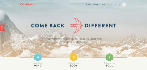
Image via combadi.com
A growing number of sites now use large, high-impact images on their home pages to draw customers in. Though typography has its place, designs like these allow the eyes to rest a bit and take in something refreshingly different. Combadi features both a large image at the top of the page and a series of smaller images for added eye candy further down.
The Verge - Story Collage Layout
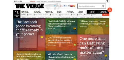
Image via theverge.com
The Verge features a story collage that highlights top features in a clean and visually pleasing way. Each headline is given ample space in its own candy colored box so the titles don't crowd each other out. Though the site has lots of content, visitors don't feel overwhelmed thanks to this simple design choice.
USA Today - Customizable Experiences for Every User
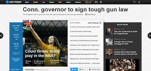
Image via usatoday.com
USA Today's design is simple and clean, making it easy to browse massive amounts of information in a short amount of time. This rigid layout is perfect for a site where readers want to navigate to items of interest as quickly as possible. One of the highlights of USA Today's site design is the viewing option, which allows readers to choose from a list or grid format. This allows for fast and easy customization to suit the tastes of each visitor.
A List Apart - Extreme Readability
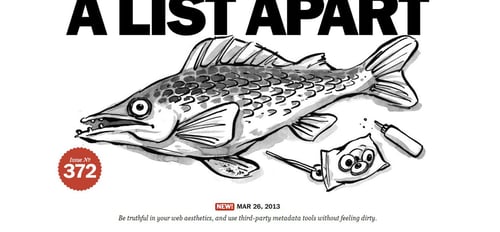
Image via alistapart.com
With so many flashy and colorful design options available, it's easy to get swept away in the visual aspects of site design and forget about the finer points of readability. This is where A List Apart truly excels. The headlines, subheadings, quotes, and article body all feature clean fonts chosen with reader comfort in mind. The content itself is well-organized and flawlessly edited as well so your eye travels easily from one short digestible paragraph to the next.
Mea Cuppa Sweets & Coffee - Striking yet Simple Color Choice
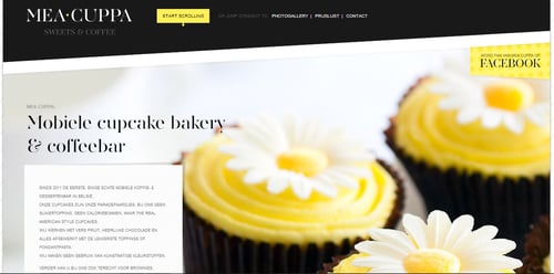
Image via meacuppa.be
The stunning color choice of Mea Cuppa immediately grabs the visitor's attention. With a clean palette of black, white, and yellow, the imagery doesn't take away from the content, but rather makes the viewer want to hang around and feast on the delicious visuals for a while longer. This design proves that less is more and simplicity isn't inherently boring.
Postable - Fast Functionality
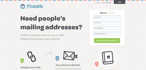
Image via Postable.com
Postable's purpose is simple. Users sign up for the free service which sends links out to their friends and family asking for updated contact information. Fittingly, the site design for this service is simple and easy to use as well. Three points clearly lay out everything the service does and a short sign up form lets you start in seconds. There's no clutter, no confusion, and no excess in this functional design.
Oliver Russell - Sleek Graphics and Simple Color Choice
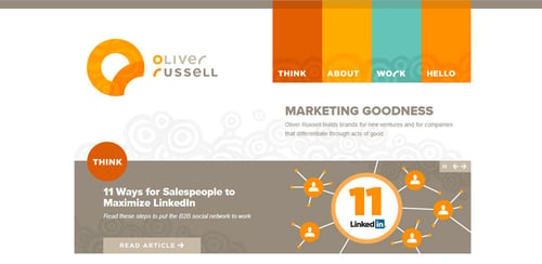
Image via OliverRussell.com
Oliver Russell's page highlights his marketing services in a sleek design that speaks to his professionalism and Web expertise. The palette features bold warm oranges and yellows with a bright touch of cyan. Finding what you want is easy so visitors never get lost on this well-designed page.
University of Notre Dame - Strong Graphics and Cutting-Edge Design
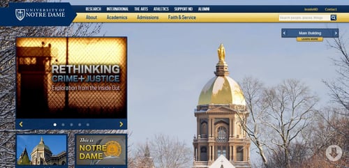
Image via nd.edu
The University of Notre Dame handily broke out of the college website mold with their new design. Bold images highlight the campus in a visually enticing way that can't help but draw visitors in. A simple static toolbar at the top makes navigation easy from anywhere on the page. The responsive design looks just as striking on mobile phones as it does on a standard desktop.
Starbucks - Meeting Mobile Needs
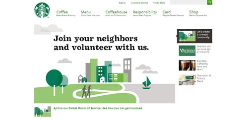
Image via Starbucks.com
Not surprisingly, Starbucks found that a growing number of visitors were accessing the site on mobile devices. In answer to the clear need for a better mobile site, they moved to a responsive design that's equally functional across platforms. The images are simple and deliciously enticing while the functionality is everything users need, allowing visitors to find a store or check gift card balances right on their phones.
Web design is a continuously evolving field and innovation is essential for any business to stay at the top. Browsing these beautiful sites will give you plenty of inspiration for enhancing your own page design.
Author Bio:
DJ Miller is a graduate student at the University of Tampa. He is an avid gadget geek who spends most his time writing on anything tech related. His specialty is Web design and optimizing sites for mobile devices and ultrabooks. You can follow him on twitter @MillerHeWrote.

Subscribe to Our Newsletter!
Latest in Web Design


