The Art of Engagement: Web Design for Affiliates

 Website design is an important aspect of affiliate marketing, where the goal is to generate as much interest as possible in advertisers' products. The main focus of each page should be to drive users to the merchant's site, which is a distinctly different beast than trying to establish a long-term customer.
Like most tried-and-tested methods, there are a few things that affiliates would do well to remember during the design process:
Know Your Niche
A major part of affiliate marketing is operating within a niche industry. The content of an affiliate site should always be related to the types of products that publishers are promoting, which is how affiliates are able to attract qualified visitors.
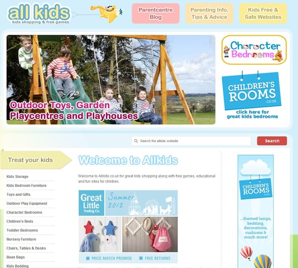
But the site should also look the part. Visitors won't take your site very seriously if the design is antithetical to the content and products being featured. Promoting carpet cleaner on a page with a skull-and-crossbones theme, for instance, probably won't get the job done. So, before planning the design of your next affiliate website, be sure to check out popular sites within your specific niche to get a better understanding of what visitors will want and expect to see.
Get to the Point
Because affiliate sites are more about driving traffic to a merchant's site than anything else, the quicker you get that message across, the better. First and foremost, put as few unrelated ads as possible on the page so that users don't get distracted by elements that aren't going to help you accomplish your goals. No extra ads would, of course, be ideal. Likewise, calls-to-action, text, links, images and other content should all focus solely on driving consumers to the merchant's product.
Make sure that the site's main objectives, whether they be gathering email opt-ins or trying to get visitors to click on something, are clearly stated and obvious to users. Images and bold calls-to-action will help them stand out more than text links that can be easily overlooked. And content such as articles and video should all be kept short and to the point.
Don't Make 'Em Work Too Hard
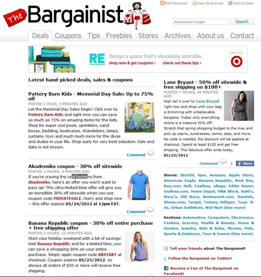
Another proven design tactic for affiliates is to utilize a two-column approach, with one column dedicated to content or whatever else you choose, and the other column used to advertise products for merchants. Another key strategy is to place the most important design elements in the most prominent areas at the top of the page, and try to avoid making users scroll down to have to find these items. Strong affiliate website design should focus on putting all of the most actionable information above the fold and always making it clear and distinct.

Maintain Consistency
As mentioned above, affiliate sites should maintain a consistent look and feel that is associated with the particular products and the niche that the affiliate is promoting. Your site should help sell the advertiser's product by preparing visitors for the experiences they will have on the merchant's site. In addition to using traditional design techniques such as color and typography to match the look and feel they are after, affiliates can also use images, logos and copy provided directly from the merchant.

TEST!
If there's one step in the Web design process that no one should ever ignore, it's testing. This helps discover which aspects of your site users are most likely to engage with and, most importantly, how effective the design is in driving users to the merchant's site (or the particular conversion goal). By testing, affiliates will be able to continue to optimize the layout of their site, alter the presentation of their content and ideally uncover the best design for accomplishing their goals (and making some money).

Subscribe to Our Newsletter!
Latest in Web Design


