Promising Trends in Web Design

So what can we expect from Web design this year? Here are the four things you need to know:
1. Hand-drawn typography
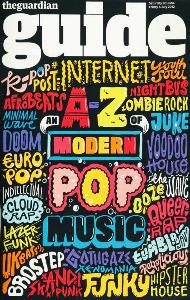
 The design principle of minimalism is still reaching websites across all industries after it first came into popularity through Apple in the mid-2000s. It provides a clean aesthetic and a clarity of intent that makes it easy for visitors to quickly grasp the meaning and purpose of a particular website. However, there is a growing reaction to minimalism as it is easy for websites to fall into a category of sameness: how do websites differentiate themselves from the competition when minimalism dictates subdued design choices and standard navigation?
To alleviate this sense of similarity, many businesses are turning to hand-drawn typography when it comes to their logos or names in order to create an authentic brand with a human touch. Hand-drawn typography provides a unique touch to minimalist websites, and you can expect to see much more of it in 2017. (Image source)
2. Streamlined scrolling
The future of Web design will forever be dependent on scrolling at least to some degree. With the rise of mobile search, people are less inclined to click through a bunch of windows, and scrolling is a simple, effective gesture for navigating a website. But in the past few years, scrolling has become cluttered with loud websites and convoluted effects like parallax scrolling. In 2017, scrolling will become streamlined and fast.
Lazy loading is a process in which more of a website is loaded only after a user expresses interest in it (such as scrolling down a page), and this, along with reducing interstitial anxiety (the delay between an action and seeing the effects on the screen), are crucial components of how scrolling will become more streamlined in 2017.
3. Card layouts
Speaking of the need for fast and high-fidelity scrolling, users want access to information with minimal effort. From their beginnings in Google's Material Design, card layouts have quickly become one of the dominant information structures for websites, and this trend will continue into 2017.
Cards are isolated tiles that contain information related to a specific subject-perfectly suited for mobile screens, but also an effective way to sort information for larger screens as well. Cards can hold all manner of content, from text to pictures and video, links and more. Cards are well suited to websites like Pinterest and any e-commerce platform offering multiple products, but in 2017, Web designers will increasingly use card interfaces across all types of content.
4. Cinemagraph backgrounds.
Cinemagraphs combine the best of photography and video into a subtle kind of gif: the image is entirely still, save for one element of that photo, for example, a model's hair waving in the wind. Cinemagraphs were actually invented by Kevin Burg and Jamie Beck in 2011, but they have become popular in the past year because of their suggestive aesthetic. A cinemagraph can add a lot of meaning to a website, depending on what part of the image moves, yet it is not so overwhelming as a full video background is. In 2017, designers will use cinemagraphs as the new hero image to give their website an additional bit of flair.

(Image Source)
2017 looks to be a promising year in Web design and will surely bring many changes as nuances within the field continue to come to the fore, in the shape of stronger color palettes, more microinteractions, and new UX interfaces like chatbots and voice-controlled technology. Look for the shifts in design listed above, and if you have any predictions about the field for 2017, leave a comment with your thoughts below!
About the Author
Ellie Martin is co-founder of Startup Change group. Her works have been featured on Yahoo! , Wisebread, AOL, among others. She currently splits her time between her home office in New York and Israel. You may connect with her on Twitter.
Subscribe to Our Newsletter!
Latest in Web Design


