Product Images - The Good, the Bad, the Ugly

 Enticing product pages are essential to the success of any ecommerce enterprise. In fact, a recent study of 1,600 online shoppers revealed that clear and thorough product images positively impacted customer loyalty more than any other website functionality.
Second on the list was ample site search capability, followed by product-viewing functions such as the ability to zoom in on images, view them at 360-degree angles and to see the products in all available sizes and colors. The clear message is that product images have a significant effect on consumer behavior.
There are some simple rules that merchants can follow to help provide customers with engaging product images, but too often they are overlooked. Below are some examples of each, with executions ranging from the good to the bad to the downright ugly.
With winter approaching here in the Midwest, I scoured the sites of some well-known retailers to get myself prepared. Here is what I found:
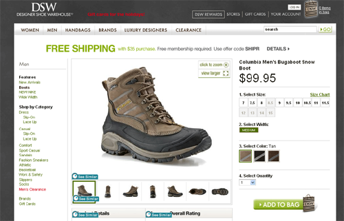
The Good: DSW
The DSW product page gives me everything I could need to buy a pair of boots online. The first product image I see is sharp and focused, so much so that I can clearly read the brand name on the actual boot. The photo appears against a white background, so that even a brown boot looks fairly striking by comparison. There are seven different displays to give me a 360-degree view of the product, and I can also zoom in as well as click to make the image appear larger on my screen. I can view any of the different views simply by hovering my mouse over the desired box underneath the main image. In addition, there is a size chart so that I can see the available sizes, and I can also view the product in its full assortment of colors. Below the screen shot taken here are several more images of similar products that might catch my interest. Well done, DSW.
Click to enlarge image
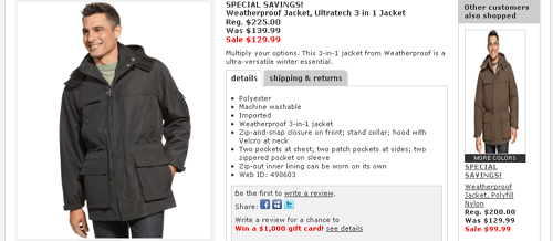
The Bad: Macy's
The next thing on my list was a winter coat, so I headed over to Macy's. It wasn't bad enough that the larger product image is slightly out of focus, but the one to the right is so badly out of focus that it actually bothers my eyes. Below the view of this screen shot are two more badly out-of-focus images that I felt obligated to omit from view. I have no other angles from which to view the coat, nor can I see it in any additional sizes or colors. It's actually not a bad looking parka from the little I can make out, but I can't get myself to make a purchase without some stronger evidence. You just lost a sale, Macy's.
Click image to enlarge
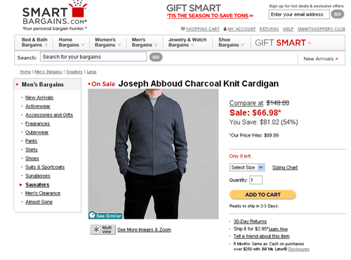
The Ugly: SmartBargains.com
I figured I could use a sweater also, so I went looking for a deal at SmartBargains.com. I found a great price on this Joseph Abboud cardigan, but the gray background and the charcoal color of the sweater make it stand out a little less than a solid white background would have. Of course, that's an insignificant detail compared to the fact that I'm viewing a headless model. I would much prefer to see the product photographed on its own without a model than shown on a model whose head is cropped at the chin. Something about that doesn't exactly sit right and I'm tempted to move on. Sealing the non-deal is the fact that when I click on the "multi-view", an army of pop-up windows invade my screen, forcing me to retreat altogether. Sorry, SmartBargains, you lose.
Click to enlarge image
Final Thoughts on Enticing Product Images
The secret to good product photography and presentation is to give it the attention it demands, and not to cut corners. You don't have to be a professional photographer nor do you have to spend a fortune on hiring one to put together a solid product page, but you do have to pay attention to details such as lighting and context. When it is all said and done, your customers will appreciate the extra time and effort.

Subscribe to Our Newsletter!
Latest in Web Design


