Not So Fast With That Website Redesign

: How an A/B Test Revealed the 'Creature of Habit' Layout :
Every year Web page design trends sweep across homepages, landing pages and plenty of pages in between. Businesses in every industry race to re-design their layouts in order to keep up with the most modern and, somewhat allegedly, higher-converting design of the moment. And, we are no exception.
We ran a B2B lead generation campaign for one of our telecom clients. On this page a customer fills out a form and a sales rep calls them back. We've been running this campaign for numerous years with great results.
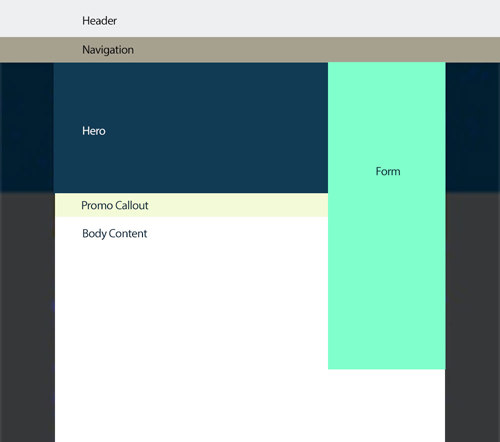
While we were constantly optimizing the landing page/microsite user experience, one thing we never touched was the form itself. It's a long 12-field form with most of the fields required in order to complete the submission process. We, along with our client's advertising team, felt the form was too long and that a higher conversion rate could be achieved if we shortened it. Due to continued opposition from the sales team the form always remained at 12 fields.
A Form Field Redesign Mystery
At long last in Q2 of 2016, we received the go-ahead to shorten the form down to the bare minimum number of fields that the sales team felt they needed to be able to close the sale. In this case, six fields were deemed crucial.
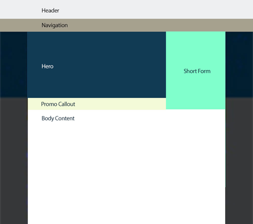
This was an exciting test for us because not only were we shortening the form, which we hoped would lead to higher conversion rates, but the shorter form also allowed us to modify the layout of the landing pages as well as allowing more content to show above the fold. We believed this new layout would also provide a better user experience.

The split test we set up pit the original page layout with a long 12-field form against a new shorter six-field form on an updated page design that put more information above the fold.
We used this opportunity to create an A/B test for a specific sub-segment of our campaigns. This would be a 50/50 split that evenly and randomly sends visitors to either the original long form page or the redesigned short form layout.
Using our proprietary measurement technology, we were able to set up separate tracking for all possible lead generation aspects of these pages, including call tracking, chats, form starts and form fills. Every metric would be tracked back to the actual ad that was clicked.
At first glance, all metrics were on target. CPCs were in line from one page to the other and number of clicks were evenly balanced. We fully expected our hypothesis - that a shorter form would result in more form fills - would also pan out. Alas, this did not happen.
After just 17 days of testing our overall conversion rate was down by 1.3 percent on the short form. Not only that, but the form fills with less information that did come through were harder for the sales team to close. Given those results, we immediately paused the test and resumed all traffic to the long form.
Redesign Split Test Round 2
With only 17 days spent in the quarter, we felt there was more than enough time left to conduct additional testing.
Based on our long versus short form results we now understood that having the additional fields was actually a plus to the end user in this vertical. The additional form fields allowed users to enter more specific information about their business which increased their comfort level in submitting a form that they felt provided a sales rep with all the information needed to respond and help them set up a new account.
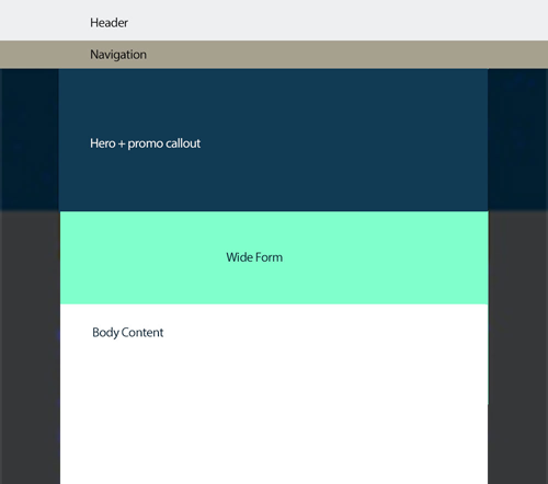
For our second A/B test, we decided to focus on the page design. Knowing from our initial split test that the long form converted better, we kept it as-is but relocated it from the top right of the page to directly beneath a widened and flattened full-width hero image where we believed it presented a more modern design aesthetic.
We hypothesized the new combination of page elements provided the best of both worlds including a fresh new layout with all the crucial entry fields proven to support conversion rates and closed sales.
Once again we used our proprietary technology to track every metric from top to bottom including phone calls, chats and form fills critical to determining the outcome of our wide form (see image) versus long form test.

Just 12 days later we pulled the plug. Average conversion rates were down 2.5 percent from the control (see image). Even though we could not understand why the wide form test was failing, we could not afford to lose out on crucial leads, so all further testing was cancelled.

Fast forward a few weeks and one of our other clients, a hotel chain, launched a complete redesign of their website. It had a more modern layout with a completely new booking form.
A few days after we launched, our marketing manager comes over to me and says something is off. Even though the average number of page views were up almost 70 percent, the number of online bookings-per-click were down. While our optimization systems were able to keep the CPLs (cost per lead) in line by compensating lost form fills with more calls, our online booking CPL had risen dramatically.
Digging into our tracking, we saw that on average users were viewing 20 pages more than before but were booking their hotel reservation online less. So the question begged, why?
'Creature of Habit' Layout Discovered
Well, let's talk about that completely new booking form. Before the redesign, the booking form was standard fare with the same visual appearance seen all around the industry. A small square at the top of the page above the fold that asks for the standard info: Where are you going? Check-in date. Check-out date. How many people?
With the new redesign, the form had been relocated below the hero (still above the fold) and now looked completely different as a single row taking up the full width of the page. Sound familiar?
Having the data from these two completely different campaigns running on entirely separate verticals, yet with the same results, allowed us to gain insight into the user's reaction.
Regardless of how "pretty" or "modern" the design, people are creatures of habit and get used to the way things are supposed to look. In this situation, they expect to see the booking form in its traditional layout at the top of the page.
Changing the booking form location and appearance created uncertainty about what to do. People start looking for the old form and go browsing through many more pages of the site trying to find it, or maybe hoping to get answers that will help them figure out how to fill in that new style booking form. What ended up happening is that many gave up the search and instead called on the phone to make their booking.
Moral of the story? Test, test and test some more. And just because your team of experts feel something is great doesn't mean that it is. Always take the average user into account and realize that just because everyone with a website is raving about a new redesign it doesn't mean your customers will be comfortable with it, or more importantly, convert.
Subscribe to Our Newsletter!
Latest in Web Design


