Long Copy Web Design Techniques

When I first started designing, developing and promoting websites in early 2000, "long-copy" pages were often the standard. While there has been a clear shift towards the "less-is-more" school of design (and copywriting), the Web is in no shortage of sites that shun the notion altogether. If you're a believer that there's something special about long-copy Web design and online marketing, then read on to discover some important site design tips and techniques.
There are hundreds of examples of long-copy designs. We will look at two today to identify techniques that you might want to employ or at least consider for your own deployments. Other long-copy websites follow pretty much the same formula. We will also follow up this post in the future with some long-copy Web design trends.
First, Slow the Visitor Down: It might seem counter-intuitive to slow down someone who has already expressed an interest in your product or service. But doing so capitalizes on the user's energy and excitement. They want something right now, and you can offer a way to deliver it to them immediately, with little effort. So how do you do that? Consider using a pop-up in the form of a lightbox that immediately summarizes the page and captures information, which will be useful to you (the marketer) regardless of whether they purchase the product on the spot or not. This technique is gaining popularity quickly, because it works. But what works best?
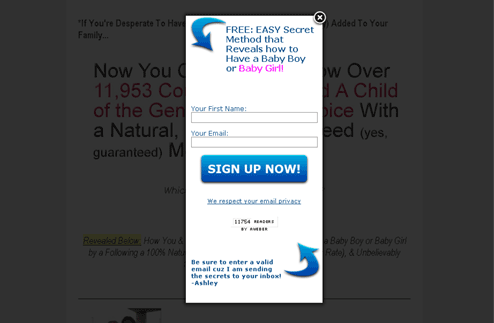
- Create a strong title that accurately reflects, in very short form, what it is that you're offering.
- Use images to draw the reader's eye to the most important sections (the title, for example).
- Ask only for the information you really need (name and e-mail).
- Tell visitors the action you want them to take (sign up now).
- Show some trust signals (statements like "we respect your privacy" or "read by over 12,000 mothers").
Acknowledge, Promise, Soothe: The initial viewing screen is the most important part of long-copy page designs. Successful long-copy websites and the copy that flows on their seemingly endless pages do two things well: acknowledge the problem the visitor is having, and promise that reading further can offer a solution and minimize/soothe any doubts they may have. All of this, on some primal level, encourages us to keep moving through the site. Consider it the stick and carrot technique, acknowledge that the visitor is hungry and dangle the carrot in front of them to make them move forward.
- Create a mild "empathy" statement that acknowledges the feelings of the visitor.
- Create a strong "promise" statement to inform the visitor of the promise being made.
- Create a connection by asking questions (the answer to which is always right).
- Create a sense of confidence by giving a peek into what exactly the visitor will find or learn.

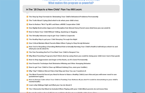
Sell the Sizzle: It's a common sales technique and works perfectly for long-copy website designs: sell the sizzle, not the steak. What site of this nature would be complete without some long-copy? Often these sites feature long sales letters that are heavy on personal stories. But what they do well is emphasize aspects of the story that are most compelling, most convincing or those that elicit a feeling. Copywriting is a matter for another article, but what you can find below is a good example of applying a design that emphasizes the "sizzle" aspects of the page.
- Common techniques include bolding phrases, underlining and highlighting, but it's not uncommon to apply some attractive, modern elements.
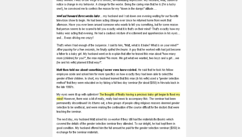
- Using images and video liberally helps people relate to you and your product (see section on trust below). The more content that humanizes your product or service, the more users will engage and, ultimately, the more products you will sell.
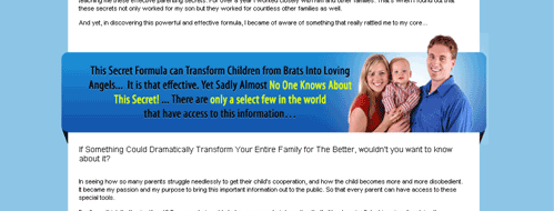
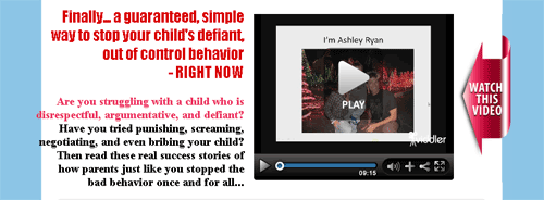
- Selling the sizzle is best exemplified in the use of bulleted lists. They come in a variety of formats and are always excellent ways to shorten sales barriers and minimize the objections of buyers.
Never, Ever Lose Sight Of the Importance of Trust: Perhaps the most important (and yet not uncommon) element on long-copy pages is the use of trust signals. From testimonials, to money-back guarantees, and all the way up to the frequently-used "as seen on" statements, the more the better.

While a long-copy page doesn't elicit much trust in the eyes of many Web experts, it can work wonders when it comes to convincing users that the site's product or service is the solution they really need.

Subscribe to Our Newsletter!
Latest in Web Design


