IN FOCUS: Inspirational Dashboard Designs

Software-as-a-service has proven to be an effective way to gain customers who may not have hundreds of dollars ready to shell out on software. The SaaS model also helps ease space requirements in local environments since SaaS products typically operate in the cloud. As SaaS becomes a more popular delivery model for software, designers are looking for ways to craft better user experiences.
Where do you go to find ultra-modern, sleek SaaS designs? Truly inspirational SaaS dashboards are few and far between, but we've managed to compile a handful of truly exceptional cloud-based software designs.
Here are 5 inspirational SaaS designs that will be sure to inspire your own designs:
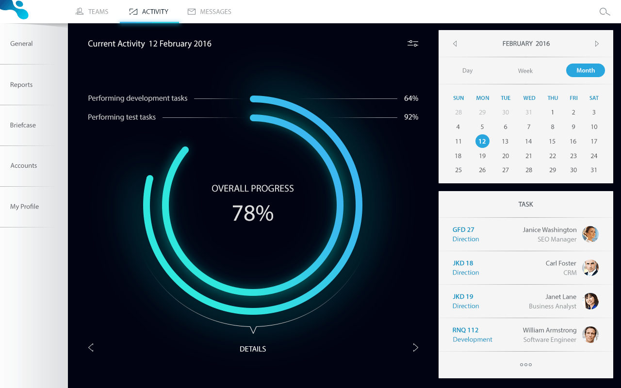
Design by Vadim Ponomaryov
It's easy for SaaS dashboards to be overloaded with features. A minimalist look can be an effective way to help your users easily digest the dashboard. Otherwise, you risk overwhelming the user. In the design above, a great deal of visual stress is eased by moving the menu to the left side, adopting a black, white, and blue color scheme, and having large widgets to the right. The focal point of the dashboard is very large, nearly half of the total space of the design. Instead of smushing elements onto one page, elements are split up via the navigation pane.
Design by Davide Pacilio
The most striking part of this design is the color choice. A deep purple is contrasted with neon pink, yellow, and cyan. The color scheme is decidedly retro, which is delightfully contrasted with its pointedly modern shapes.
Everything is organized within clean rectangular shapes, which would seem to suggest a certain flatness. Thankfully, the bright neon shades beautifully counteract the flatness of the otherwise repetitive rectangular shapes. The shapes and colors combine to create a design that's easy to process, but isn't too boring either.

Design by Sushi.io
The dashboard above is a great example of balancing a large number of widgets without overwhelming the visual space. The dark background is overlaid with mainly two colors: a light blue and orange. A mint green is used sparingly as well.
Again, we see the a sidebar with allow for navigation on the left side. The UX design is superb here. The design is further simplified through the use of icons on the left side. Most of the widgets within the dashboard can be understood visually, which is accomplished through the use of mock color-coded graphs and text.

Design by Ashley Nootenboom
The design above deals with text-heavy dashboards in an ingenious way. The dashboard is sectioned into unequal thirds. Your eye is immediately drawn to the largest section. The dark background of the middle section is contrasted with the bright aqua and white sections. This serves to draw your eye in further. A deep blue is used on the middle and right sections. It's used to help guide the eye through the text sections. The left section, the navigation pane and main menu, is given much more room than is typically allotted, which makes for a visually stunning design.

Design by Rifayet Uday
This design seems to be sliced vertically in two places. The navigation pane resides in the rightmost section, a subtle inversion of what we expect. This inversion serves to make the design more unique. Because the design is so clean and organized in such an obvious way, the user is not confused by the designs slight, small inversions.
Another menu appears at the top of the section section, but it's horizontal. This inversion may have been confusing in a busier design, but in this clean, minimalist design, this inversion helps us differentiate the menus intuitively.
Building designs that make for amazing user experiences is difficult to say the least. However, with a little bit of dedication, a great deal of studying, and dozens of hours of practice, and you should be able to arrive at amazing designs yourself. Search what popular UX designers are doing, learn the techniques they employ, and start crafting your own inspiring SaaS dashboard designs. About the Author: Josh Althauser is an entrepreneur with a background in design and M&A. He's also a developer, open source advocate, and designer. You may connect with him on Twitter.
Subscribe to Our Newsletter!
Latest in Web Design
