How to Perfectly Insert Images into Posts

An advertising manager named Fred Barnard speculated that a picture is worth a thousand words, and used it for an ad in a trade journal called Printers' Ink. It became one of the most remembered ad slogans in American history. Others have taken a more scientific approach, estimating that a picture is actually worth 84.1 words (Blackwell). Whatever the number, the combination of words and images communicates information far more favorably than words alone.
A well-written post which exploits carefully selected images can stir emotions while incorporating precise detail, when needed. The fact that they almost always yield better results than words alone has been proven in practice, taught in academic settings, and repeated in endless blog articles for a long time.

We process information more quickly with images. The human mind has evolved to better absorb information when it's image-driven. It's that fact which gives infographics their enormous power and the ability to substantially augment business communication, for example.
Unlike printed articles, digital posts can add functionality to images. If an image piques the interest of the reader, give them a way to access more detail. Set the image as a clickable link.
It's not unusual for online editing tools to create clickable images. If you want to have more control using HTML attributes, here's a quick tutorial. Imagine a post about Facebook business services, and the author wants to use an image as a link to show the reader an example of the services which help new businesses get started.
1. Redirect the user to another page when clicking on an image. Adding the "href" attribute (without a target specification) can be manually added.
In this case, "your_image.jpg" is the (local) name of the image file to be displayed and "https://websitemagazine.com" is the URL (Web address) to which the user is redirected when he/she clicks on it.
2. Redirect the user to another page after opening a new tab. For this you need to include a target specification (target="_blank"). The syntax would look something like this:
Note: Although this will work, the complete syntax will include dimensions for the width, height, and border thickness of the image. Tutorials on using an image as a link are easy to find with your browser.
Where and how to place your images will do a lot to enhance the story. Image placement is also very important consideration when it comes to where and how your brand's logo will appear on the page. With the spoken word, pauses, body language, and other cues are timed to enhance the story. Similarly, the article uses visual prompts by placing images which coordinate with particular aspects of the story. Display your images prominently, but proportionally with the text. Keep the image big enough to see all the details but not so big as to crowd the text. For example, try not to occupy more than half the page width for images which are right or left-justified. Of course, when using larger images, keep the number down to one, two or three.
Artwork, and photos all work to enhance the reader's experience. With the popularity of social media came the infographic and meme, which can abbreviate a whole story by embedding text in and around an image. It's impossible to apply one rule to every example, suffice to say that balance between the image and the text is essential - not just to keep you from causing clutter, but also to prevent redundancy when the same thing is communicated in detail with both.

Content should always be based on the assumption that collectively, there won't be one perception within your target audience. This certainly applies to what the reader sees in your images. The viral photo and meme known as the "the dress" is a case in point. The black, blue, or gold you see in the dress may not exist from the point of view of another reader.
#ThrowbackThursday to when everyone was freaking out about #TheDress. The science is in: https://t.co/Foas83vRCt #tbt pic.twitter.com/bkAN333mJy - Luke M Simmons (@LukeMSimmons) April 2, 2015
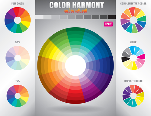
Size, shape, contrast and color play a role, not just the subject matter within an image. Graphic artists and (to a lesser extent) writers use tools to evaluate the image, so as to make an educated guess as to what most readers will see - even if they're visually impaired. One example is the color contrast analyzer. It uses metrics like luminosity and contrast ratio to evaluates an image and help estimate how easily a typical viewer might see it.
Having covered topics like image placement, size, contrast, and colors along with a the origins of where and how images have been used, this article is still only a summary. People have dedicated their entire careers to understanding how images "speak" to the reader. Specialized applications which depend more heavily on images are emerging in advertizing. Techniques like real-time marketing are attracting more specialized talent, and the lines which separate image and text-driven content are increasingly being blurred.

Subscribe to Our Newsletter!
Latest in Web Design


