Google+ Makes Waves with Massive Redesign

 Did you just love Facebook's Timeline update so much that you wished another major social media site would adopt something similar? Well, Google apparently did also and has included a conspicuously Facebook-like redesign of profile pages among its many recent (and major) updates to the Google+ social network.
In addition to the redesigned profiles, the big G+ update is rife with new features in addition to a drastic overhaul of its general look, most designed to improve navigation and functionality.
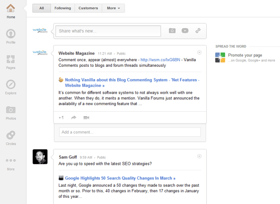
Looking at the new News Feed and profile page designs, it's clear that Google was attempting to play off the minimalist style it adopted for most of its other Web properties. Notably, the icons that once rested atop G+ pages are now conveniently located on the left-hand side of the page and feature tabs for Home, Profile, Pages, Photos and more (see example below).

And the location of these different tabs can now be customized to the preference of the individual user, including a More tab that will house all of his/her lesser-used icons.
Also, evidence of Pinterest's growing influence on the Web is apparent in Google+'s emphasis on photos and sharing. Photos on the site will now be displayed more prominently and take up more space on a browser screen with a layout reminiscent of Tumblr.
A big part of the redesign has also focused on improving conversations, making discussions and comments more visible to improve participation. Users have a new Explore button to highlight specific activity and posts on the site as a stream of trending activity (see example below).

All told, this will make it much easier for G+ users to find and participate in conversations outside of their Circles, a commonality that has heretofore been an issue for the social network.
Hangouts, meanwhile, the most successful part of Google+, is getting its own space on the site. All Hangouts will have their own dedicated Web pages with a sleek design. Users will be able to both view their own Hangout sessions and track their personal invites more easily. The biggest change, however, will be the ability to scan for open public Hangouts that they can join or watch.
The design updates are already live, and other features will be unveiled throughout the week.
Public reaction
So far, the changes have been met with praise, which is certainly not always the case with regard to Google+. Though users aren't necessarily in agreement about the conspicuous reliance on white space in the redesign, they do generally seem to be pleased, specifically with the new look of profile pages (including the addition of the Facebook Timeline-esque cover photo) and the relocation of and ability to customize icons.
However, this major overhaul does make one curious about whether or not this redesign was part of the plan from the beginning. After all, Google isn't exactly known for making drastic changes to its products in such an unexpected and sudden way. Typically, the company is more comfortable unveiling its properties slowly and making minor tweaks along the way to improve user experience, which seems like it would be especially true for important properties that the majority of its other services rely on.
In this case, the Google+ updates, which in some cases dramatically alter the user experience, came with little foreshadowing and caught most users by surprise. And people seem to love them. Of course, it shouldn't be any surprise that Google has likely been closely monitoring user activity and reactions to its social network since its initial private launch, but the real question is whether the company always anticipated a massive redesign around this time from the very beginning.
Covert operation?
If that's the case, it would explain the curious silence on the part of Google concerning the majority of complaints about G+ that most Internet users weren't shy about airing. Rather than address each issue individually, especially when they concerned subjects as meticulous as page design, its probable that Google spent the last few months collecting anecedotal and more scientific data and fixing things behind the scenes.
This means that the "old" Google+ was probably never meant to be a final product, but rather a starting point in Google's seemingly never-ending quest to create the perfect social network. It also means that the social network may not be done changing just yet, and it's definitely going to be something that users and Web businesses alike are going to want to keep on their radars in the coming year.

Subscribe to Our Newsletter!
Latest in Web Design


