Google Flip-flops on Page Layout

 Google's new page layout algorithm update may force many Web workers to reconsider from where exactly they will receive their next check. The change essentially analyzes the layout of a webpage and the amount of content immediately visible to a user. If you've been relying on ad revenue from placements that make it harder for users to find content, then you had better pay attention.
The algorithm modification was made to improve the user experience, according to Google. Websites that do not have much content above the fold (what a user sees immediately upon arriving on a site without scrolling) will be affected by the change. According to the official post on the Webmaster Central blog:
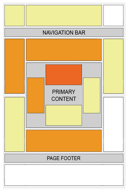
"If you click on a website and the part of the website you see first either doesn't have a lot of visible content above the fold or dedicates a large fraction of the site's initial screen real estate to ads, that's not a very good user experience. Such sites may not rank as highly going forward."  Google clearly understands that placing ads in highly visible (above-the-fold) locations is common, namely because the ads tend to perform better in terms of clicks. Just look at the guidance for Adsense Publishers on "Where to place Google Ads on pages", and you'll see some conflicting information (see the sidebar for an image). The strongest performing locations - featured in the darkest orange - are exactly the location Google might penalize website owners for displaying ads.
There is clearly a lot of room for interpretation with this change, however. Google has said that the algorithm change will not affect those sites that place ads "to a normal degree," but the search engine will penalize those that load pages with ads to an "excessive degree" or which "make it hard to find the actual original content on the page." Google isn't making it clear, and the only loser will be the website owner.
So what should you do? It's pretty straightforward. If you've followed Google's guidance on ad placement all along - particularly as an Adsense publisher - just continue doing what you've been doing. Google is taking a hard line in the enforcement of the very ambiguous optimal user experience, but it doesn't take a usability expert to know that ad-filled pages that emphasize ad clicks over content do not satisfy.
Should you, in the next few days and week, find that your listings have been lowered and suspect that the page layout you are using might be to blame, know that changes will be automatically reflected once Google re-crawls and processes a sufficient amount of pages to assess the layout change. It may take several weeks, however, to see a noticeable improvement (or decline) based on the size of the site itself as well as how efficiently Googlebot crawls content. Google anticipates that the change will affect less than 1 percent of global searches.
The most proactive exercise you can engage in at the moment is to look at your pages just like a user would. Start with Google's Browser Size tool, or Ben Beckford's Resolution Test Chrome extension. Both tools provide Web workers with an understanding of what users are seeing on their pages and if they are indeed providing an optimal user experience or need to switch things up in relation to their layout.

Subscribe to Our Newsletter!
Latest in Web Design


