Essential Rules of Single-Page Site Design

Single-page site design is among 2013's hottest trends, and for good reason.
The technique essentially brings the brand experience (including content) into a onepage website, making it easier for visitors to find what they need, while also giving developers the ability to incorporate unique interactive features and creative navigational elements (without the use of flash) for a far more interesting digital experience.
The imminent release of new gTLDs could escalate the popularity of single-page sites. These specific domain extensions will enable brands to create "extension" sites, separate digital destinations built to promote a special project or service. For example, if Amazon ends up with the .book extension, the company could allow authors to create individual sites to market their new Kindle-exclusive e-books. Since these promotional pages would only require basic information, such as book descriptions, consumer reviews and images, they are good candidates for single-page design.
That said, the practice isn't right for every enterprise. While it can positively affect engagement metrics like time-on-site (and, ultimately, conversions), it is really best suited for projects that aren't content heavy. A merchant with a large inventory or a high-volume content publisher, for example, would not benefit from this method. Conversely, sites with less content, such as a portfolio site or a site featuring a single product or service, would be among the best candidates for this design approach.
In order to execute a successful single-page site, there are three rules that designers and developers should keep in mind.
1. Get to the point.
Although single-page sites don't provide much content, they can serve a distinct purpose, which should be immediately revealed so visitors have a reason to keep exploring after arriving.
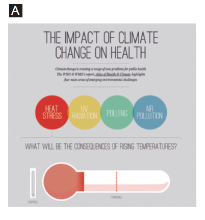
Information site Undertheweather.eu, for example, uses large header text, along with a brief description, to state its purpose clearly (the impact of climate change on health). The variance in font size between the header, description and other sections of the site is used to create a layout hierarchy that helps visitors quickly identify the most important pieces of content on the page (see image A). Additionally, this site's bright navigational icons, which include obvious keywords (heat stress, UV radiation, pollens and air pollution), assist visitors in identifying relevant content throughout the page without the need for excessive scrolling (more on that in the next section).

2. Keep navigation top-of-mind.
Some single-page sites are laid out vertically and others horizontally. Regardless of the layout choice, designers should not overlook two important navigational elements: static menus and properly labeled outbound links.
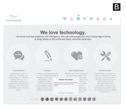
For instance, South African site teamgeek.co.za (see image B) offers a clear path to its services with a static menu bar. Instead of scrolling to find content, this fixed menu bar allows visitors to click on icons to jump to bookmarked areas of the single-page site. The menu also identifies which area of the page visitors are currently viewing by highlighting that section's icon in the menu bar with an arrow.
Aside from maintaining compelling page navigation, it is also important to label outbound links on singlepage sites properly. Since it is common for these pages to link to external websites, such as to their social profiles, blogs or payment platforms, these links should be labeled so visitors know when they are being directed away from the website. Teamgeek does this in its site's "technology" section. As visitors scroll over icons that represent technology the company "loves," a pop-up window opens to provide additional details. This popup window also includes an outbound link that invites visitors to "read more on Wikipedia." By properly labeling this link, teamgeek doesn't disrupt the user experience, because visitors should understand by clicking on these links that they are opening thirdparty websites.

3. Be a design showoff.
The most engaging single-page sites impress visitors with their interactive features. In fact, the interactivity is one reason why single-page sites can foster higher engagement metrics than their counterparts.
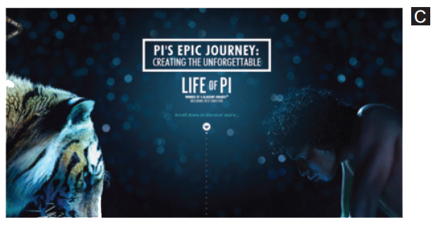
For example, the website created for Academy Award winning film Life of Pi (see image C) uses a single page to tell a story in a captivating way. The site features parallax scrolling to take visitors through behind-the-scenes facts, video footage and photos. The transitions from these navigational elements include movement, fade-ins and sliding panels, which are visually appealing and give visitors complete control over the story-telling experience.

Time to Design
As you can see, there are many elements to consider in a single-page site. While some designers choose to make these sites simple and straightforward, others prefer to provide an out-of-the-box experience. Regardless of the virtual design path you take, keep the aforementioned rules in mind to make the end-user experience as effortless and engaging as possible.

Subscribe to Our Newsletter!
Latest in Web Design


