Designing Your Website Checkout for Conversion


For the folks who are really interested in what you have to offer, however, there is only the checkout process standing between them and a purchase. There are many instances of customers adding products to their shopping carts only to abandon the lot and exit the site without making a single purchase. One of the main tasks of an ecommerce website developer is to figure out the reason for this behavior and to take steps to reduce its occurrence. Some practical tips on optimizing the checkout design to facilitate successful transactions on your website include:
Host the Checkout Yourself
It can be very disconcerting for a shopper to be redirected to a third-party site (unless it's PayPal to which often reduces their anxiety) to complete the checkout process and complete the purchase transaction elsewhere. The redirection tends to be negative and disruptive and often scares away the customer because there is a very high degree of sensitivity associated with disclosing personal and financial details to a site they have no idea about. If you are serious about your ecommerce business, it is far better to host the checkout process yourself rather than hand it over to a third-party transaction facilitator simply because you do not want to take the extra trouble of programming that module yourself.
Say No To Hidden Fees
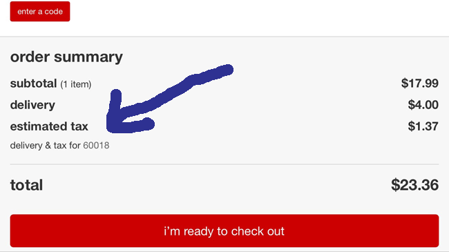
One of the most disconcerting things that an online shopper faces is the imposition of undisclosed fees at the time of the checkout. Even if it is as simple as something like tax and shipping cost, it should be included in the product price upfront so that the customer does not feel that his trust has been betrayed. While the best thing is to avoid any extra charge or fees, however, if that is not possible then the user needs to be made aware of the fact even before he or she clicks on a product to transfer it to his shopping cart. Keeping the fee structure is crucial to building trust.

(Image Source: Target)
Offer an Option for Guest Checkout
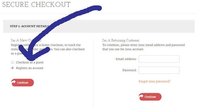
Often users are in a big hurry, and it can be really troublesome for them to have to create an account before being allowed to buy something. It could be because they find the process tiresome or don't want to be bothered about having to manage yet another online account. Whatever be the reason, it is best to offer an option for visitors to make a purchase without having to create an account first, as there will be many visitors who appreciate that you have made the purchase process more convenient for them.

Display Site Security
The biggest hurdle that ecommerce businesses face is the lack of trust that most customers have about disclosing their personal details to an unknown entity. However, there are some widely accepted security signals that can be displayed on your site to assure the customers that you adhere to strict security measures. Security seals are available from third party sites like TRUST2, BBB, etc. Also, make sure that you have an SSL certificate that is a proof that your site uses a secure encrypted connection to protect sensitive financial and personal data transmitted from the user's browser to the ecommerce site. Even the payment gateway that you use should have a very good reputation.

(Image Source: Kohls)
 Still in a Slump?
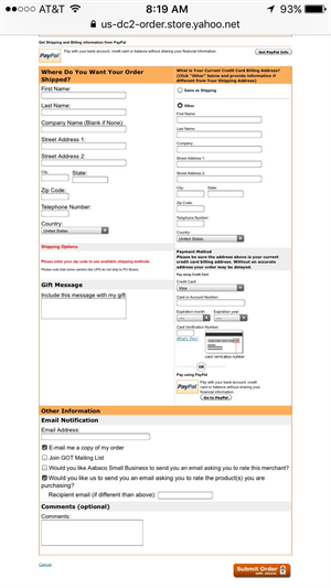
Even after following all the above tips you may still have lots of customers dropping out before making the payment simply because the process can often be somewhat lengthy (see image) and involve a number of pages. Having a progress bar or a map that tells them exactly where they are in the process will reduce the shopping cart abandonment substantially.
It's a safe bet that while most of your websites offer a mobile-friendly checkout experience, it's worth repeating that not having a checkout that adapts to the device, will kill conversions.
Presenting the checkout process on the right will alienate shoppers who really did want to buy because of its length, its crowded presentation and its non-mobile process. The only redeeming quality is that it offers PayPal, which could make shoppers, who feel anxious about entering their credit card information on a page that doesn't instill a lot of trust, more comfortable.
About the Author
Evans Walsh is a freelance content writer who publishes articles for different industries including technology, health, fashion, beauty, education, career and travel."Subscribe to Our Newsletter!
Latest in Web Design


