Designing Interfaces with a User Experience (UX) Perspective

Most of us spend countless hours online surrounded by a myriad of tech devices with screens, which receive our utmost attention. More than 1 trillion web pages and innumerable mobile apps want us to give time to them and respond. Here are some of the major principles, which will help you to craft websites and user interfaces that provide a magnificent user experience and in turn, repeat visitors.
Design should focus on delivering an experience

People usually do not attach themselves with the presented information on the website but always follow their feelings and first impressions on the first look of the website. They remember what they feel and not what is being told. The entire focus of a user interface should be on selling to our hearts. The information itself is not wholly important, but the emotional effect resounds on the audience for an extended period of time.
This is why UX design is an integral part in making web and application work. The design should be efficient in its combination of text, graphics, layout and miscellaneous interactive elements so that users have a fantastic experience and not just a dry informational view.
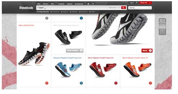
Since the websites nowadays are mostly swimming in complexity and a huge quantity of information, it is important for sites to create differentiators in terms of design and approach. The best sites include a plethora of visuals, story and content, which makes them feel compared to what their competitors are doing.
People scan websites, they don't read them

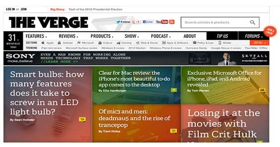
If the website is scannable, it is bound to succeed. Users generally do not read websites and hence nowadays infographics have become standard fare. Infographics bring data and visuals together to register an impact.
It is also possible that you might not read this entire article here but scan through the subheads and get the gist in mind. By making the interface scannable, the site would be more accessible and simpler for today's audiences.
Users crave simplicity of content and clarity of approach

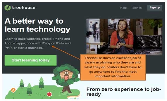
Visitors have just about 0.5 seconds to decide if they would like to continue exploring a site or skip it. This means that the first impression in terms of design should be great. Interfaces now need 'preferred actions' and users should not be confused as to what you want them to do. The uncluttered approach to a site makes it clear and precise about the call to action that you mean for the users.
You website can implement diverse elements for implementation and make it available so as to convey your message to the majority of your users without delivering everything directly on the face. A consistent design helps users to associate with the brand since the components, behaviors, colors, and the like are similar in every page reducing the effort that users would take to rethink. Complying with patterns consistently will make the system simpler.
Assess where you need to be creative and use common design patterns
Innovating new UI patterns is a tough ask but one should first make use of commonly known patterns. Users need not be pushed to think too hard about common elements. Most interfaces are known to users and the elements should function as they expect to do so. Buttons should look like buttons. Login access is situated at the upper right corner while logos and company names occupy the upper left space ideally.
Getting too creative might ruin the impact too. It might feel cool to do something which is not traditional, but that does not mean that users will be use the feature efficiently. Usability and creativity should be well balanced in all terms. Usability is one of the first factors of creating a website, hence do not let creativity hamper that part.
Design to capture someone's attention on the surface rather than in the interior parts

The stuff which needs to be marketed need not be put into view directly where people see; however, one needs to balance simplicity, clarity, and experience on first view. Everything need not be on the surface since users do not gauge a site directly on the first page, but yes, they need to be interested in what you offer on the first impression.
It is important to capture attention so that they scroll down or click the stuff that you want them to click. The experience rendered here is more important than putting all the information on front view.
Scrolling is quicker than paging
As per Web 3.0 standards, today's websites are vertically longer and even clickable through the menu. Scrolling was never a good option for most experts a decade back when they focused on speed. But in today's context, scrolling is faster than paging and hence web navigation is less complex and more enticing.
Clicks that require page refreshes are highly "expensive" but people click so that they can explore information. The average website refresh takes about 6.5 seconds to load completely. Alternatively, one can scan a longer home page in about 5-10 seconds through scrolling. Even in the mobile context, it is easier for users to flick and scroll rather than click to the next page.
Build nice responsive design vs. just responsive design

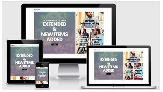
Responsive design involves a fluid interface for multiple device sizes and it is important for businesses to create sites which can load anywhere anytime efficiently.
Users and prospects are conversant with all device types and different screen sizes, so for designing a site or app, one should adhere to responsive design standards and expand the audience.
About the Author: Chirag Leuva is a CEO at Yudiz Solutions, a web and mobile development company focused on delivering the highest quality mobile app built upon the principles of Yudiz Solutions.

Subscribe to Our Newsletter!
Latest in Web Design


