Designing for a Designer [A Before & After Look]

Like cooking for a chef, designing for a designer can be nerve-wracking. Most approach a project differently when providing services to a peer, because expectations are usually higher.
IdeaWork Studios, a full-service interactive agency, found this to be the case when it was tasked with designing the online presence for luxury interior designer Geoffrey Bradfield.
"It's imperative that the online presence accurately portrays and conveys any brand," said Jay Schwartz, founder and Chief Creative Officer of IdeaWork Studios. "That imperative is elevated when the brand is design-focused. When designing for a designer, you have to put yourself in a different mindset - our goal here wasn't to reflect the work of Geoffrey Bradfield, but rather to showcase it. To do that, the design of the site needs to be invisible, stripped down to its essentials so it doesn't get in the way of visitors learning about the designer and his projects."
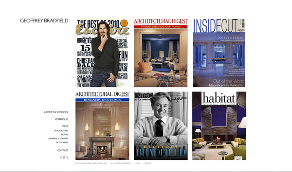
In designing this site, IdeaWork's approach was clean, with simple navigation. This allows the work of Mr. Bradfield to speak for itself, unfettered from site design. The site showcases an international design portfolio, both in private and commercial spaces, and also features the designer's publications, including his latest book. The website is also multilingual, to accommodate the designer's focus in Asia, and responsive, so it works with mobile technology. It also includes a custom content management system, which allows Geoffrey Bradfield and his team to add or change content ongoing.
Here are before-and-after images:
Before
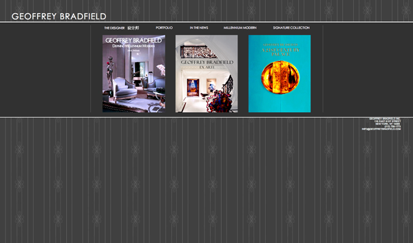
After
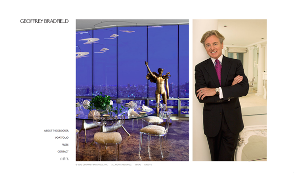
Before
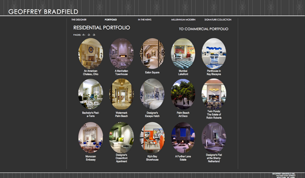
After
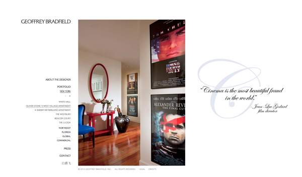
Before
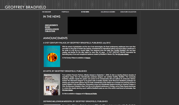
After

Subscribe to Our Newsletter!
Latest in Web Design


![Designing for a Designer [A Before & After Look]](https://www.websitemagazine.com/hubfs/Imported_Blog_Media/ideawork_100x100-1-1-1-1.png)
