Before & After: 11 Exceptional Website Redesigns

The list of reasons for a website redesign includes different concerns and objectives for every enterprise, but designers and developers certainly know that outdated and clunky websites that are not search engine, user and mobile friendly should top the list.
Companies also turn to their in-house design teams or outside agencies to take advantage of third-party integrations and emerging trends and best practices, as you'll read below. Here are 11 exceptional website redesigns for your inspiration.
Vienna Beef
Agency: Orbit Media
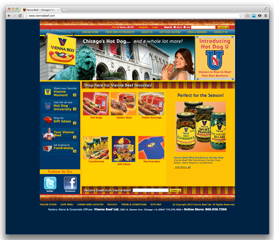
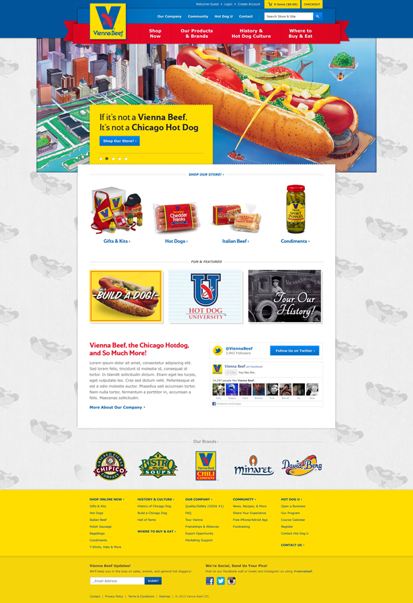
When Vienna Beef wanted to create a progressive website that showcases its store and core values, the iconic brand turned to Chicago's Orbit Media, a Web design and development firm. Vienna Beef benefited from having a dedicated project manager, Christa Vrabel, and designer, Kurt Cruse. The goals of the project were: to improve the ease-of-use for mobile users; to modernize the ecommerce storefront for both desktop and mobile users; to highlight the Chipico, Bistro and Minaret brands; to create an easy-to-update back-end; to enable the brand to track visits to the site; and for the Web property to develop long-term relationships by keeping the site fresh.
Before:
After:
FromYouFlowers.com
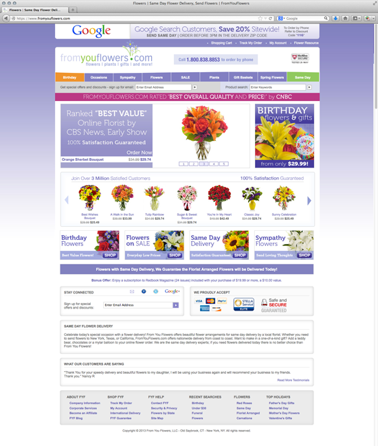
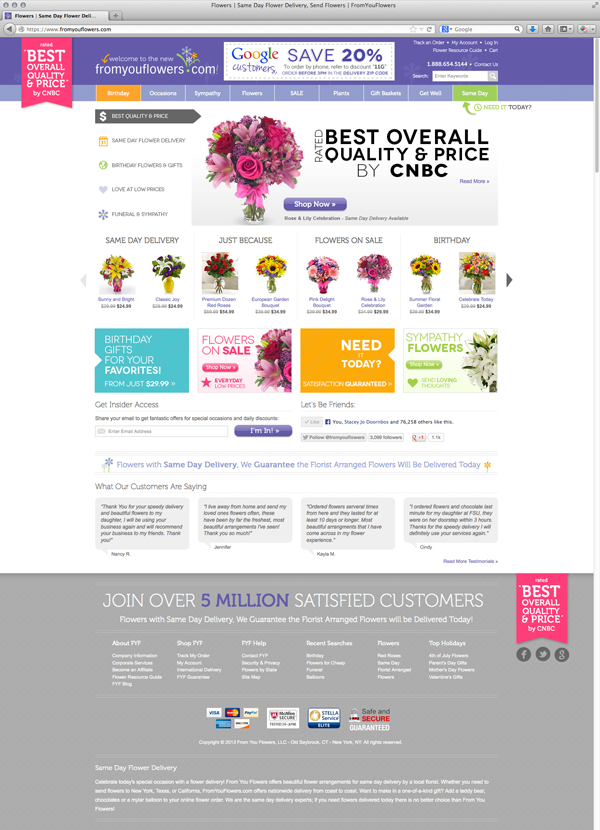
From You Flowers successfully launched a site redesign for FromYouFlowers.com, the culmination of a year's worth of planning and work. The FromYouFlowers.com team knew that there would always be newer technologies and more changes than they could implement in a year's time. To streamline the process, the executive and marketing teams created a timeline of tasks that must be completed over the course of the site redesign process-and they stuck with it.
"We've never had a change on the site perform so incredibly well on tests as this new site design," said FromYouFlowers.com CEO Mike Chapin. "This was all a result of team effort and staying up with current technology trends, while keeping the customer at the forefront of our minds."
Before:
After:
Direct Insite
Agency: Walker Sands Digital
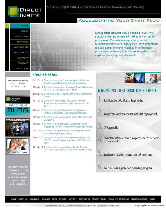
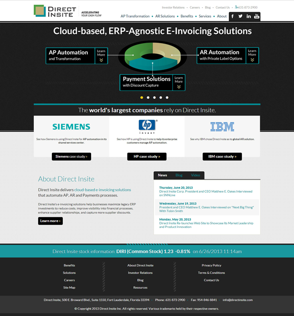
Direct Insite wanted to give their website a more modern feel, and they hoped to integrate with Salesforce to meet their business objectives. Their new site was launched recently with the new design, and Salesforce integration is expected to be complete within the coming weeks.
Before:
After:
Storflex
Agency: Walker Sands Digital
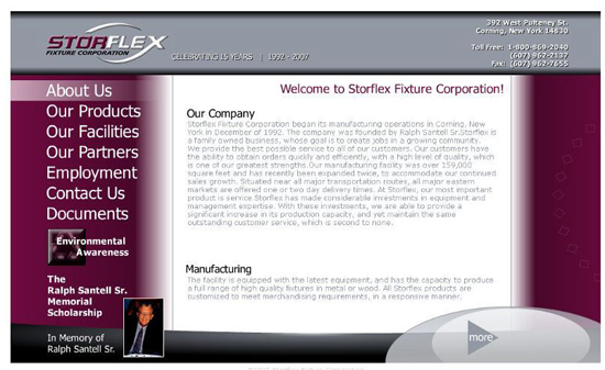
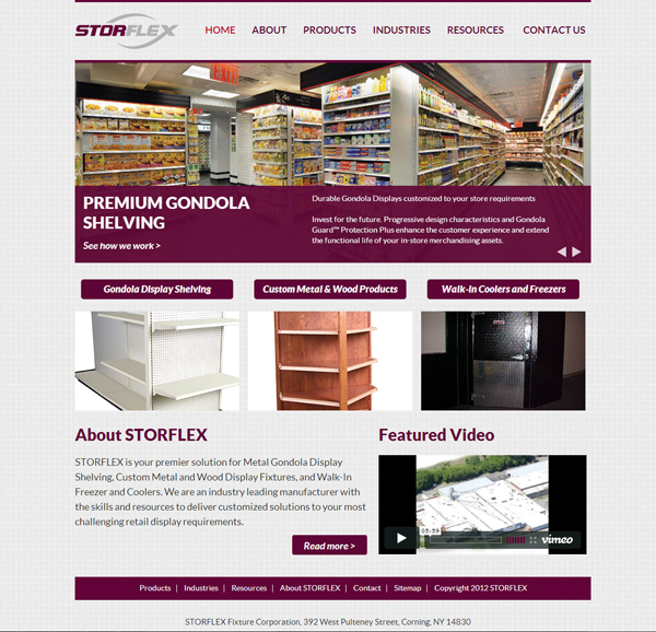
Storflex's old website was built primarily using Flash, meaning it looked outdated and functioned poorly on several devices. Their new site incorporates a much more contemporary design, and it has been optimized for search engines to allow them to better compete against other businesses in their industry.
Before:
After:
International Specialty Supply
Agency: Walker Sands Digital
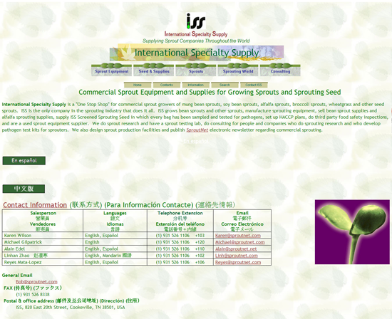
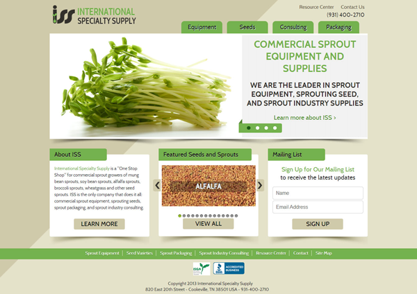
International Specialty Supply (ISS) had a highly search engine optimized website, but it needed a powerful design to match. Through incorporating a modern design and further optimizing key pages on their site, ISS noticed an improvement in sales almost immediately; whereas they had not taken a single order for sprout growing equipment in the six months previous to the redesign, within a month of launching the new site ISS received two orders for a piece of equipment worth $15,000.
Before:
After:
SDI
Agency: Walker Sands Digital
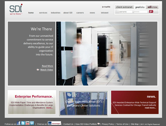
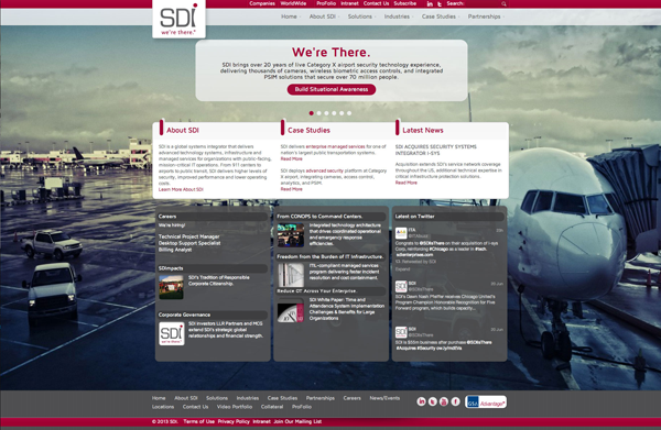
SDI had a number of unique challenges they wanted to meet. Like Storflex, their old website's design relied heavily on Flash, meaning it was not supported across all devices. They also wanted to showcase their company's international presence with a nearly identical version of their site in Turkish. To meet these objectives, Walker Sands built SDI's website to be responsive, meaning it will work on nearly every browser or device. The agency was also able to build out an international section of their website to showcase SDI's presence in Turkey.
Before:
After:
Scout Analytics
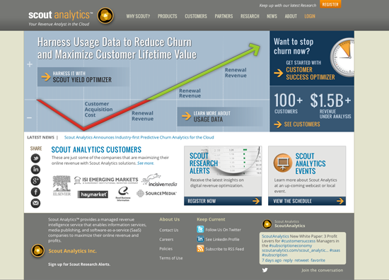
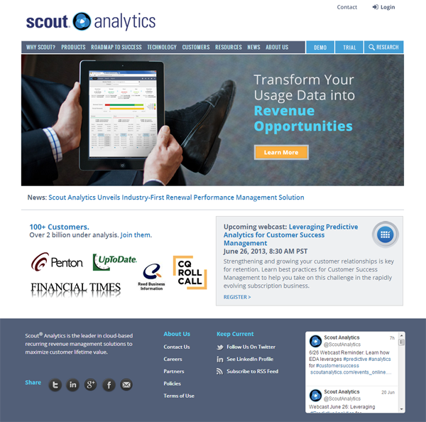
The overall look and feel of Scout's website was updated to represent Scout branding and messaging, and to better position Scout as a leader in the cloud-base recurring revenue management space. There was also improved organization and flow so that content and product information is easily accessible, as well as enhanced navigation to make it easier to move around and peruse the site
Clear calls-to-action both above the fold and below were added to drive visitor engagement and lead generation. The website redesign also leveraged responsive design for optimized viewing on multiple devices (e.g. mobile, table, laptop).
Before:
After:
Black Diamond Equipment
Agency: Acquity Group
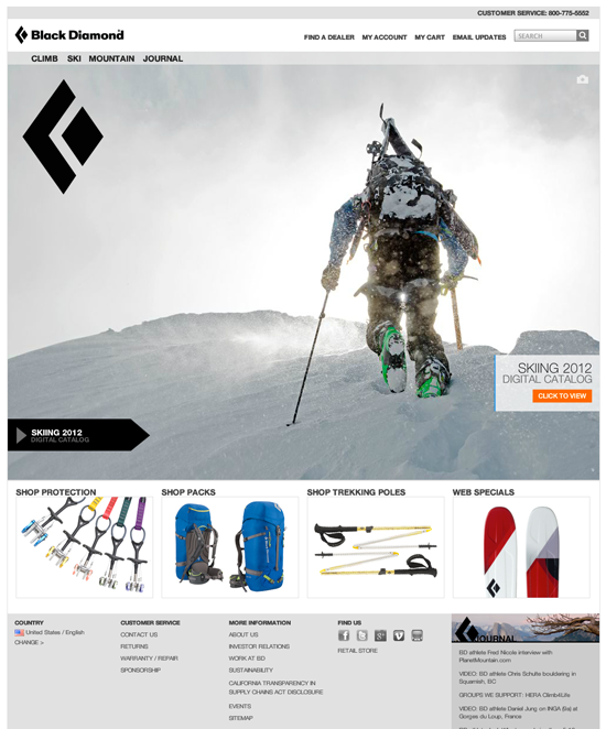
Black Diamond Equipment realized they needed a vastly improved website experience to serve their ecommerce and CMS needs better after going public in 2010 and experiencing year-over-year growth.
Working hand-in-hand with Black Diamond Equipment and their customers, Acquity Group provided brand strategy, user research, prototyping, responsive frameworks and visual design for a dual approach; to showcase Black Diamond's Equipment's innovative climbing and outdoor products in the SHOP area, and to provide a rich user experience for Black Diamond Equipment's voracious community of video watchers, expedition followers and photo posters in the EXPERIENCE section.
With two distinct, yet seamless paths, blackdiamondequipment.com now generates sales and develops brand affinity with a beautiful responsive site that's visually stunning and deeply engaging.
Before:
After:

belkin
Agency: Acquity Group
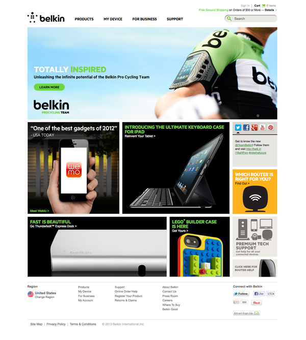
Belkin is one of the world's fastest growing companies with more than $1 billion in annual sales. Although Belkin is known for wireless networking solutions, it also offers a diverse product mix that includes lines of mobile accessories, business-class solutions and energy conservation products-all of which share the brand's core commitment to innovation and relevancy to the everyday lives of modern consumers.
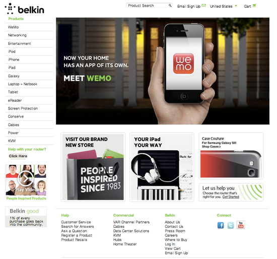
As the company shifted from a primarily B2B sales model to more of a B2C model, the need to develop a closer customer-brand relationship was elevated. Belkin knew it had to offer a rich digital experience that facilitated B2C sales, presented its broad product catalog effectively, and moved Belkin products from a commodities category to must-have consumer items.
Belkin engaged Acquity Group to help re-imagine the company's web presence, enabling the brand's eCommerce experience to be as innovative as Belkin's products are to consumers.
After:
Summit Power
Agency: The Medium
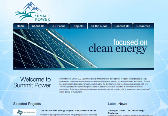
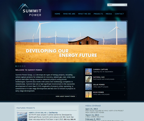
The Medium completed a re-branding and website update for Summit Power in July 2012. The previous Summit site conveyed basic information about the company, but the look and feel didn't reflect the cutting edge nature and personality of this energy development company. Their new identity and website evokes a modern, innovative, and successful aesthetic. The site is built on a fully customized WordPress platform, allowing internal staff to easily update Summit's current projects, site location map, team bios, and other text and images as needed. In addition, an extensive Media section shares recent press releases, articles and events that Summit is involved in.
Before:
After:
Olson's Tack
Agency: The Medium
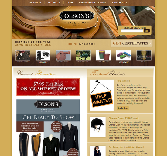
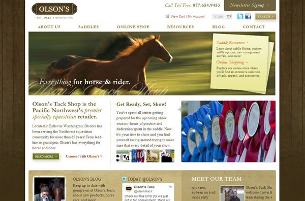
The Medium created the new Olson's Tack site to serve as an enticing resource for equestrians in the Pacific Northwest Region. The updated site is built on the WordPress platform, which allows staff to easily update dynamic features such as employee profiles, sales and events, a barn directory and an informational blog. The homepage features a Twitter feed and a rotating feature article which pulls from the blog.
While the old site was static HTML/CSS and couldn't be easily updated, their new site is very dynamic and extremely easy to manage. In addition, The Medium integrated the site with a customized Volusion ecommerce solution so that Olson's can sell their products online.
"We are very happy with the increased traffic, as well as the better placement on search engines for the specialty equestrian products we carry,” said Olson's Tack Owner Mike Akers.
Before:
After:

Subscribe to Our Newsletter!
Latest in Web Design


