Rock Star Web Design

 Not everyone can be a rock star by definition, but rock-star Web pages can fill a stadium's worth of customers and advertisers for even the most subdued online enterprise.
The most effective designs on the Web today incorporate elements such as originality, artistic integrity, sensitivity, authoritativeness, social consciousness and, last but not least, displays of out-of-this-world talent. Not very different from some of the men and women we have hailed as rock stars over the years.
Whether they are outrageous, charismatic or perhaps even a little bit dark, rock stars put their personalities on stage the same way that companies do with their websites. Maybe it's time you thought about your own Web design with a little bit more of a rock-star mentality.
Below are some examples to aid the thought process:
Let it Bleed
What better way to begin the conversation than with the landing page for the 2009 book, Let it Bleed, chronicling the historic 1969 tour by the Rolling Stones - arguably the greatest collection of rock stars of all time? Conventional wisdom tells us that black can be a risky proposition when it comes to Web design, but true rock stars value conventional wisdom about as highly as sleep and a healthy diet. This stunning and elegant design leaves nothing to the imagination, much like the Stones themselves in their heyday.

Nothing says "rock star" more than snowboarding, and Burton knows this better than anyone else in the action-sports retail marketplace. The sport lends itself to some potentially mind-blowing imagery, but Burton takes its Web design a step further than the competition by constructing a highly informative, interactive and edgy site. This particular page hits all the high notes, leaving visitors no reason not to want to watch the company's video.

There's not a major retailer in the world that defines rock star as well as Nike. There are literally thousands of campaigns and tens of thousands of Web pages in the company's arsenal to illustrate the point, but this one fits the bill just fine. Simple but beautiful; refined but irreverent. And don't forget socially responsible - these shoes are made from "environmentally preferred rubber, water-based cementing and recycled polyester." Even Bono would be proud.

Apple may be a close second to Nike in terms of rock-star sensibilities among globally renowned corporations, and the late Steve Jobs' knack for simple yet powerful designs has played a major part in building one of the world's most recognizable brands. This iPhone 4 product page seems to be saying what only a select few rock stars in history have said themselves: judge me for my talent, not my act.

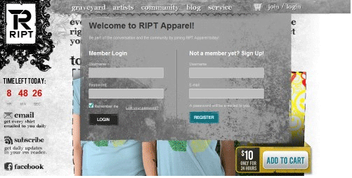
Didn't think registration forms could be rock star? Think again. Graphic t-shirt retailer RIPT pulls off the improbable by incorporating its slightly creepy, very cool graveyard motif onto a simple login landing page. The calls to action are crystal clear to users, but the brand is in no way compromised by just any run-of-the mill form. Gene Simmons and company would appreciate this clever and creative makeover for what many Web companies essentially consider a throwaway page.


Subscribe to Our Newsletter!
Latest in Web Design


