8 Web Design Goals for Ecommerce Sites

Ecommerce websites have a different set of goals than other types of websites. Not only does the site need to be extremely user-friendly, but it also needs to convert visitors into customers. Competition online is fiercer than ever before, with more than enough choices to go around. If your site doesn't stand out from the crowd, then you risk losing your customers to competitors.
If you take the time to make your site the best it can be, there is a substantial payoff as online spending per customer is about $1,800 per year now. So, want your business to gain a big slice of their share of wallet?
Focus on these eight web design goals for your website:
1. Mobile-First
Today, mobile traffic makes up about 53 percent of all online traffic, and that number doesn't show any signs of shrinking. In fact, the percentage is likely to increase as more people turn to smartphones. While a responsive website is an excellent first step, a mobile-first design is something ecommerce sites need for the best conversions possible.
When choosing a mobile-first design, the way that the site looks might differ between mobile and desktop devices. However, the entire website will fit on a small screen and offer easy navigation to make browsing and purchasing seamless.
2. Smart Filtering
Have you ever been on the hunt for just that perfect item in the perfect color? Smart ecommerce site owners know that the ability to filter down choices avoids customer frustration and allows for a more personalized experience.
Filtering options work particularly well for products with a lot of different options, such as clothing - but don't overlook the value of adding filtering for other types of products, like smartphone cases, as well. 
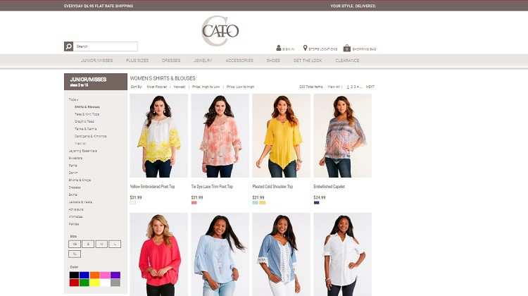
Cato Fashions sells clothing and accessories. Not only can you filter items by category but you can also narrow them down by size, color and more. Also, there are options beneath each product, allowing users to trim down their results further.
The ability to search fast and easy with filters creates a positive user experience.
3. Personalization
If your ecommerce site doesn't already focus on customization, take the time to figure out how to enhance the user experience. For example, what is the customer's purchase history? How can you utilize that to offer new items that would spark that person's interest?
Another idea is to offer suggestions for products that complement what the person has in their shopping cart. One way to implement this technique is through a banner at the bottom of the shopping cart that says, "Other customers who purchased this item also bought..."
Likely, your viewers won't resist the temptation to click.
4. Background Information
Your company's "About Us" page, as well as any other pages that details the backend of your business, is a vital part of your ecommerce site. It's the information that tells the consumer who you are and develops a sense of trust.
When making a large purchase, 80 percent of consumers do research online first. If someone is debating about buying from your website, give them all the background information they need to feel that purchasing your product is a smart, plus rewarding move.
5. Loading Times
One of the biggest goals you should set for your ecommerce site is for it to load at lightning speed. At least half of internet users expect a website to load in under two seconds - after three seconds they'll abandon the site. Also, 79 percent of people who have trouble with a site loading won't go back to that website again.
As an ecommerce site, you need to ensure that your site loads fast on all devices, from mobile to desktop. You can boost your speeds through simple page designs and image optimization, as well as adjusting your server speed. Site speed is one of the most critical factors you can focus on to improve your ecommerce website - so don't forget about it. 
Note how quickly the landing page for Ambiance Window Coverings loads. Even though they utilize a slideshow with big, beautiful photos of their product in action, the page pulls up very quickly. As the slideshow rotates through the images, each one is complete. The site also loads very quickly on mobile devices.
6. Geographic Location
Use the location information of your site's visitors to deliver content that targets their geographic location - you can collect this data by gathering the IP address of anyone that visits your website at any given time.
Once you have their geographic location, you'll know a lot about that person, including typical social behaviors for the area and relevant local products. For example, if someone located on the equator visits a clothing site, suggestions for tank tops with cooling material make a lot of sense.

Groupon is an excellent example of a website that uses geolocation to deliver coupons in the user's nearby area. Viewers can also search a specific area that they may plan to visit or allow Groupon to automatically pull up their current location and offer savings in their area.
7. Simple Design
If you have an ecommerce website with a massive number of products, it can get cumbersome fast. However, you want to keep navigation simple and the overall design uncluttered. One way to accomplish this is with a handful of categories. You can also add smart filters to help users find similar products with minimal effort.
Keep in mind that the average user has limited time. They'll want to visit your site, pull up the category and find an item in mere minutes. Think about the advanced search features of Amazon and how well that works when searching for a product. It's another reason why Amazon is an ecommerce giant in today's marketplace.
8. Security
For users to buy an item on your website, they need to trust that their information is secure. Making sure that you not only provide a safe shopping experience but show that it's a safe one is an essential part of selling online.
Use SSL certificates and list your privacy policies. Also, state what happens to any shared information, such as credit card data. How do you go about keeping that information safe for your customers? The more secure a visitor feels, the more inclined they'll be to purchase from you.
About the Author: Lexie Lu is a web designer and writer. Her work is featured on CreativeBloq, Envato, Marketo and JUSTCreative. She manages her own design blog, Design Roast, and loves connecting with people on Twitter @lexieludesigner.

Subscribe to Our Newsletter!
Latest in Web Design


