7 Brands Doing Mobile Design Right

Executing a comprehensive mobile strategy goes far beyond just optimizing your website for mobile devices.
Now days, consumers interact with brands through a variety of mobile touchpoints, including emails and applications. To complicate matters, consumers expect top-notch performance from every channel they access a brand on, which means companies need to step up their mobile games or risk losing their customers to the competition.
This is why it is important to keep the user experience top of mind when extending your brand's presence to the "small screen". Look below to discover seven brands who have executed mobile design (for websites, emails and apps) the right way:
1. DoggyLoot
Mobile Takeaway: Email with Clickable Calls-to-Action 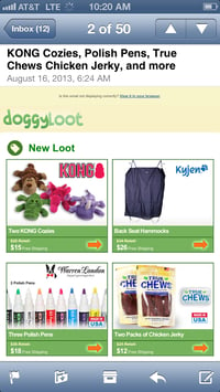
Finding a birthday present for my furry four-legged friend (Piper, he will be 1 soon!) is not a problem regardless of where I open my emails, thanks to Doggyloot's mobile friendly design. The company's use of big, clickable boxes makes it easy to move from the inbox to the checkout page without accidentally hitting the wrong item. For extra incentive, Doggyloot even includes the words "Free Shipping" next to each product's price.
2. Sweet Leaf Iced Teas
Mobile Takeaway: Easy-to-Navigate Site
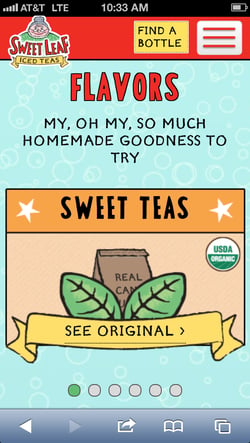
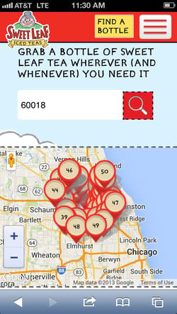
Sweet Leaf Iced Teas does a fabulous job at transferring its desktop website to the tiny screens of mobile devices. In fact, the design of the company's mobile site actually makes you want to keep scrolling, as it doesn't require visitors to pinch their screens in order to read text or view content. The site features large calls-to-action that aren't only optimized for mobile, but also for fat fingers. Plus, Sweet Leaf's site enables visitors to swipe images in certain sections to reveal more content. All that being said, the most notable feature is the site's static menu bar, which stays put at the top of the screen despite how far you scroll. The menu features a drop down tab that allows visitors to navigate to any section of the site, as well as a call-to-action that helps users locate nearby businesses that sell Sweet Leaf products.
3. Kraft
Mobile Takeaway: Engaging App
For some brands, the tricky part about creating a mobile app is designing it so that people actually want to engage with it, rather than use it occasionally. Kraft combated this problem by creating an app (for both iOS and Android devices) around something that people love (and need) - food. In fact, some consumers may not even be aware that the iFood app is associated with Kraft, as its purpose is to help users find and save recipes, as well as create grocery shopping lists. That said, the company gets its ROI from this app by subtlety adding its products to recipes. Furthermore, Kraft makes the app very user friendly by including voice recognition technology, filtering options for the recipe discovery and the shopping list feature, UPC scanning, the ability to integrate loyalty cards and coupons into the app, tutorial videos and more.

4. Harry & David
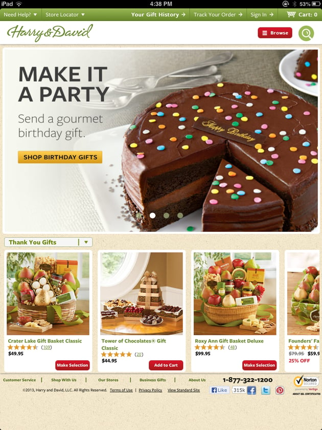
Mobile Takeaway: Tablet-Optimized Site
While having a mobile site optimized for smartphones in necessary these days, not many brands spend the time and resources to optimize sites for tablets as well, like gifting retailer Harry & David. In doing so, however, the company has successfully extended a unique ecommerce experience across desktop, smartphone and tablet devices. The tablet-specific site features better navigation for the end-user, an easier checkout and also leverages the high-resolution capabilities for images on tablets.
5. GoDaddy
Mobile Takeaway: Short-and-Sweet Messages
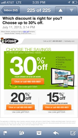
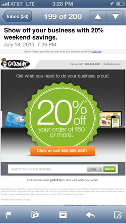
The challenge with designing email messages is that you do not know (and cannot control) what device consumers will use to open a message. This means that marketers must always think mobile when creating campaigns, which includes keeping messages short and sweet so they are easy to consume on smartphones. GoDaddy does this by delivering image-rich messages that fit the screen of mobile devices and don't require users to zoom in or out in order to see the message's full content. In addition, GoDaddy typically includes its phone number in messages, which makes it easy for consumers to contact the company if they have any questions.
6. CVS
Mobile Takeaway: App-Focused Mobile Site
If you have spent a lot of time creating a feature-rich mobile app, like CVS, then there is no shame in promoting it on your mobile-optimized site, as long as you don't do so through pesky app download interstitials. While CVS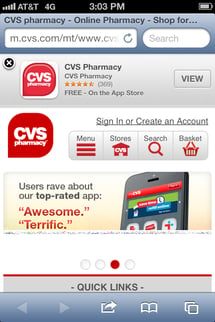 offers customers a mobile-friendly website, the company also lets site visitors know about its mobile app by including a Smart App Banner on the Safari browser, an app download link in the bottom vertical menu bar and a rotating ad for its app in a user-controlled slideshow in the middle of its site. Aside from promoting the CVS app, the company's mobile site also comes with all of the features of the traditional desktop site, including the ability for visitors to find brick-and-mortar store locations, sign into their user accounts, refill subscriptions, view the CVS weekly ad and more.
7. ModCloth
Mobile Takeaway: Ecommerce Friendly App
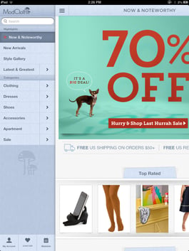
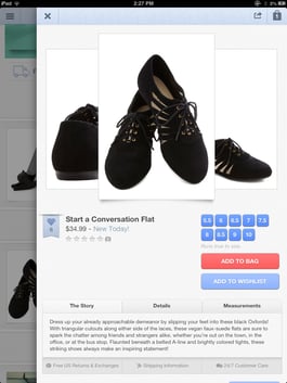
ModCloth leveraged the services of Prolific Interactive when creating a shoppable mobile app for iOS devices. The app enables users to synchronize their account with Modcloth's traditional website so that customers have a streamlined experience across devices. Moreover, the app features a variety of filtering options to help customers find items quickly and even includes a "style gallery" that allows customers to share images of themselves wearing their favorite ModCloth clothing. Most importantly, however, is the ease of checkout on the ModCloth app. Users can add items to their shopping bag with one simple click, and then must fill out a few typical forms for shipping and billing information.

Subscribe to Our Newsletter!
Latest in Web Design


