6 Sexy Web Design Agency Websites

Web designers are only given one chance to make a good first impression and often that first impression is made on their website. From which Web design trends to implement to which projects to show off, designers and the agencies that employ them have difficult choices to make about how they will present themselves to potential clients.
To guide Website Magazine readers to their perfect Web design website, we're spotlighting six Web design and development companies that have websites worth emulating. (Note: the screenshots below are taken of the homepages and above-the-fold.)
Design Lobby
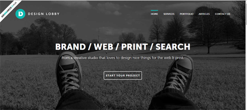
Often brands want to hire a design agency that is cooler than they are, but not too over the top. Design Lobby fits the bill, as its use of black and white - with a pop of color - gives off a modern vibe without startling the senses. What makes this creative studio's website especially worthy of note is its simple, yet effective call-to-action, "Start Your Project." Basically this CTA tells the user what Design Lobby wants them to do. Sure, there are other navigation items that enable visitors to see what type of work Design Lobby does and what work the company has done in the past, but "Start Your Project" is ultimately why a user goes to the website. This CTA takes visitors to the "Contact Us" page.
KREATIVA STUDIO
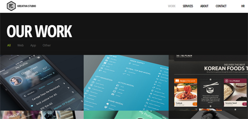
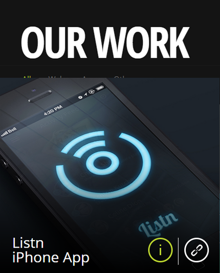
With creative in the company name (regardless of how it's spelled), businesses will expect an imaginative approach to Web design. KREATIVA STUDIO's website doesn't disappoint. In a pinboard-style format, KREATIVA STUDIO highlights its best work. What's particularly "sexy" about this format is that when a user clicks on one of the images, they are given two icons an "i" to get more information about the portfolio piece or a link symbol to visit the actual website (see second image below). What kreativa-studio.com is missing, however, is a powerful, conversion-driving CTA, like we saw on Design Lobby's website.
Pulpfingers
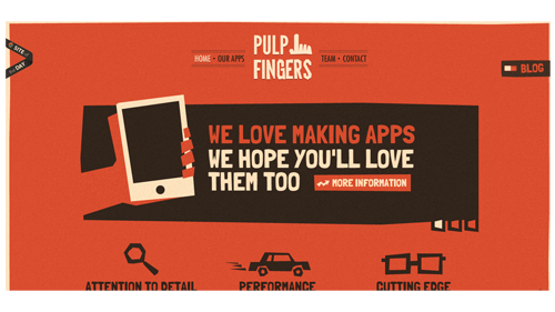
Pulpfingers' team of designers and developers make its website look retro, yet modern - proving that oftentimes less is more. Visitors immediately understand that this company is passionate about making apps and are invited to get more information about what it offers.
The New York Website Designer
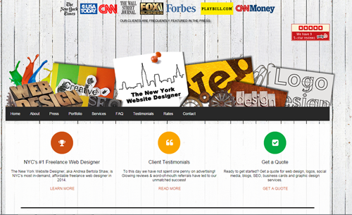
The New York Times, USA Today and CNN...this website design team must be legit. The New York Website Designer immediately provides trust indicators, including content that shows its clients are frequently featured in major publications and awesome Yelp reviews. What's more, its use of design-related images immediately tells potential clients (without using copy it doesn't need) that it's passionate about Web design. Finally, its choice of website copy gets straight to the point - who they are, who they've worked with and how much they'll cost you (get a quote). This website is direct, easy on the eyes and directs users to take action.
tenddo
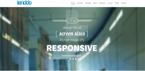
Counting McDonald's, Honda, IBM, Chase and other top enterprises as clients, tenddo plays to the idea that many prospective clients may be coming to a Web design agency's website to learn more about responsive. It puts responsive Web design at the forefront of its homepage, which is smart because we know that only a small percentage of enterprise-level brands are using responsive, but that number is expected to grow.
Of course, the tenddo website leverages responsive Web design, but like a couple other Web design agencies in this list, it could use a strong call-to-action to show users exactly what they should be doing on the site.
Orbit Media Studios
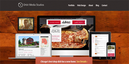
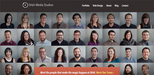
A Chicago-based Web design and development company, Orbit Media Studios is proud of its Chicago roots, which is why its homepage works so well. The homepage immediately shows off Orbit Media Studios' work with Lou Malnati's, a pizzeria often in the heated "best deep dish pizza" conversation in the second city. What's more, if users stay on the homepage for roughly 8-10 seconds, a new screen will appear with the faces behind the Orbit Media Studios' team. What's particularly noteworthy about Orbit Media Studios' website is that it's not only clean and easy to navigate, but its portfolio also shows work on all devices (desktop, tablet and mobile).

Subscribe to Our Newsletter!
Latest in Web Design


