6 Colorful Websites for Design Inspiration

The majority of websites are light in color and feature a lot of negative space (aka whitespace) - and for good reason.
Light colors are easy on the eye, which means that they aren't as likely to take attention away from the main goal or goals of a site. Negative space, on the other hand, makes websites look less cluttered and easier to navigate. Even though negative space can actually be filled with any color, white is typically the safest bet. For example, a brand like Best Buy is associated with the colors blue and yellow, but the company primarily uses these colors in the navigation menu of its site, which leaves plenty of whitespace to help guide visitors' eyes to calls-to-action (CTAs) like "Shop" and "Find out more."
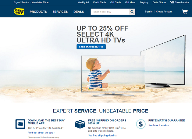
Some brands, however, are okay with challenging the rules of Web design and are doing so with colorful designs that are pushing the best-practice boundaries. Although colorful designs are certainly not for everyone, they can be successful when they are executed correctly and used for the right brand. For some inspiration, check out the six colorful websites featured below:
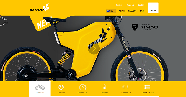
Greyp
Why It Works: Electric bicycle company GreyP uses a yellow color palette to make its site really stand out. The site does feature its fair share of negative space, but instead of using white in this area it uses yellow and gray. It is important to note that instead of just one shade of yellow, Greyp takes a gradient approach, with the color slowly getting brighter as a visitor's eye moves from the top to the bottom of the page.
Roobar
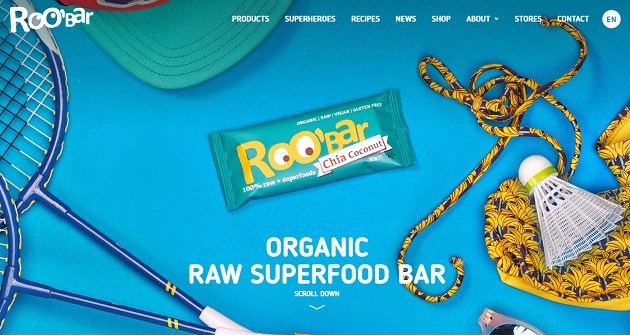
Why It Works: Roobar does a good job of making its product stand out on a bright and busy background. The company does this by filling the background with random items, like badminton rackets, but then also including just enough negative space (filled in with the color blue) to make its product and copy stand out.
Slack
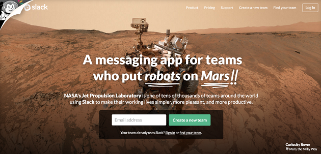
Why It Works: Whatever Slack is doing is certainly working, as the two-year old company has been growing very quickly. When it comes to the design of the messaging app's landing page, however, it is clear to see that the company takes a unique approach. Although a simple site with clear CTAs, Slack uses an image of the Curiosity Rover as its background image and main design element. The reason why this image works for Slack is because it helps build the brand's reputation, as the text on the landing page lets visitors know that Slack is so useful that even NASA's Jet Propulsion Laboratory team leverages the service.
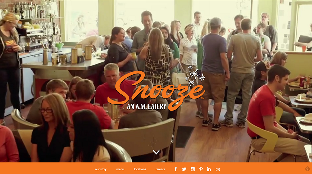
Snooze
Why It Works: Snooze isn't on this list simply because it serves amazing breakfast food, rather it is on this list because of its distinctive "moving"landing page. When arriving at the site, visitors are actually taken inside of the restaurant with a looping video that fills the entire page. Visitors also have the ability to navigate the site with the menu bar featured at the bottom of the landing page, which stands out because it is bold and orange. Furthermore, by scrolling down the site users can learn more about the restaurant, including information about the menu and access to Snooze's live social feeds.
Spotify
Why It Works: Spotify takes the opposite approach to Web design that most take, as the company features a bold background with white copy on its website instead of a white background with bold copy. While the "Get 3 months of Premium" definitely stands out, the purple CTA could be changed to a color that doesn't blend in as much to the company's bright background design.

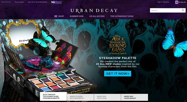
Urban Decay
Why It Works: Urban Decay is a beauty brand known for its bright-colored eyeshadows and edgy products. Since purple and black are both colors that are associated with the brand, the company's colorful website makes sense. Although the brand's landing page doesn't feature much negative space, the company does follow design best practices on its product pages, which feature lots of whitespace as to not distract shoppers from the main objective - "add to bag."

Subscribe to Our Newsletter!
Latest in Web Design

