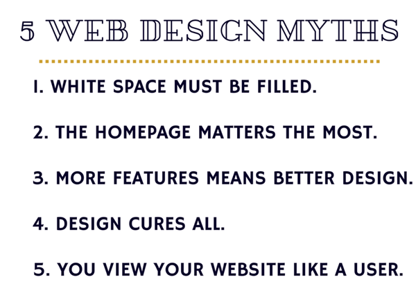
5 Website Design Myths

Have you inadvertently bought into website design myths? It is easily done, but you could be losing out on sales, traffic and other metrics that improve a brand's bottom line.
Website design is at the heart of great user experiences. How your website is laid out, functions, what colors, fonts and images you use can mean the difference between success and failure. Apart from making an eye-catching Web design and balancing a huge amount of information, an effective Web design can improve the perception of your brand.
Therefore, a solid understanding and implementation of a balanced design process should be the motivating force to achieve the results your company desires.
There are various beliefs of what a website should and should not be, and while brands need to customize their websites to meet their needs, the subjective part of design leaves plenty of room for opinions. This column will bust the top five common website design myths, and offers Web design dos and don'ts.
Myth #1: White space on a page should be filled with something.
Fact: The opposite is true. Open space is an excellent way to separate content and give items breathing room for an easier read. It can be overwhelming to try and trudge through a crowded parking lot of content and images.
Myth #2: The homepage matters the most.
Fact: Unless you are going directly to a website, you probably will not land on a specific website's homepage. In fact, due to the increasingly exacting powers of search and paid links that users often click on, customers may never actually see your homepage. Putting all the design focus on the homepage is kind of a waste of time. Having a consistent design throughout your website is more important than having a nice homepage.
Myth #3: More features means better design.
Fact: There are too many websites that make user experience unnecessarily complex because of unnecessary features. Bells and whistles are wonderful -- if they have a purpose. Ask yourself how each feature will contribute to driving conversions.
Myth #4: Design cures all.
Fact: Design is more than colors, graphics, and fonts. It is an experience that facilitates interactions, and provides a function. A great design can help solve difficult challenges, like user journeys and brand experiences. However, design alone will not fix everything.
Content concerns, low traffic, poor engagement or low conversion rates require more than just design. Successful experiences are created by teams -- from editorial to development, and everything in-between.
Myth #5: You view your website like your users do.
Fact: No one views your website like you do. This is a much-too common problem. As owners and employees of businesses, it's easy to assume customers understand and use the same terminology as we do. This is hardly ever the case. Your website needs to communicate with your customers where they're at in the buyer's journey, not where we want them to be.

Web design dos and don'ts
Let's start with things you should do:
- You need a mobile website. Period. Most people now reach websites with mobile phones. Responsive design allows websites to be viewed on different devices, with an emphasis on mobile web development.
- Ask non-technical people to test your apps and sites.
- Use sprites to reduce page load times, instead of using individual image assets.
- Include a "Rate Us" or "Write a Review" component on every app.
- Accumulate a variety of mobile devices with different operating systems to test your mobile properties.
You should never do:
- Ignore SEO. Content should be discoverable.
- Forget analytics. Even simple Google webmaster tools are better than nothing.
- Spam users with update notifications over the same channels you use for in-app functionality. If your app uses push notification or SMS, enable the default app store functionality for update alerts.
- Include a "Rate Us" or "Write a Review" component that pops up even if the user has already rated the app.
Successful Web design must reflect evolving user preferences, needs and expectations. Demystifying the pervasive myths of great design and following the suggested design dos and don'ts will lead to better user experiences and stronger relationships with your brand.
Sam Tribble, Senior Designer, Metia
Samuel brings more than 15 years of experience in UX design to create effective and powerful software and websites as well as captivating marketing collateral. He has a diverse skillset and he has worked in several capacities within the creative field. Sam graduated from the Art Institute of Seattle with a degree in Visual Design.
Subscribe to Our Newsletter!
Latest in Web Design


