5 Noteworthy Designs of 2014

The Web design industry is in a constant state of change, with new trends and techniques emerging every year.
In 2014, for example, the design industry saw a variety of digital developments, from an increased focus on responsive design to a stronger commitment to image-rich styles.
While there are many sites that deserve to be in the conversation about the best website design of 2014, the five featured below provide great examples for some of the year's most popular trends:
Baxter of California
2014 Trend: Unique Menu
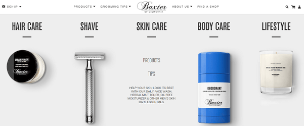
Baxter of California take a unique approach to its navigation menu, as the company uses large product images as icons to represent each menu category. These icons not only draw site visitors' attention, but they also make it easier for visitors to find what they are looking for quickly. Additionally, when scrolled over, each product icon is replaced by a description and relevant calls-to-action for each category, such as "Products" or "Tips."
Imaginovation
2014 Trend: Strong Calls-to-Action
This subscriber-nominated B2B website uses strong calls-to-action to drive conversions. Imaginovation's landing page, for example, features a revolving carousel of hero images that are accompanied by large, red icons with calls-to-action like "View Our Portfolio" and "Hire Us." Moreover, the company's navigation menu also focuses on getting visitors to take action, with another bold icon that allows prospects to "Request a Quote" with just a click.

Text in a Bottle
2014 Trend: Minimalistic Design
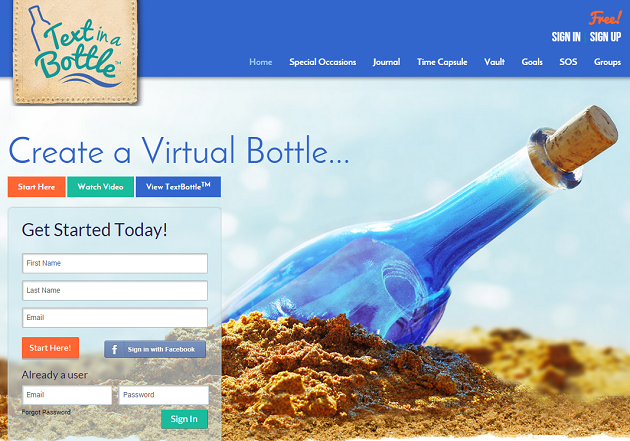
The Text in a Bottle website, which is built by custom Web solution company iStartus, uses a minimalistic design to put an emphasis on the service it delivers. Although the landing page features a bold and bright image, the image isn't considered busy and it complements the main call-to-action of "Create a Virtual Bottle" on the landing page. Moreover, the site is responsive, which allows the company to provide a consistent experience across screens.
Tonda Pizza
2014 Trend: Distinctive Navigation
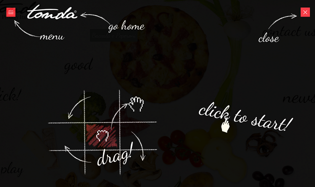
Tonda Pizza is an Italian company that has a stand out website because of its unique navigation. Instead of scrolling to get around the site, visitors are required to drag the screen, either up, down, right, left or diagonal to reach different areas. While this type of navigation certainly won't suite every type of company, it does deliver a memorable and engaging experience to end-users.
USA Today
2014 Trend: Pinboard-Style Content Display
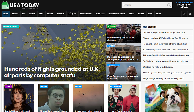
Image-rich designs have been trending for a few years now, driven party because of the popularity of social networks like Pinterest and Instagram. Popular information publisher USA Today has found a great way to leverage this design trend without overwhelming site visitors with too much visual content. The publisher does this by using a pinboard-style layout to showcase its top stories. Plus, in addition to using an image to represent each article, USA Today adds an appropriate tag, such as "People," "Nation" or "World" and headline to the images in order to give visitors more information about articles before they decide to click-through.
What was your favorite website design or design trend of 2014? Let us know in the Comment Section below.

Subscribe to Our Newsletter!
Latest in Web Design


