4 Reasons Your Web Design Is A-OK

It's easy for website owners and those who manage digital presences to get wrapped up in what their site does not have. This is because if they can imagine a bell or whistle, there's a big chance the 'Net offers it or there is someone who can implement it.
The digital grass is, of course, greener on other sites, but there is reason to believe that your Web design is A-OK (and likely better than you think). Let us explore four reasons why.
It Passes Google's Mobile-Friendly Test
Anyone worth their virtual salt understands consumers' propensity toward navigating the Web on their smartphones, which is why they have ensured their site renders properly regardless of the device in which a user is accessing it on. Whether the site offer responsive or adaptive design or an m.dot site, if it passes Google's mobile-friendly test, it's doing alright. Could it do better? Maybe, but the point is, sites that pass Google's mobile-friendly test are not only ahead of the curve (remember more than half of businesses still do not have websites at all), but they are also in the good graces of Google (at least in regard to this requirement), which as of April 21, 2015 will be expanding its usage of mobile-friendly factors in its search algorithm. In other words, businesses without mobile-friendly websites will not remain competitive in Google's search engine result pages, as they will not receive a mobile-friendly label, which will result in SEO repercussions. If there's no other digital improvement made this year, let it be getting a mobile-friendly website immediately.

It Instantly Tells A User What It Offers
Whether a first-time website visitor arrived on a site from an ad or a search result, there's a significant chance that they are very unfamiliar with what the company offers. They may have a slim idea as to what it does, but brands have to sell themselves - and very, very quickly. In fact, a recent Monetate Ecommerce Quarterly report indicates that it's within the first minute of an online shopping session that brands lose 30 percent of their site visitors.
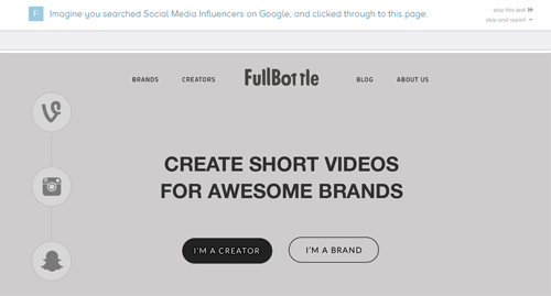
Letting users know what a website offers in about 5 seconds isn't easy. Not only does the website need to have strong, clear copy, but the design cannot distract from the message. Five-Second Test is an online user-testing tool where businesses can upload a screenshot of a landing page or a mockup, set questions they want to have answered and get user feedback. By completing tests for other companies, businesses can earn free responses for their own tests, otherwise plans range from $20-$200 a month. Anyone can head over to fivesecondtest.com to provide feedback for other websites, which can be a learning process all in itself (as they see sites from a user's perspective).
Check out this example test (to zoom in, click on the images):
It Loads Quickly-Ish
Today's website visitors want a website to load in less than 2-3 seconds, yet today's top ecommerce pages do not meet these expectations. In fact, according to 2015 data from Radware, the median time to interact for a top 100 retail site is 5.2 seconds. Radware also reports only 14 percent of the top 10 retail sites rendered feature content in less than 3 seconds. Page size and complexity certainly contribute to these less-than-ideal load times, as do un-optimized images. As with almost anything, its top brands that set users' expectations. This isn't to say companies should give up on decreasing their Web pages' load time (as long load times can lead to higher bounce rates, less conversions and even a hit on SEO efforts), but if they are loading in less time than top retail sites, they are doing better than they think. To test load time, check out Google's PageSpeed Insights or pingdom's Website Speed Test. Keep in mind, however, that top brands do have the benefit of the doubt, as consumers have background information on them.
It Demonstrates Credibility
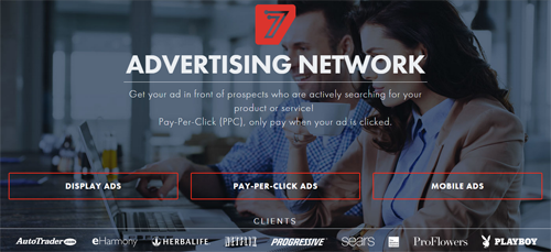
Just like user reviews provide consumers and business buyers with more (and often seen as better) information to use in purchasing decisions, so too do client lists, security seals, testimonials, etc. Brands who let website visitors see these types of social proof at a quick glance are poised for higher conversions, as they are more deemed more trustworthy than what a brand says they have to offer (although it's important to share that too). 7Search.com, for example, provides highlights of its clients list directly on its homepage, adding instant credibility to its services.

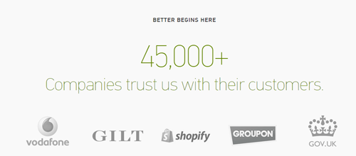
Adding client lists, testimonials and more definitely requires a designer's eye and experience to ensure they add to the message and not just clutter a Web page. Another worthy example is Zendesk, demonstraing (again on its homepage) that more than 45,000 businesses trust it for their customer service needs.

There are certainly dozens of other elements that can indicate to a company that their Web design may be better than they think it is, but those who have mastered these four points are certainly well on their way to digital success. Of course mediocrity is never acceptable, but it's important to remind ourselves that if we care enough to worry and are doing our best to improve our site's design, we're doing A-OK!

Subscribe to Our Newsletter!
Latest in Web Design


