15 Sites for Web Design Inspiration

:: By Jeff Davis ::
There are websites that don't merit a second glance; there are others whose designs will stay with you for a long time. Among these are a few that will inspire you to come up with better designs for your own digital properties.
These are websites that make you want to be a more accomplished Web designer.
These websites take design to a whole new level. They introduce a hot new concept or take an existing trend and twist it to suit the needs of the website or just do what everybody else is doing, but only do it better.
You take one look at these sites and you are interested in knowing more about the message they wish to convey. Let's take a look at some of these sites and see what makes them tick:
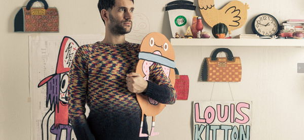
1. The Great Discontent
This site wins full marks for its simplicity. But what helps it stand out and pique the interest of visitors, is its large visuals. This one is an interview site and it follows a specific design pattern. A perfectly composed visual of the person who is being interviewed is followed by the interview. You might think it's not very inspirational, but take a look at the site. You'll know how wrong you are.
2. Stuff & Nonsense
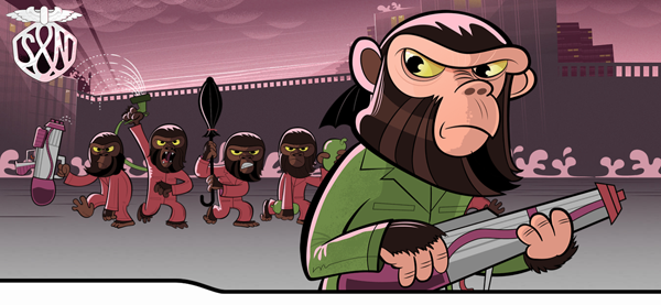
Aside from the chimps, why does the Stuff & Nonsense site make an impact? The answer lies in the kind of typography that has been used; it is different, yet clear and supports the content of the page. The serif font used on the site wins full marks for its ability to make an impression.
Learning: Don't hold back, experiment with typography.
3. Medium
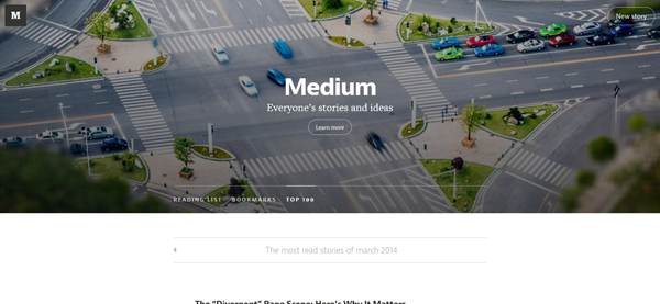
This site is a textbook example of how infinite scrolling must be used. This trend is catching on and does have its strong points. But it must only be used with content that will benefit from such a scrolling experience. This website uses infinite scrolling as a means of engaging visitors and improving their browsing experience. That's killing two birds with one stone.
4. eBay
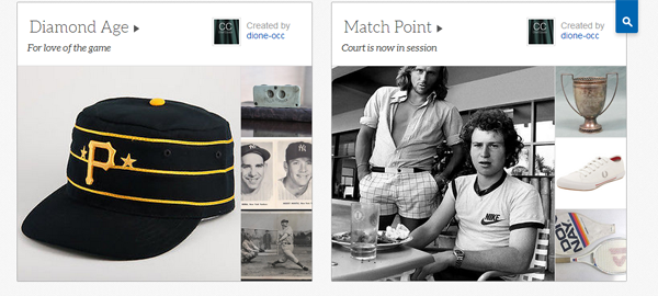
Surprised, why eBat makes an appearance on this list? Look at it - eBay.com looks a lot like Pinterest, with images of varying sizes and items that have been displayed in multiple columns. The pinboard style is a clean, uncluttered design with lots of white space. It's a text book example of how ecommerce sites selling a massive range of products can still make their sites look 'cool and contemporary'.
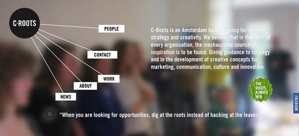
5. C-Roots
This site oozes creativity as illustrated with its uniquely designed navigation that resembles a spider's web. If that's not enough, the inside pages have a unique design of their own. The guys behind the site have just decided to run with their creative instincts and it works.
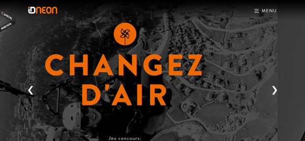
6. ID Neon
This site stands out for its use of monochromatic color theme. The colors of choice are black and orange. It requires a lot of guts and a truckload of creativity to design such sites. They are truly an inspiration.
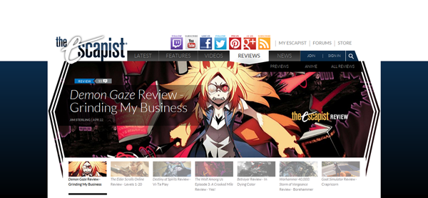
7. The Escapist
There are a lot of things happening on this 'gaming news' site and all of them are good. If you think your site needs to present a lot of information and you want users to make sense of all the information on your site, get inspired from The Escapist.
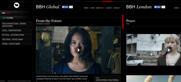
8. BBH Global (Bartle Bogle Hegarty)
This is the site of one of the most well-known creative agencies in the world, and they have offices all over. Rather than having different websites for each location, they've used horizontal scrolling to help visitors check out their work across the globe through a single website. Apart from the fact that the whole website looks like a collage of their best work, it also tells you how horizontal scrolling must be used.
9. Ponto
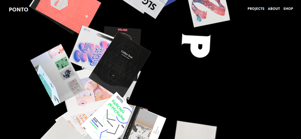
This one represents a design studio and it's the Home Page of the site that is the real inspiration. It is like a designer's table cluttered with project leftovers. Purely for its Home Page, and its focus on its portfolio, this design is an inspiration.
10. Coastal Conservation
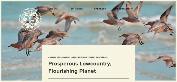
This one is a print-inspired site. When you peruse the site you will be forgiven for thinking you are reading a novel. Basically what you are doing is juxtaposing the look and feel of print onto a website. This is creative thinking at its best. Don't tell me you aren't inspired already.
11. Milkable
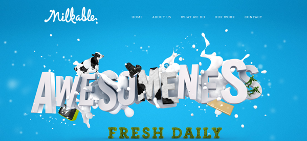
This site uses animation to show in a fun way what the business does. There is some fluid creativity at work here, and it delivers by the gallon.
12. Copywriters of Distinction
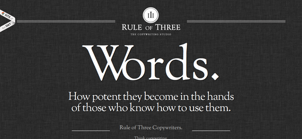
This website uses animation to tell visitors why they need to use the business's services and it adopts the 'storytelling format' to get its point across. It's one of the better uses of animation I have seen, where animation is not only used to create interest and engage visitors but also make an important point.
13. Coin
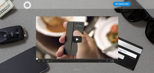
Coin uses a product video in its hero area. That's one of the best uses of video in website design. The first thing that visitors see on the website is the product video. No prizes for guessing they are going to click on it.
14. Creative 9
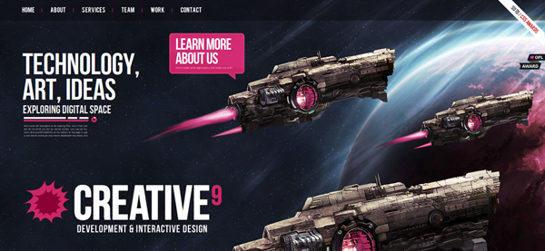
Alright you hate simplicity and want some inspiration to push the creative envelope! I get you. Get inspired from Creative 9 website. The design revolves around a galaxy motif replete with space ships. Super cool colors, graphics and just pure unhindered imagination have helped craft an award winning site.
15. Kickstarter
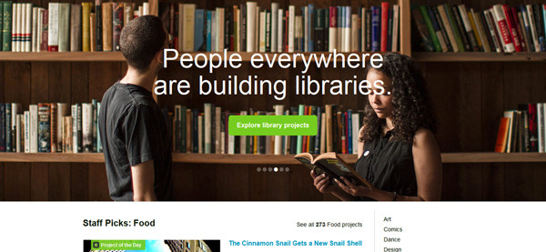
Kickstarter is an example of how you can bake emotions into Web design. It's not only about the visuals but also about the textual content, the colors, the videos, the navigation and everything else you use to create a satisfying visual experience for the user.
Your Turn!
I am sure these 15 sites will help you come up with some extraordinary designs that will see your website figuring on the list of inspiration websites. But, do not stop at these sites, getting inspiration from various sources should be an essential part of your Web designer DNA. Otherwise, you'll only end up bringing forth ordinary websites at best.
Author Bio: Jeff Davis is living in California and currently associated with Quick Laptop Cash – a place for selling a laptop online. He has been in this field for the last six years and is responsible for troubleshooting issues. Interact to discuss projects, technology solutions.
Subscribe to Our Newsletter!
Latest in Web Design


