12 Design Elements Every Site Should Have

With 2016 expected to be the year of more targeted lead generation for businesses of all sizes, your site might need an overhaul.
How can you tell if it does? Take a close look at your analytics. Are people leaving your site without providing their contact information? Are folks abandoning your product pages? If so, your site isn't performing as effectively as it could be.
The good news is that you're in control. You can upgrade your site's design so visitors stick around and reach out to you. Luckily, we've provided you a blueprint for making that happen below. If you hope to maximize your traffic in 2016, your site must have the following 12 elements:
#1 - Intuitive Navigation
Visitors must be able to find what they're looking for when they arrive on your site. If your navigation scheme confuses them, they'll leave.
Menus and links should be intuitive, organized according to a simple hierarchy. Your visitors should know at every turn how to reach every other section of your site.

#2 - Responsive Layout
Expect half of your visitors to view your site on their phones.
Will your site display properly? Will your menus work as intended? Or will visitors be forced to scroll sideways just to see the entirety of each page?
Your site needs to be built with responsive design to perform in 2016. Nothing less will do.
#3 - Slideshow
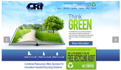
Sliders are ideal for displaying a collection of images and corresponding messages in a limited space. The content rotates, eliminating the need to scroll downward.
The graphics and copy work hard to engage the visitor and compel him or her to click through to the underlying pages.
#4 - Calls To Action
The only reason to bring people to your website is to persuade them to take some sort of action. That might include signing up for your newsletter, visiting a landing page or buying a low-priced product to enter your sales funnel.
None of the above happens without a call to action (CTA).
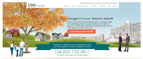
Tell visitors what you want them to do on every page of your site (note the "click here to plan your visit" CTA in the screenshot below). Make sure you have different calls to action for different offers.

#5 - Images That Support Your Value Proposition
It's not enough to explain what your company does and how you can help visitors. Your site needs arresting images that support that message.
That might include graphics showing your product in use. Or it may include showing a satisfied customer. The images should be consistent with your brand and style.
Speaking of branding...
#6 - Strong Branding
Branding is a key part of Web design. Every element of your site should support a cohesive brand experience for the visitor. That brand experience should match their expectations and leave a positive impression that lasts long after they leave.
#7 - Signs Of Authority
People trust authority. They associate it with proficiency, reliability and professionalism. Those attributes make them more likely to buy your products and contract your services.
How can you give your site the air of authority? Mention awards your company has received in the past. Point out how you were recognized for excellence in your industry. Also consider adding a list of clients and using trust seals.
It's not mere bragging. It's smart promotion.
#8 - Social Proof
Your visitors want to know that other people have benefitted from working with your company. Use social proof to demonstrate as much.
Include customer testimonials praising you and your staff. Post case studies detailing customers' success stories. Include social sharing buttons that display how many times your blog posts and other content has been shared in the social channel.
Social proof is powerful. Have you ever wondered why McDonald's claims "billions and billions served?" Now you know.
#9 - Up-To-Date Usability
Usability refers to how easy it is to use your site.
We touched on this concept earlier when discussing navigation (ref. #1 above). But that's just the tip of the iceberg. Web usability goes much further.
It includes whether your site is accessible, whether the information is presented in a clear manner and whether the design meets visitors' expectations.
The tenets of good usability change over time. The elements of good design for 2016 are far different than the elements that worked in 2014. Make sure your site is consistent with the times.
#10 - Hero Image
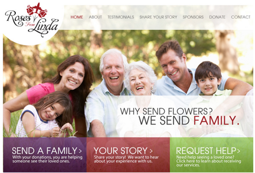
Nothing expresses a concept, message or brand identity as strongly as a good visual. That's the idea behind using a hero image on your site.
Typically displayed as a large header, your hero image speaks to visitors on a different level than your copy. It doesn't take the place of persuasive copy. It complements it.

#11 - Hover Animations
This effect makes your site seem dynamic. As users move their cursors over certain areas of the page, the underlying graphics change.
Use this design element to highlight certain products, provide additional details regarding specific content and enhance navigation. As a bonus, the hover animations will grab the visitor's attention, extending the time he or she spends on your site.
#12 - Links To Social Media
Place social media icons on important pages - preferably in the footer next to your contact information. That will encourage your visitors to reach out to you on Facebook, Twitter and the rest.
Don't dismiss the potential of a strong social media presence. If you're not at least on Facebook or Twitter, you're missing out on a big opportunity to connect with your audience.

Web design is more complex today than it was just a few short years ago. In 2016, your site must appear attractive on more devices than ever while catering to Google's increasingly intricate ranking algorithm. At the same time, it must be optimized to take full advantage of your traffic, converting your visitors to leads and customers.

Subscribe to Our Newsletter!
Latest in Web Design


