The Facebook Timeline Countdown is On

 Seven more days.
The countdown to Facebook Timeline for Pages has begun, which gives brands that haven't already made the switch one more week until the new format is mandatory. That's just seven more days of Timeline transition, and there are several areas that social media managers should be focusing on if they want to get it right for their businesses.
Here are the four most important things to consider, followed by examples of how businesses are already using these new features to better promote their brands:
Cover Photos
The cover photo is the most important aspect of the new Facebook Timeline format. It provides brands with a wide, open space to upload an image - which will undoubtedly be the first impression made upon visitors arriving at a Facebook Business Page. Therefore, it is important to utilize this space in a unique way in order to make your brand stand out and capture visitors' attention. Many brands are choosing photos that best represent their companies such as a logo or staff photo.
The App Section
Directly below the cover photo is where the new app section is located. Although the photo app is mandatory, brands have the option of choosing the three remaining displayed apps that will best represent their business. Some of the best apps to display here are an email list signup option or a shopping section for ecommerce businesses.
Pinned Posts
One of the next big changes, pinned posts, provides brands with the option of pinning an important post to the top of their pages. Many brands aren't utilizing this feature yet, perhaps because it pushes all other content down the page, but it is still a great new way to feature specific pieces of content such as sales promotions or recent milestones for your company.
Highlighted Content
Lastly, the highlighted content feature stretches a specific piece of content horizontally across the page. This feature is particularly eye-catching when used with photos.
Here are some examples from businesses big and small that are utilizing all of the new Facebook Timeline features mentioned above:
The Southern Mac & Cheese Truck
Not only does this cover photo make me particularly hungry (for obvious reasons), but the small business' About section and app section are also being utilized to the company's advantage. The About section provides important contact, pricing and operating-hours information while the app section enables consumers to easily join the company's email list and easily check out the menu.

With a big brand like Olay, consumers wouldn't expect anything less than a professional photo that displays the company's focus - beautiful skin. However, Olay has not only chosen a cohesive design for its app section but is also providing consumers with valuable apps for consulting, shopping and content consumption.

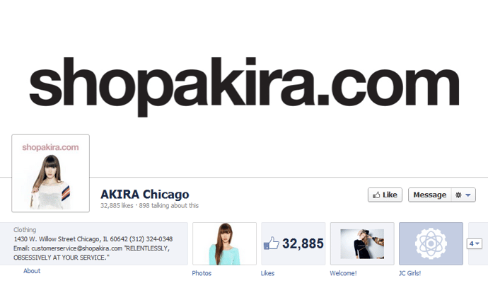
This small business gets straight to the point. By utilizing the cover photo space to promote its website, there is no way that consumers would forget this retail store's URL.
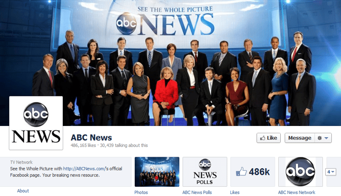
This cover photo's personal approach has been taken by many companies that have switched to Facebook Timeline. ABC's photo displays the company's employees, showing visitors exactly who is apart of the ABC News' team.
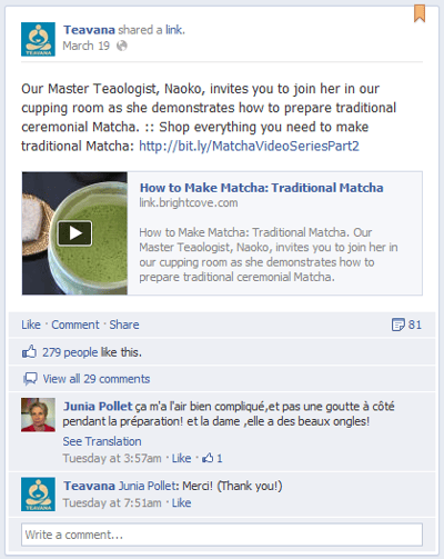
Teavana took the informative approach when deciding which post to pin to the top of the company's Timeline. The chosen post is an informative video that allows visitors to learn how to correctly make Matcha - which is a tea that the company sells.
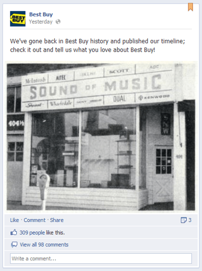
Best Buy pinned a post to let its visitors know that the company made the Timeline switch. By pinning this post, site visitors will be able to see the company's Facebook milestone without having to scroll down the page.
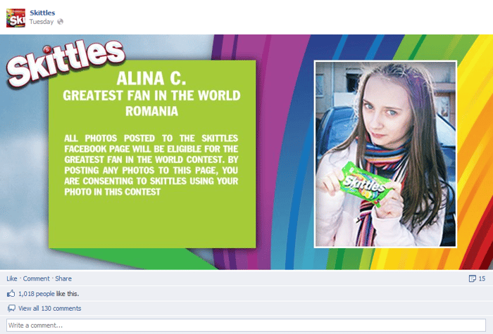
Alina loves to taste the rainbow and Skittles wanted to make sure any visitor scrolling down their Timeline would know who she is! The candy company chose to highlight their greatest fan in the world contest, which is a great way to show the company's appreciation to its fans.
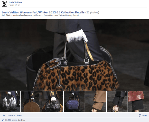
Louis Vuitton's strategy of highlighting their women's fall/winter 2013 collection certainly worked. Without even clicking on the photo album, I already know which bag I want. (bottom row, middle - if anyone is in the gift-giving mood) Good marketing strategy, Louis Vuitton.

Subscribe to Our Newsletter!
Latest in Social Media


