Six Degrees of Social Computing

Creating Relationships on the Web
by Charles Kreitzberg

On the Web, as in life, establishing and maintaining relationships can be tough. But when it comes to Web 2.0, relationships are what it's all about. As a Web professional you want to not only attract visitors to your website but encourage them to return over and over again, to develop a relationship with your site.
Close Encounters of the Online Kind
If you think about relationships in your own life, you quickly realize they are the result of repeated interactions or encounters. Encounters may be brief or extensive and they may be frequent or far between. At any rate, every time you interact with another person the relationship becomes better defined. If the encounter is positive, the relationship is strengthened; if it's negative, the relationship is weakened. The same is true about websites.
Users who feel frustrated, incompetent, or are unable to complete a critical task report negative experiences - most often caused by usability problems and weak content. Your goal is to create positive encounters every time the user visits.
Understanding Encounters
I've come up with a model that helps me give users a positive experience each and every time they visit a website. I call it the "E3T" model, named after four key elements I aim for with each encounter. They are: Engage, Empower, Ease and Trust.
Engage
Although I might try many creative techniques to engage the user, at its core engagement is most simply defined as face time. My goal is to keep the user on the site and encourage them to explore. If I fail in this task, I cannot build a relationship.
What produces engagement is a decision by the user that spending time on the site is worthwhile. I start by asking myself, "why has the user come here?" and then make certain I've made the value clear. As I review each screen I ask:
- Is the screen site attractive and well planned?
- Is the information useful, up-to-date and easy to comprehend?
- Have I created any engagement barriers - long forms, slow servers, boring flash introductions or complicated passwords?
Users who visit a website for the first time decide in seconds whether to explore or move on. So an important aspect of design is to create an initial "stickiness."
Empower
The user has come to my site for a reason: to get information, make a purchase, perform a task, or to be entertained. Empowerment is the payoff - giving users what they came for. When users are empowered they will feel positive about the encounter so it's important to figure out:
- What the user wants from this visit
- How the site can deliver the payoff
- How to make it obvious to the user what actions will produce the desired result
Ease
Ease refers to the amount of effort required to achieve a desired result. When the site is not easy to learn and use, the results are fatigue and frustration and site abandonment. Even if the site delivers important value and users are willing to dedicate more effort to pushing through usability issues, they're likely to feel resentful. Here are a few tips to help ensure usability:
- Avoid "corporate speak" and jargon.
- Ensure all links are clearly clickable and the user knows where a click will take them.
- Don't jump the user to a new page unless it is clear how to get back.
Of course, usability testing - even informal tests - can yield a great deal of information about what needs fixing.
Trust
It's impossible to have a good relationship with someone you don't trust. Many psychologists define trust as composed of four dimensions: competence, predictability, benevolence and honesty. As you design the site, think about whether you have conveyed each of them:
Competence means that the user trusts you to deliver correct information. Recently, I purchased a book from an online seller. I received a paperback copy rather than the hard cover I ordered. A simple error but the result was that I will no longer trust the company to deliver what it promised.
Predictability means that everything will happen as expected and there will be no unpleasant surprises.
Benevolence means that the user trusts the people behind the site to act in his or her best interests. If you recommend products to your users, they must trust that the recommendation is best for them and not just the most profitable or easiest for the company. Hiding customer service telephone numbers may reduce call volume but does little to engender trust. Neither does making it hard for the user to locate the free version of a product in the hope they'll download the paid version. I see both of these techniques frequently.
Honesty means that the user trusts the people behind the website to deliver accurate and complete information. There must not be hidden agendas. For example, users often suspect that product reviews are faked to make a particular product look good and the competition look bad.
Growing Relationships
The E3T model suggests how to design each encounter. However, if you are creating an online community, you want to nurture relationships for the long haul.
Relationships change over time. If you understand how relationships grow and mature, you can design the site to take advantage of the process.
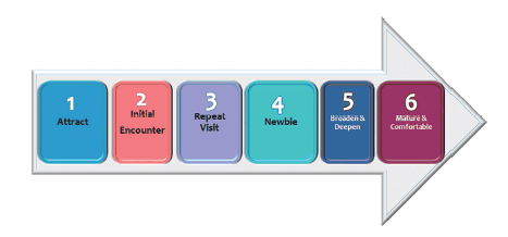
The "Six Degrees of Social Computing" model outlined here helps you think about how to grow a relationship over time.
It can be a lot of work to design for all of these stages but, while applying the E3T model to each stage, the payoff can be big. And even if you only include a few features in each stage, you will improve retention. The table that follows shows the six stages and suggests some techniques for each:
Attract: "This looks interesting. I'll check it out."
Get the person to notice you and make initial visit to your site. Make certain there are no barriers to entry. It should be easy and effortless to get to the site and to immediately feel oriented
- Viral Marketing
- Blogs
- Email Campaigns
- PR
- YouTube Videos
- Advertising
Initial Encounter: "Hey, this is pretty neat!"
Create an initial experience that is engaging, empowering and easy. The visitor must find the home page of the site sticky enough that you have a chance to capture their interest.
- Know your user.
- Get them engaged quickly and deliver immediate value.
- Explain the value and features of the site in easy to understand, high-level terms.
- If possible, get their email or find a way to follow-up.
- Offer truly useful content.
- Offer extreme usability.
- Offer beautiful design.
- Be transparent and trustworthy.
Repeat Visit: "It was worthwhile this time too."
Get the person to come back to the site. Get the user to subscribe to the site and commit to becoming a member of the community. This can be the toughest part since you often don't yet have a good communications channel to coax the user back. You must create a fresh and engaging
experience that delivers enough value to bring the user back.
- If possible, remind the user to return through email or RSS.
- Provide fresh content so the user sees new value and not just a repeat of the previous experience.
- Offer subscriptions to promote repeat visits.
- Offer incentives for returning.
- Demonstrate the depth of community so the user sees value in joining.
Newbie: "I'm having fun. I hope this lasts."
Convert the user to a subscriber. The user must see enough value to be willing to join. Once the user has joined they are "newbies" in the community you have set up. Be sure to welcome them and help them find their way around.
- Support new users and make them welcome.
- Use introductory offers to engage new users.
- Consider rewards and loyalty programs to encourage repeat visits.
- Make certain your community is well-managed so the experience of participating is consistently good.
- Maintain a consistent supply of high quality content.
Broaden & Deepen: "There's a lot more points of interest than I first realized."
Engage the user more deeply in the community. Not all communities have the same amount of "depth." Create and support a loyal user who
advocates for the community and contributes to it on a regular basis.
- Help the user discover new functions and content.
- Consider tiered memberships that reward participation.
- Offer loyalty programs.
- Provide users with self-development opportunities that help them grow.
Mature & Comfortable: "I'm really comfortable here. I get consistent value and don't waste effort."
As the relationship matures, the user should find a comfortable role in the community and participate on an ongoing basis.
- Consider honors and recognition for senior members.
- Provide opportunities for senior members to recruit new users.
Putting it all together
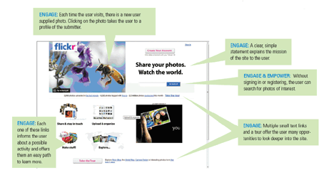
Flickr (www.flickr.com) has become extremely popular, largely because of its easy-to-use interface and social computing tools that encourage user engagement. The illustration below shows the home page display for an unregistered user. Note the simple yet rich design. I've annotated elements of the page to indicate how Flickr connects the E3T and Six Degrees of Social Computing models:
CLICK TO ENLARGE
Another element that relates to trust is found in the "About Flickr" section. Here the site presents photos of the team members, reminding visitors that the site is run by real people and not some faceless bureaucracy. The fact that some of the avatars are eccentric reinforces the idea that the team is creative and the company behind it is not rigid.
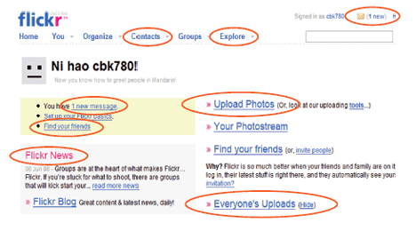
Now look at the page displayed for a returning user. You will see that, like the new user page, the design is built in a way that fits the E3T model. But note all the places where there are opportunities to broaden and deepen the relationship, including communication and networking abilities between members and the site itself.
I've marked an element as engagement if the primary purpose is to get the user to click and go deeper into the site. Search falls under empowerment because a user could use it to locate photos of interest - exactly what they came for.

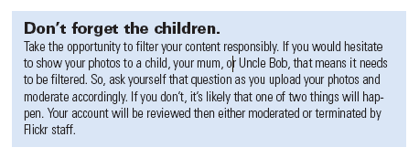
Also on the home page at the bottom, there are a number of links that relate to establishing and maintaining trust. The Flickr Community Guidelines are clean, informal and not written in legalese. Here is an example:
Note the presentation of the content. First they present the requirement "filter your content." Then they provide examples to help the user apply the requirements. Finally they spell out the action that will be taken should the requirement not be completed. The writer has done a good job of conveying the desired information without seeming authoritarian.
Relationships are at the heart of social computing. But they just don't happen, they require some effort. Unlike the wisdom of Kevin Costner in Field of Dreams, if you build it they may not come. Today there are a hundreds of millions of websites to choose from and you need to make the case that yours is worth visiting and spending time with.
The E3T and Six Degrees of Social Computing models can help you not only attract users but develop long-lasting, and fruitful relationships with them. And that's what every Web 2.0, community driven site should aim to achieve.

Subscribe to Our Newsletter!
Latest in Social Media


