New Facebook Layout: Cheat Sheet

2014 marks the 10th Anniversary of Facebook, which means it's time for a little Facebook Botox.
So, how will Facebook look for businesses?
Two-words: Streamlined and consistent.
There are great advantages to the new layout that will help businesses of all sizes.
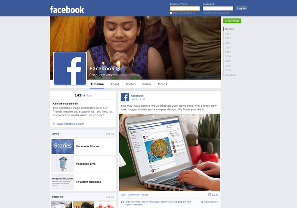
Let's get into the break down of the new layout, which will be the same on desktop and mobile to make a unified experience.
Left: The need-to-know information, which I'm calling Facebook's Sweet Spot.
The top left features all pertinent information for businesses, such as website URL, hours of business, map, phone number, bio. Finally, consumers won't have to click around and go to the about page to find the most important information about a company. In addition, the left side will feature apps, photo albums, videos and pages your business likes too.
Now, you are probably wondering, where are posts being featured?
Well, it's the right side and it is the "right" side. Posts are now streamlined in one location, for easy reading, instead of staggered all over the place.
The overall visual aesthetics are important to the layout. We'll see biggest stories, bigger images and a new font.

If you're managing pages, you are probably wondering what size images will I need to use, so we have an updated Facebook Cheat Sheet.
Cover Photo: No change in size, still 851 x 315 px.
Profile Picture: A small, bigger change: 170 x 170 px. (Since, we have to upload to 180 x 180 px, this probably won't make much of a different).
Timeline Image Size: This is the biggest change, instead of 403x403, the new recommended size is 470 x 394 px.
Facebook provides easier access to navigation and admin tools. Now, regardless of where you are on your page, you can view information about ads running, new likes, unread notifications and messages.
Time will tell as to how this new layout impacts social media engagement and conversions, but take a look at Facebook's layout evolution from 2005-2010 to see how far the network has come.
Matt Hensler is a digital marketing educator and award-winning digital marketer. With both in-house and agency experience, he works with small businesses, startups and Fortune 500 brands, including notable clients like DISH Network, Hailo, USA Today, Wells Fargo, Marriott and Chick-fil-A.

Subscribe to Our Newsletter!
Latest in Social Media


