Facebook Improves Mobile Business Pages

Facebook is helping businesses show off their most important information with an updated Page design for mobile devices.
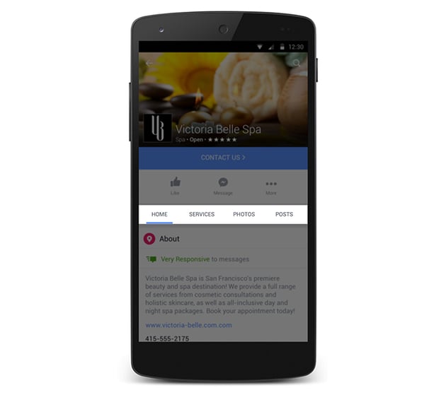
The updated design features new sections, including a "shop" and "services" section. With the shop section, merchants can feature products on their Page, while the services section enables businesses to showcase a list of their offerings. What's more, Facebook notes that it is planning to build additional sections for Pages in the future.
"So now, for example, a spa can add their services menu to their Page or highlight the line of products they sell, helping people get to know their business faster. And understanding the services and products a business offers is key to deciding to work with that business," Facebook states in its announcement.
It is important to note that the new sections are featured at the top of a Page so that information is easy to find. In fact, the updated mobile Pages layout will also feature new tabs, similar to the tabs for photos and videos. According to the social network, the layout will be launched in the coming weeks, and will enable Page visitors to click on the tab associated with the content that they want to view, such as home, services, photos or posts. It is important to note that the home tab is the landing tab for Pages, and will feature highlights of each section so that the most relevant information is presented to visitors as soon as they navigate to a business Page.
Lastly, Facebook notes that its call-to-action (CTA) buttons on mobile are going to be more prominent. In fact, the new design of these buttons is bigger, brighter and featured directly under the Page cover photo. Plus, the social network is testing out new CTAs on mobile, including "Call Now," "Send Message" and "Contact Us."


Subscribe to Our Newsletter!
Latest in Social Media


