Brand Examples: Social Profile Designs on the Big 3 Networks

When social networks first arrived on the scene, most business professionals were entranced by the vast marketing opportunities that these sites offered. Teams spent long hours not only creating content strategies, but also designing their profiles across the Web's top social sites.
However, that starry-eyed feeling isn't as prominent any more, which has left many brands unintentionally implementing a rather stagnant approach to social. And even those brands that do make an effort to switch up their promotions and status updates, rarely change their profile designs. Although consistency can be a good thing, taking the right opportunities to update your cover photo or avatar image can spark new interest from your customers, as they will be more likely to notice and actually read what you post instead of glazing over your brand when glancing through their news feeds.
In fact, brands should take advantage of the opportunity social networks provide to customize areas like cover photos, background images and avatar icons, because doing so can help businesses make a statement, market special promotions and stand out from the competition. But before you open up Photoshop to concoct your brand's newest cover photo or profile image, it is important to make sure that there is a method to the madness as well as consistency across your brand's social handles. For some inspiration, check out the three brand examples (on the big three social networks) below:
Papa John's Pizza
Take It - A Fresh Approach
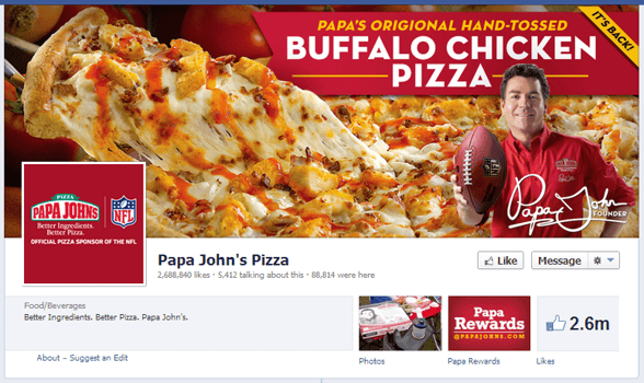
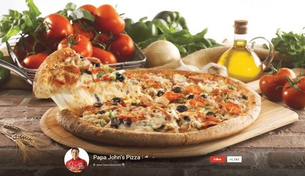
Jumping on the "fresh and healthy" bandwagon that has been spreading across the food industry, Papa John's Pizza features vegetables on both its Twitter and Google+ Pages. This strategy entices consumers to think about all the healthy items that pizza is made out of, such as tomatoes and peppers, rather than the not-so-healthy ones, like cheese and sausage. That said, it is also important to point out Papa John's Facebook strategy, which highlights the company's partnership with the NFL just in time for football season. What goes together better than pizza and football anyway?
Leave It - Google+ Icon
Papa John's Google+ icon can be easily overlooked, as some consumers may not recognize the image of "Papa" at first glance.
Facebook:
Twitter:
Google+:
Petco
Take It - Heartfelt Messaging (and Branding)
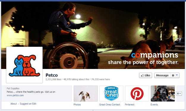
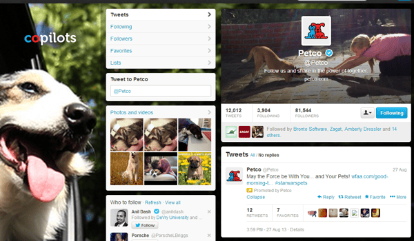
Petco plays up the "Co" part of its name with its "Power of Together" campaign. The pet retailer features the same tagline on its social profiles along with a word that starts with "co" and describes the relationship between pets and their owners, such as "copilots", "companions" and "costars". This strategy not only highlights the company's name, but also tugs at the heartstrings of followers and fans.
Leave It - Blurry Images
Although the idea behind Petco's Power of Together campaign is stellar, the company could certainly improve the image quality for some of its pictures.
Facebook:
Twitter:
Google+:
Virgin America
Take It - Eye-Catching Imagery
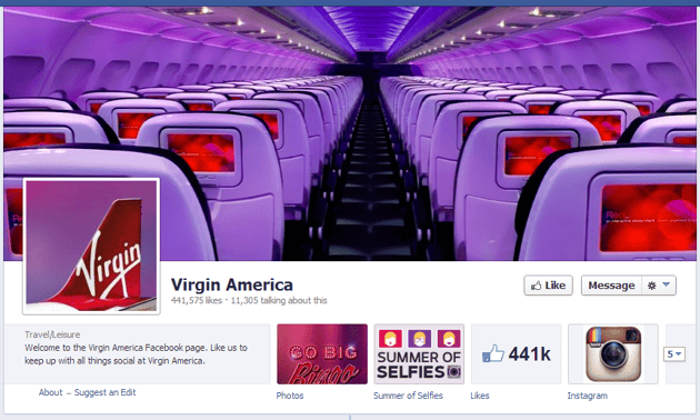
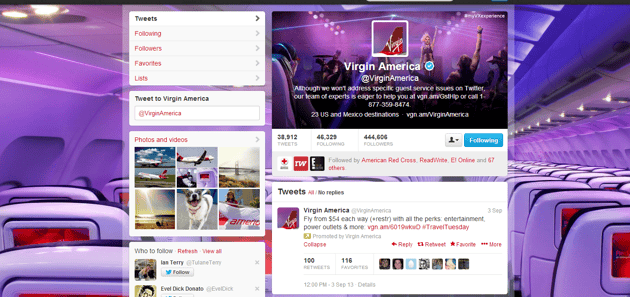
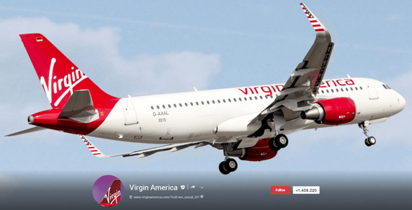
Virgin America takes a typically boring image (the inside of an airplane) and makes it appear stunning with unique perspective and lighting on both its Facebook and Twitter accounts. In fact, the company's Twitter page looks like one giant flying party. Conversely, the company's Google+ page design is very straightforward, including a simple airliner en route to presumably some amazing destination. That said, the company keeps its branding consistent across the top three social networks by using the same avatar image, which features vivid, eye-catching, colors.
Leave It - Missed Opportunity for Hashtag Promotion
The nice thing about hashtags is that they are now a functioning feature on all three big social networks. That said, Virgin America drops the ball on its "#myVXexperience" promotion by only featuring it in the design of its Twitter page. Not only should this hashtag promotion be featured more prominently in the company's Twitter page design, but it should also be displayed on the company's Facebook and Google+ cover photos in order to receive better engagement from fans.
Facebook:
Twitter:
Google+:

Subscribe to Our Newsletter!
Latest in Social Media


