Awe-inspiring Twitter Brand Page Designs and Tips

 While awaiting the imminent rollout of "the new Twitter" to the majority of the social network's user-base, now is a great time for businesses to start considering how to prepare their new Twitter brand page layouts.
Whether Twitter's big update will be your company's first attempt at a brand page layout or yours was one of the businesses that has enjoyed early access, it will be important to have your page optimized before the entire Twitterverse gets a look.
Here are five basic tips (and examples) to help you tweet your way to Web success:
Make a strong first impression with headers
Since headers are going to be the very first thing that users see when they go to your brand page, you definitely want to take advantage of the space as a place to share essential information and establish your branding.
Use the section for your 140-character bio to let the user know what your company is about and what your Twitter account is for, whether it be support, news, contact or all of the above.
For branding purposes, the clear first step is to include your company logo or icon as your profile picture. Twitter also gives you space just below the header to include banner images that can run the length of your Tweetdeck. Here, you should include an image that reflects the tone of your brand or business, as in the example below:

Embed images and video in your Promoted Tweets
Analytical data has shown us that the most important aspect of a Twitter brand page is the Promoted Tweets section just below the banner image. This is where you can share your most important and relevant information with users.
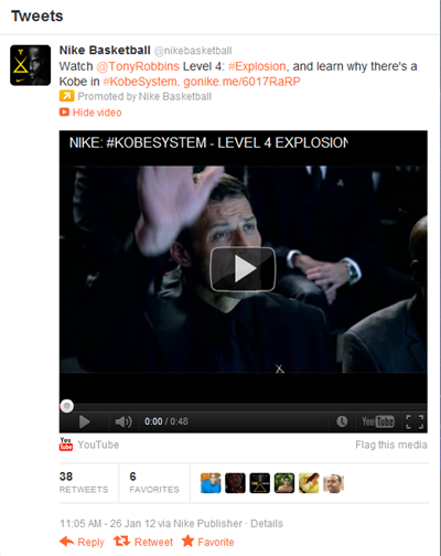
Studies have shown that the best way to do this is by embedding visual images or videos, so taking advantage of this opportunity is important for brands and businesses. With consumers' increasing acceptance and even reliance upon online video, executions like the one below will likely draw the most interest and engagement from users:
Create synergistic designs
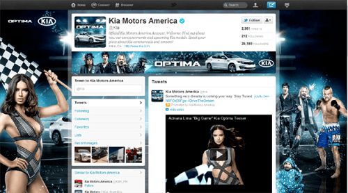
There's a lot of customizable space included on the new Twitter brand pages. Profile pictures, background images, banners and the Promoted Tweets section all offer a place for you to imprint your brand's unique presence. Try to ensure that they all maintain a consistent tone and express the image of your brand, as in the example below:
Use promotional space wisely
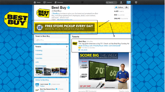
Every customizable part of the Twitter page design affords you space to both impress your brand on the Twitterverse and promote important contests, deals or sales that you offer. This is an opportunity to apply some basic advertising design techniques, announcing promotions in an eye-catching and interesting way. Of course, consumers don't like to feel like they're being advertised to all the time, so use this option sparingly (see below) and only for crucial deals that will help drive conversions. For everything else, just write up a tweet about it.
Make your brand easily accesible
Stay social and network with your brand page by providing users with information on how to best contact your company on the 'Net. Twitter provides you with the opportunity to include a link at the end of your bio, but that should definitely be reserved for your primary website's address. To promote your other social destinations, like Facebook and Google+, learn from some other major companies and include the URL information for these profiles on your background image. They won't be clickable, unfortunately, but they will be extremely visible and helpful for users looking to connect with you through another avenue.

Check out this screencast for more examples of Twitter Brand Page designs!

Subscribe to Our Newsletter!
Latest in Social Media


