6 Tips for Foolproof Social Media Design

Brands spend a lot of time testing and optimizing their social media marketing strategies, yet many are still missing the mark when it comes to social design.
This is a costly mistake as design can have a significant impact on the success of social media initiatives. A brand's social profile has one chance to make a good first impression on prospects, and a profile page that is not aesthetically pleasing or fails to convey the brand's message may deter prospects from hitting "like" or "follow."
Making things even more complicated is the fact that social networks are infamous for unveiling redesigns without much notice, resulting in brands scrambling to optimize their profiles after the fact, like for new image dimensions for cover photos or posts. To ensure that your brand maintains a visually appealing social presence, follow these six tips for foolproof social media design.
The Profile Page
A brand's social profile page is the equivalent to a website landing page - the main directive of both is to deliver a lasting impression to prospects. To be successful, brands must create a social presence that is consistent, attractive and well-maintained.
Tip 1: Create Consistency
Since most brands have a presence on at least Facebook, Twitter and Google+, it is important to establish design consistency across these social networks, at a minimum.
Consistency, however, does not mean that brands need to implement identical designs across social networks. While it is a good idea to stick with the same avatar/profile image (typically a logo works best), brands can switch up their cover photos based on each social network's specific audience and their interests.
For six examples of cover photos that rock on all the major social networks including Facebook, Twitter and Google+, visit wsm.co/6covers.
Tip 2: Know the Right Size
Consistency unfortunately won't go very far if a brand uses low-quality images within posts and profile areas. It's important to know the precise sizes each social network requires for avatar and cover images. Here are the recommended sizes (at the time of writing) for images on Facebook, Twitter and Google+:
- Avatar: 180 x 180 pixels (displays at 160 x 160) Cover Photo: 851 x 351 pixels
- Avatar: 400 x 400 pixels (displays at 200 x 200) Header Photo: 1500 x 500 pixels
- Avatar: 250 x 250 pixels Cover Photo: 1080 x 608 pixels
Tip 3: Keep it Fresh
Brands must find the balance between maintaining consistency on social profiles and implementing the occasional refresh. Although this balance will be different for each brand, some enterprises might want to consider updating branded images during notable events, such as a change in seasons, the launch of a marketing campaign or a company-sponsored conference.
For instance, a youth clothing retailer could update its cover photo for back-to-school season and then again during holiday shopping to accurately represent seasonal merchandise and promotions. Further, while it is typically a good idea to stick with a logo for avatar images, brands can consider adding a seasonal element to their logos, such as a snowflake in December or a heart in February.
Individual Posts
Even when time is allocated to improving social design, many brands still overlook individual post design. This is an even costlier mistake, as posts are more visible on a day-to-day basis than social profiles. To optimize posts for the best performance, brands need to know their audiences' preferences and be familiar with the guidelines of the social networks they are posting to.
Tip 4: Get Visual
We live in a visual world, which makes it unsurprising that visual content like images and videos tend to receive more engagement than text-based posts on social networks.
For example, Twitter revealed in March that tweets containing photos perform the best on the social network, with this type of content averaging a 35 percent boost in retweets. Comparatively, tweets that contain videos average a 28 percent boost, while tweets with quotes receive a 19 percent boost, tweets including a number receive a 17 percent boost and tweets with hashtags receive a 16 percent boost.
Similar engagement metrics can be seen on Facebook, which is why marketers rely heavily on image-based posts. A 2014 Social Baker study found that images are the most common content posted on Facebook Pages, accounting for 75 percent of posts globally. Comparatively, links came in second place, accounting for just 10 percent of posts.
For a list of five Web-based image editing tools to help your brand create picture perfect content, go to wsm.co/editimages.
Tip 5: Follow Best Practices
To achieve success with social, brands must follow the recommendations and best practices for each network.
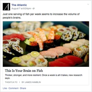
Facebook, for instance, recently shed light on best practices when it comes to publishing posts that contain links. According to the social network, people prefer to click on links that are displayed in the link format (see image A) rather than links included in the caption of a photo. People prefer the link format because it provides an additional description about the link, which makes it easier to decide if it is worth clicking. Because of this, Facebook started to prioritize content that uses the link format in the news feed, which means that brands using this format will have a larger reach.

IMAGE A: The Link Format appears when users paste a link while drafting a post.
Tip 6: Market to Locals
Brands with brick-and-mortar locations also need to focus on designing posts that will grab the attention of local consumers. The best way to do this is by advertising, leveraging location-based hashtags in posts, including images featuring local content within posts or simply inserting local terms prominently within posts. There's a solution that can help.
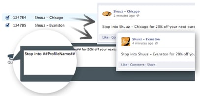
Multi-location brands can create one social message that is automatically tailored to each location (name, address, phone number, etc.) with the Geo-Modifier/Wildcard feature available in SIM Partners' Velocity Social solution (see image B).

IMAGE B: Wildcards inserted into a post will automatically fill in the appropriate content for each location.
Be Prepared
Although there is no way of knowing when the next social media redesign will take place, brands can be prepared by optimizing the design of their current pages. This may be one reason Jay Hawkinson, SVP of emerging products at SIM Partners emphasizes the importance of having a dedicated social team.
"I think the mistake that a lot of brands make is not really having a team that is dedicated to just social," said Hawkinson. "There are so many things going on, so having a team in place that can respond is really critical for any brand nowadays."

Subscribe to Our Newsletter!
Latest in Social Media


