6 Social Media Cover Photos that Rock

With the right cover photo design, brands have the ability to make a statement on social networks like Facebook, Twitter and Google+.
While some brands choose to use this customizable profile space to show off their top products, others decide to use this space to promote current marketing campaigns and discounts. Regardless of the strategy your business takes, it is important to remember that the most successful cover photos are those that are high quality, visually appealing, up-to-date and consistent with a business's already established branding.
For some inspiration, take a look at these six social media cover photos that rock on Facebook, Twitter and Google+.
Facebook Cover Photo: 851 x 351 pixels
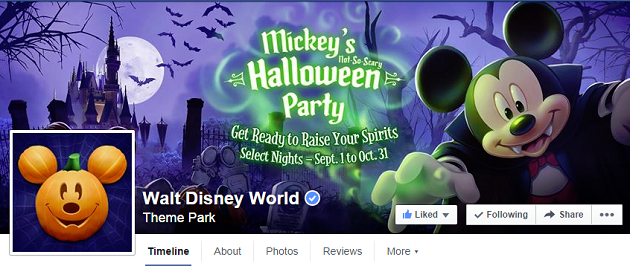
Why it Rocks: Not only has Walt Disney World updated its avatar and cover photo to coincide with the Halloween season, but the theme park is also using its cover photo as a virtual billboard to promote its upcoming Halloween event.
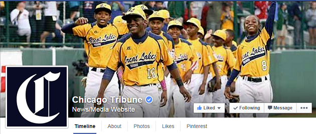
Why it Rocks: The Chicago Tribune makes sure that its post are easily recognizable in the newsfeed by using its well-known logo for its avatar. For the news organization's cover photo, however, the Chicago Tribune decided to put the emphasis on local news stories by featuring the kids of Chicago's Jackie Robinson West, who recently won the Little League World Series U.S. Championship.
Twitter Cover Photo: 1500 x 500 pixels
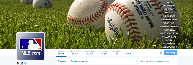
Why it Rocks: The MLB's simple, yet visually appealing cover photo features a baseball to show visitors exactly what its page is about. That said, the real standout of the cover photo is the Twitter handles featured on the right side, as MLB uses its cover space to promote some of the other Twitter handles associated with Major League Baseball.
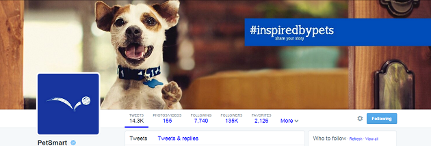
Why it Rocks: PetSmart's Twitter cover photo rocks not only because it features an adorable puppy, but also because it promotes the pet retailer's current social marketing campaign. By highlighting the #inspiredbypets hashtag in a blue box, visitors are immediately encouraged to share their own unique pet stories with the retailer. This strategy is likely to increase engagement as well as boost PetSmart's visibility on the social Web.
Google+ Cover Photo: 1080 x 608 pixels
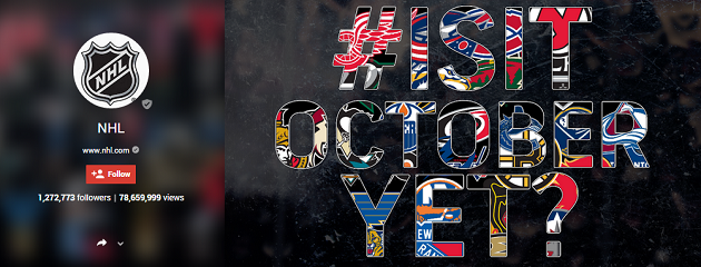
Why it Rocks: If you've been wondering when the NHL's season starts up again, look no further than the organization's Google+ profile. The NHL displays a unique design of an #IsItOctoberYet hashtag with letters that feature team logos from throughout the league.
Starbucks
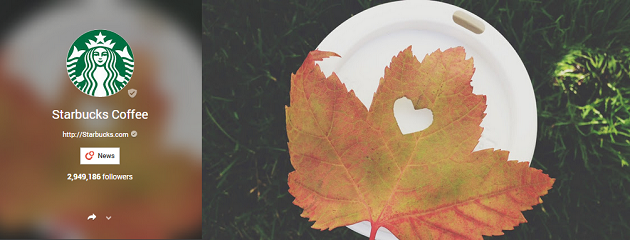
Why it Rocks: Fall is arguably the favorite season of coffee lovers. Not only does a warm drink help make the cooler air more tolerable, but favorite seasonal flavors like pumpkin spice also make a comeback during September and October. Starbucks uses its cover photo to welcome the new season in a simple, yet powerful, way. This is done by featuring a colorful leaf with a heart cut out, which is laid on top of a Starbucks' coffee cup.

Subscribe to Our Newsletter!
Latest in Social Media


