5 Twitter Profile Design Inspirations

While many brands couldn't wait to get their hands on Twitter's new, image-rich profile design, others have been a little more hesitant to make the switch.
This is because the new profile is a pretty big departure from the previous design, meaning that brands will have to take some time to modify their presence on the social network. The design features a slightly bigger (400 x 400 pixel) profile image and a much larger (1500 x 500 pixel) header image. Moreover, the design highlights users' best tweets and allows for tweets to be "pinned" to the top of the profile page.
Through the new design and its features, brands are able to offer a more visually engaging experience and have more space for promotion initiatives. Some brands, however, need a little design inspiration before committing to the new layout. As a starting point, consider the five design strategies below:
Walt Disney World
Strategy: Bold Branding
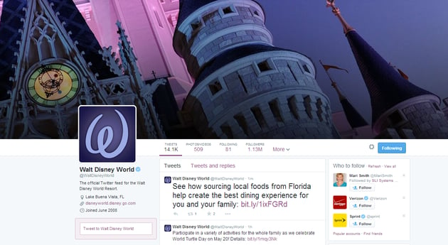
Walt Disney World took full advantage of Twitter's bigger header space by featuring a close-up image of its iconic castle. The colors used in the header image work well with the brand's profile image, providing a consistent and visually appealing experience for visitors.
Amazon
Strategy: Promotion Powerhouse
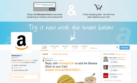
Amazon is using Twitter's header space as a virtual billboard to promote how consumers can use its new hashtag shopping feature. Furthermore, Amazon uses the social network's new Pin technology to further promote its hashtag feature, as the company has pinned an #AmazonCart tweet to the top of its timeline.
Sports Illustrated
Strategy: Content Showcase
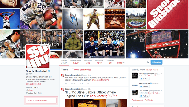
As an information publisher, Sports Illustrated decided to use its new header space to showcase some of the content that it covers. This strategy enables visitors to learn more about the publication with just a quick glance, which helps them make the decision of whether or not to follow the brand.
Udi's Gluten Free
Strategy: In-Your-Face Contest Campaign
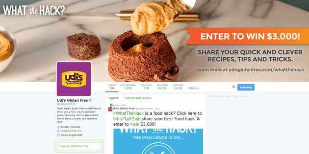
Similar to Amazon, Udi uses its new, larger header space as a promotional tool. Instead of promoting a new product or feature, however, Udi's uses the space to promote a contest. Plus, the company attracts eyes to its message with an orange banner that highlights a $3,000 prize. Udi's also uses Twitter's new Pin feature to promote its contest further.
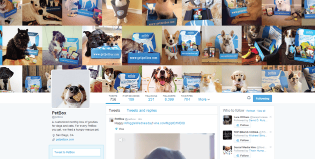
PetBox
Strategy: Showing Off Satisfied Customers
PetBox leverages "woof of mouth" to market its brand rather than word of mouth. To do so, the company features dozens of satisfied customers (the furry kind) in its header space, which shows new visitors that the company's products aren't just for dogs, but for cats too.

Subscribe to Our Newsletter!
Latest in Social Media


