Engage Shoppers with Enhanced Site Search

When people shop online, they're usually looking for the quickest route to the items they seek - whether they have lots of time to browse or just a few minutes.
Since most shoppers go to the search box to find what they want, delivering accurate, relevant search results is one way to satisfy busy shoppers. However, a fulfilling shopping experience goes beyond just relevant search results; in order to fully engage your visitors, you need to improve the overall user experience.
You can increase the likelihood of shoppers making purchases by adding features to your online storefront, which showcase your products in a visually attractive manner, and makes it easy for shoppers to hone in on the details they're interested in, in as few clicks as possible. By providing them with a positive (overall) experience, you also increase the likelihood they'll return.
Below are some practical ideas for helping shoppers make easier buying decisions through added site features.
Provide Fast Info with Quick-View Windows
Increasingly, shoppers view site search as the online equivalent of scanning a rack of merchandise in a realworld store. They're trying to collect as much information as possible about their prospective purchases without having to click through too many pages, or back up to the search results, if the item wasn't what they wanted.
Quick-view or quick-look windows can facilitate this process. They work by showing buttons that hover over product images in search or category pages, or appear just below a product image.
When shoppers click on the button, they can view a window with essential product information. For instance, a picture they can enlarge, a short description, any available product ratings and "Add to Cart" buttons. It's very much like a product minipage.
If shoppers are viewing a quick window and want to get back to the search results page, they simply close the window, instead of having to click back several pages. Quick-view windows can also increase conversions, because they allow shoppers to buy a product and even add it to a favorites list without going to the specific product page.
Save Shoppers Time with Stock Status Updates
It's annoying for online shoppers to find the product they are eager to buy, drop it into the shopping cart and click on the "Checkout" button - only to find out that the item is out of stock. Unfortunately, this is still a common scenario on many retail websites, even big-name brands, especially if they are using less-than-robust homegrown site search or search that was provided as part of an ecommerce platform. Shoppers will be less prone to such disappointment if you add stock information to the beginning of the search process, giving your customers the opportunity to view similar products that may be more readily available.
One approach is to place stock updates within search listings, so visitors can choose to only see instock items in the results, or rank in-stock items higher than out-of-stock items. You can also add a refinement, which allows shoppers to select whether they want to see out-of-stock products or not. If you do display outof- stock products, make sure to include information about future availability.
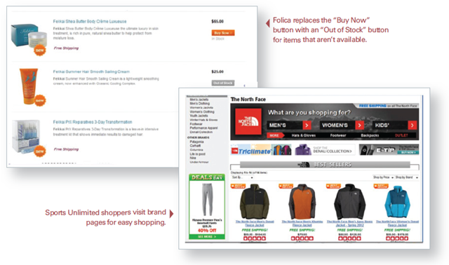
You should also think about how you'll display stock information, and how you can help customers recognize when a product is out of stock. For example, hair care retailer, Folica, places a stock status notice in a highly visible location, next to its "Buy Now" button. However, when a product is out of stock, the "Buy Now" button changes to "Out of Stock" and is gray instead of orange. These changes provide a helpful visual reminder for shoppers who are quickly viewing search results (see sidebar).

Encourage Brand Fans to Shop More with Hybrid Search/Category Pages
If your online storefront includes name brands, you can use hybrid search/category pages to display more of that brand's products and to encourage sales for shoppers who prefer searching by brand names.
Hybrid search/category pages are like a store within a store. They can include features that you would usually find on a category page, such as a large product image, text about the brand or the category, promotions and news articles. Sports Unlimited takes this approach for some of its bigger brand names, such as The North Face, an athletic clothing brand (see sidebar).
When shoppers search for The North Face and reach this page, they not only know they're in the right place because of The North Face branding, but they can also begin shopping within categories such as men's or women's clothing or by clothing type. If they don't immediately find the product or category they seek, they can browse popular products within the brand name. They can also apply search refinements - for instance, they can filter a search by sport or price.
One of the most popular uses of search category pages is for gift guides. You can compile a group of related products, such as items less than $50, or products relating to a holiday, and place them under a special header with seasonal images.
Make Search Results More Visible with Infinite Scrolling
Infinite scrolling is used on sites such as Facebook and Twitter to show users more information without requiring extra clicks. When website visitors scroll down, additional info, such as more tweets or additional Facebook updates, appear automatically, rather than forcing a user to click on a page number or a "Next" link.
By adding infinite scrolling to your site, shoppers can view more search results without having to make extra clicks. Hurried shoppers might not take the extra step to click through to a second page of results - they'll think that if the sought-after product isn't on the first page of results, it won't be on the second page either. Infinite scrolling allows search results to simply show up on the screen, which means customers are more likely to keep looking and keep shopping.
About the Author: Terry Costa is the vice president of marketing for SLI Systems, responsible for global marketing efforts as well as for driving growth of SLI's search technology and services in the ecommerce and publishing industries.


