The Importance of Monitoring the Mobile User Experience

You've just launched your app after many hours, nights and weekends spent with your development team. The downloads start trickling in, and then wham! Users are downloading your new Sporting News app by the hundreds. By the second week you have more than 3,000 downloads. Downloads is a very important metric, but it doesn't give you the entire picture. More so, once you have all these downloads, then what? If you see your users aren't returning and becoming active, then what's the point? What is the problem? It is most probably that your app is providing a poor user experience (UX). The only way to identify the root causes of users not returning is by monitoring their experience from day one.
The Core of Your App: UX
There are hundreds of thousands of apps out there, but only a handful rise to the top of the charts. You need to ask yourself why. What makes them stand out in the app pack? Creating a solid app that serves users' needs is part of it. But there are lots of apps that do a lot of the same things. If you take the time to download some of these apps to give them a test drive, you'll notice a strong trend.
The most popular apps have amazing mobile UX. You'll see it within the first few seconds after launching. An app with solid UX will keep you engaged in those first few seconds and beyond. Great UX takes users to a place where all their needs are fulfilled, where their experience is guided seamlessly by their journey on that small screen. Users never need to guess where to go next. This first time use is when app developers want to onboard users and make them active ones.
Think of onboarding as a ramp going onto a highway. You want to make it as smooth as possible with no roadblocks or bottlenecks getting in the way. The onboarding experience is one of the most important elements of your app's success. The saying you only have one chance to make a first impression looms large over customer acquisition. People don't have time. They want to get what they want smoothly, without any friction. If they encounter any obstacles during their first time use, your app most likely will just be another unused app on their smartphone and at worst deleted from their device.
Constant Monitoring
It is important to monitor and analyze the user experience from day one during this initial onboarding period and beyond, in order to increase user engagement, retain users convert them and if your app is set up for it, increase monetization. Analyzing the user experience is paramount in the context of all of this.
You check your reports and your returning users. It does not look good. For this reason, you must be constantly monitoring the user's experience and behavior. Are users dropping out when they reach a certain screen? Do you see them tapping on an image they think is a call to action, which is just frustrating them? Is the mandatory tutorial too long? Are people dropping off after the seventh screen when they have five more to go? Is the registration process a hassle? These are all things that are UI related and that you can monitor in order to devise an app optimization strategy that will retain your users and keep them active. Remember, UI is a part of the overall UX. It's all about monitoring, analyzing, refining and doing it all over again. It will only get easier with time.
Figuring out the Why
There is no magic answer to any of this. Using a visual mobile analytics tool will enable you to understand the why behind your users taking certain actions (both good and bad) by providing insights into the mobile UX. This type of analytics goes beyond what traditional analytics tools, such as Google Analytics provides. It goes further than just giving you numbers and focuses on the why, so the optimization of your app UX won't take any guess work.
For example, you notice that users are placing a bunch of items in their shopping cart and just as they are about to check out, they're abandoning the entire cart. Google analytics will only show you that the checkout screen has a high drop off rate. Via visual mobile analytics you understand why, as you discover that this screen contains unresponsive gestures. Users tap on the "Buy Now" button, but the app doesn't respond, causing frustration which leads users to abandon the checkout process. Making your "Buy Now" button responsive will result in a decrease in cart abandonment and an increase in sales.
By investing in a visual mobile analytics tool, brands can monitor the why behind user actions and optimize where needed. For instance, user recordings are actual recordings of a user's actions in real-time. The feature allows companies to see how users are using their app through their own eyes. Other features some visual mobile analytics tools provide are touch heatmaps (to see where people are tapping, swiping and pinching) and real-time reporting.
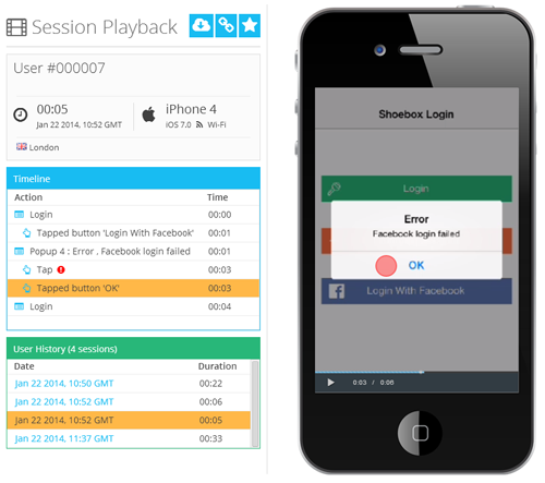
In designing a killer app, it is important to consider the UX and how it contributes to providing a smooth and engaging mobile user experience. It should be both a combination of intriguing content combined with cutting edge graphic design. Using a visual mobile analytics tool will only help you reach your goal of creating the app of your target audience's dreams.
Alon Even is VP Marketing at Appsee Mobile Analytics. His areas of expertise are online marketing, mobile analytics and mobile UX. Alon is experienced with the app optimization process for delivering increased engagement, conversions and in-app monetization. You can connect with Alon on LinkedIn and on Twitter.
Subscribe to Our Newsletter!
Latest in Mobile Marketing
