Follow the Mobile Leader

The mobile channel is redefining digital initiatives. In fact, 80 percent of marketers using mobile believe their efforts on the channel do or will provide a return on investment, according to the 2014 State of Marketing report from ExactTarget, a Salesforce company.
Despite marketers' optimism, the same report indicates that less than a third of marketers are actually using some of mobile's most-promising capabilities like location-based functionality. Far fewer are utilizing mobile push notifications - failing to capitalize on 48 percent of U.S. shoppers who would be receptive to receiving messages and promotions to their phones based on their in-store browsing behavior, according to data from Usablenet.
To make mobile work, strategies must be put in place that address mobile's unique possibilities and the development, promotion and analysis of the mobile Web - anything less will come up short. In this month's feature article, discover several mobile Web strategies that are providing rewards to today's most successful enterprises.
HEAD OF THE LINE
The mobile Web is hyper-competitive. When looking at the application market alone, of the world's 19 million software developers, 8.7 million are now writing apps for mobile devices. Many of the enterprises who have already gotten to the front of the digital line, per say, are those who have been working on their mobile Web strategies for years - designing, analyzing and optimizing for smaller screens.
Just like in the children's game Follow the Leader, savvy marketers, designers and business owners are mimicking these leaders' actions. Brands not following in-line or adding to the mobile industry can quickly find themselves out of the game.
DESIGN & RELIABILITY
If there were ever a time for companies - retail businesses in particular - to think about their mobile design, it's now. Mobile site traffic accounted for 38.2 percent of website visits in March 2014; more than double that of March 2012. As a result, in its 2014 U.S. Online Retail Holiday Readiness Report, IBM predicts mobile will account for 20-plus percent of site sales and more than 43 percent of site traffic in Nov. 2014 - the official start of the holiday shopping season.
Knowing this, IBM advises retailers to pay attention to both device type and operating system, to better focus their mobile app and analytics investments, while ensuring a flawless customer experience between devices and operating systems. Easy enough, right?
The Need for Speed?
The mobile Web needs to be faster. According to Google, all above-the-fold content should render in less than 1 second; anything more will result in a poor user experience.
Despite this, some of the most well-known brands take much, much longer to render completely. Keynote's Mobile Commerce Performance Index shows Sears' mobile site loading in 2.33 seconds, Walgreens in 4.95 seconds, Walmart in 10.9 seconds and so on. Since Google and your users may not be as forgiving with your site, check out, "5 Ways to Speed Up the Mobile Web."
The Three Amigos: Optimized, Responsive and Adaptive
When designing a mobile experience, some popular advice is to focus on the user, not the device. That said, a user's experience is affected by the type of device he or she is using - requiring attention be given to the device that is in his or her hands.
This has, of course, given responsive Web design (RWD) digital legs, as the approach allows Web pages to adapt to a device's screen without compromising functionality or aesthetics (read: "Responsive Web Design Simplified"). To add to its benefits (see 10 plus reasons to go responsive), RWD is strongly recommended by Google as the search engine can crawl one URL rather than multiple. (For example Nordstrom.com also has an m.nordstrom.com URL for its mobile users.)
Experts like Joelle Kaufman, head of marketing and partnerships for BloomReach, and Carin van Vuuren, chief marketing officer at Usablenet, warn that businesses need to understand that responsive design isn't going to answer all of their mobile issues.
What responsive Web design often lacks is a focus on creating an experience that is based on the goals of users per each device. For example, through its data, a company could see a large portion of its mobile traffic converting (whether that's phone calls or directions) and customizing its mobile experience based on particular goals would be much more complex with responsive design. The reason is because RWD minimizes many Web page elements and doesn't necessarily "optimize" them. The same could be said of tablets. While mobile phones are often used to research products and for on-the-go searches with local intent, tablets are primarily used when connected to an at-home Wi-Fi network (earning the couch-computing label). In fact, in a 2014 whitepaper on the subject, Usablenet indicated that 72 percent of consumers use their tablets primarily at home, either while watching TV or in bed at night. It should be obvious by now that at-home users require a different experience than on-the-go ones.
In the same report, Usablenet advised that, "It is a mistake to treat the tablet as a large smartphone or a small desktop computer; the tablet environment must be understood and exploited on its own merits."
Creating device-specific experiences can quickly cost a company - in both time and money - but the path toward Web supremacy is likely including a bit of both responsive and adaptive design based on a company and its users' goals and experiences. For the unfamiliar, when Econsultancy approached the subject, Stuart McMillan, deputy head of ecommerce at Schuh, defined adaptive Web design like so, "In many ways, adaptive is not dissimilar to a mobile specific site, in that the server delivers different content to different devices. Where it differs is in the logic used to determine which devices get which content."
Perhaps, only when more companies realize the benefits of using both responsive and adaptive approaches will users stop switching from device to device because of user-experience shortcomings.
"Can retailers have their cake and eat it? They absolutely can," said van Vuuren. "They should approach responsive as they see fit but remember to build with flexibility in mind. Bring adaptive pages into their sites and go for the tools that enable marketers to do what marketers do - changing content as many times as they need to."
J. Crew is a good example of a retailer that offers the best of both worlds. Its mobile site is 100 percent designed for mobile users. They do not use a responsive solution, but they do offer responsive checkout. What does this mean for the end-user? It means mobile users can have an experience that is uniquely optimized for their devices - everything from navigation to calls-to-action to store locator - but if they get interrupted and aren't able to complete their purchases, then the checkout experience on their desktops (when they log on later) will be consistent with what they encountered in their earlier shopping experience. This is because even though the website itself is optimized for the particular device being used, the checkout is responsive and the handoff between the two is made very easily, according to van Vuuren.
Whether a business chooses optimized, responsive or adaptive Web design (or a combination), the important thing is to make a decision. Companies not offering any sort of mobile Web experience will lose out on significant revenue. Want to know how much? Check out the SkavaOne Calculator which lets users input data to calculate how much revenue a bad (or non-existent) mobile site is costing them.
Test the Best Experience
Use tools like BrowserStack, Browsershots or CrossBrowserTesting to make sure even customers using unpopular devices are getting the best experiences.
Not Sophisticated - Just Smart
Part of offering a smart design is ensuring the mobile Web experience is as natural as browsing in-store with a sales representative. This, according to Kaufman of BloomReach, means businesses should make personalized suggestions and navigation intuitive as opposed to having a bunch of rarely used bells and whistles - focusing on smart mobile experiences, not sophisticated ones.
Neiman Marcus provides the second example of a mobile leader whose mobile Web development, promotion and analysis is one to mirror because it identifies users across platforms and is able to tailor an experience for each shopper - meaning, even if a shopper follows the typical cross-device purchase path (research on mobile or tablet and purchase on desktop), Neiman Marcus will provide a seamless and consistent experience from start to finish - even if he or she isn't signed in.
Using BloomReach Search, Navigation and Personalization (SNAP) service, the luxury retailer is able to identify a user across platforms by algorithmically analyzing and matching with statistical certainty behavioral patterns, geo-data, time of day, products viewed and other factors. (Other companies offering predictive analysis include Custora, SAP, etc.)
For example, say a consumer is a semi-regular online shopper of BloomReach customer Neiman Marcus - often shopping for men's shoes and ties. He was browsing on his phone one evening on the Neiman Marcus mobile site for men's Gucci loafers. Often gravitating toward black-colored size 10 shoes, he clicks the "More Like This" and sometimes clicks other product pages. Then, that week he continues the experience on his desktop, visiting similar pages. BloomReach SNAP would recognize this user and begin coupling the experience across devices to further "test." This would result in personalized navigation and filters, product suggestions and ranking, etc., specific to that consumer. If the coupled experience indicated that the users were unlikely to be the same (which is a low probability), the experience would be decoupled, according to Kaufman of BloomReach.
J. Crew and Neiman Marcus are two solid examples of how a smart and reliable mobile design can help with an organization's acquisition and retention efforts, as, according to Paige O'Neill, chief marketing officer at SDL, it is vital for organizations to ensure channels are so connected that they become irrelevant, placing the focus on delivering true omnichannel engagement.
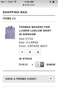
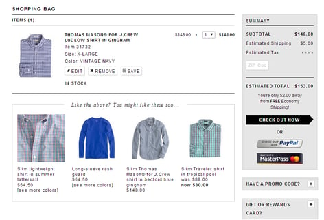
As a signed-in user switches from mobile to desktop, his shopping bag follows him, and he is presented with a responsive check out despite J.Crew's website being optimized for mobile specifically.
Acquisition & Retention
Internet professionals don't even need to look far to know the influence that mobile has on everyday users - they just need to look for their own smartphones, which are likely within arm's reach. An International Data Corporation (IDC) research report (sponsored by Facebook) found that 79 percent of smartphone users have their phones on or near them for all but up to two hours of their waking day - that's in stores, at work, in the car and so on.
There may never have been a greater time to be in the acquisition and retention business than now, because mobile phones are a near-constant connection to end-users, for those Web-based businesses willing to try.
Beacons to the Rescue
As previously mentioned, mobile Web users are more than willing to get notifications from businesses if it means more personalized experiences or discounts on items they are already considering purchasing. For the first time, according to van Vuuren of Usablenet, retailers are embracing mobile in store. Last year around this time, merchants were scared of showrooming - the act of consumers researching an item in-store and buying at a discounted price online - but now they understand it's something to embrace not run from, because the practice can improve both acquisition and retention efforts. Serving up an irresistible offer that feels personalized will be a big conversion mover this holiday shopping season, predicts van Vuuren, and that may start with beacons at physical store locations - complemented by mobile Web technology.
Swirl is a leader in the beacon space and the way beacons work for its clients is a simple process. Swirl's mobile client SDK can be added to existing mobile apps and then in-store indoor positioning beacons (some look like ordinary rectangle boxes while others look like smoke detectors) are set up in any store location. The Swirl platform leverages Bluetooth Smart and Apple's iBeacon technology to deliver targeted content and offers to consumers based on their specific in-store locations or in-store behaviors (like a person is spending a lot of time in the dress department or standing in front of a store display and using his smartphone to browse the Web - see image for more detail).
Powered by Swirl, Hudson's Bay and Lord & Taylor became the first major department store chains to roll out beacon technology in North America. Just in time for the holidays, the two retailers will automatically deliver branded content and personalized offers to in-store shoppers through an array of company-owned and third-party mobile apps.
Feeling App-Y
Perhaps, with the exception of Target's Cartwheel app, a lot of retailers haven't hit it out of the park with experiential apps, but that doesn't keep many companies from trying as Flurry reports that apps command 86 percent of the average U.S. mobile consumer's time, or 2 hours and 19 minutes - leaving just 14 percent of a consumer's time spent on the mobile Web.
Van Vuuren of Usablenet says that as mobile sites become more complex with more functionality, there are fewer reasons why a company needs a branded app. There are some compelling use cases for apps when users want to come back and experience something again and again like, for example, Hard Rock's app which focuses on its Hard Rock Rewards program.
Retailers see higher conversions when they specifically detail the use case that they will deliver - knowing what they are asking customers to do on their mobile sites versus what they are asking them to do in their apps.
An alternative is to create a presence on already-established apps, like TheFind, for example. TheFind delivers a comprehensive shopping experience, putting 500 million products from 500,000 stores at a user's fingertips - they call that the entire shoppable Web and users can easily access it whether they are on their desktop computers, mobile phones or tablet devices.
For retailers, TheFind is one of the largest independent shopping traffic sources available. In June 2014, TheFind launched its retailer advertising program, which provides merchants with options to improve search rankings as well as increase and diversify qualified shopping search traffic. The new program enables retailers to increase conversions and visibility for promoted products and supports both cost-per-click and revenue share-based models.
Additionally, as part of its search algorithm and relevance-based ranking, TheFind shows shoppers trending products that are prioritized based on Facebook likes or by analyzing its traffic patterns.
TheFind is just one of many companies realizing that mobile is intrinsically social, as mobile users are spending most of their time in social apps - opening up many opportunities for companies to acquire and retain via both mobile and social. Take PagePart as an example.
When it was launched by Constant Contact Founder Randy Parker, PagePart solely focused on building mobile sites for small businesses by pulling information directly from their Facebook pages, which 30 million already have (according to the social network). Today, PagePart has turned a big part of its attention toward helping that same audience run targeted Facebook ads - while still helping small businesses look good on mobile - to increase the chances of them being found on the world's most popular social network. In short, PagePart is working with Facebook to simplify social advertising for small businesses so they can reach local, mobile users.
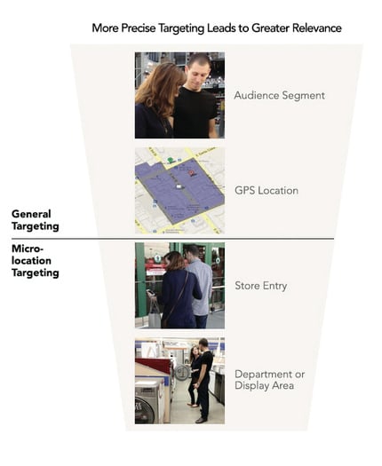
With Swirl, retailers like Lord & Taylor, Alex and Ani and others are delivering more relevant and personalized mobile experiences based on shoppers' exact locations - like entering stores or standing in front of in-store displays.
Analytics & Optimization
It's too easy to drown in all the data points that seem relevant and important to a company's mobile Web strategy. Turns out, often companies have a mobile data problem, not a design problem. This is why Kaufman of BloomReach says that companies should focus on incorporating data that can collectively and individually analyze and constantly improve the user experience.
Kaufman continues that mobile sites should be optimized for experience, not just for conversion. Almost every company can see the dramatic increase in traffic to their mobile sites. For example, after hiring California-based IdeaWork Studios to rebrand its site, Southern California Builder Allen Construction saw 30 percent of its traffic coming from mobile (which it likely wouldn't have tracked before). It needed to educate its potential customers coming from all devices, so IdeaWork Studios chose a responsive strategy, allowing all user subsets (desktop/tablet/mobile) to utilize the same website, but track the customized resulting for each.
Companies need to optimize for what customers want to do on their websites from their different devices, but what metrics are available to make these crucial business decisions? From clicks and conversions to swipes and time on site, learn how to create a mobile Web strategy based on the data.
THIS WAY TO THE TOP
The gap between where marketers and the companies that pay them think their mobile strategies are and where consumers think they are is wide - and perhaps even widening. According to Kenshoo, 82 percent of consumers are disappointed when they reach a site not optimized for the mobile experience, yet marketers think they are currently providing a rich mobile optimized Web experience across smartphones (50 percent) and tablets (47 percent).
To make mobile truly work, companies must address mobile's unique capabilities and the development, promotion and analysis of the mobile Web - and many of today's top companies are providing the perfect paths to follow.

Subscribe to Our Newsletter!
Latest in Mobile Marketing
